Unlock a world of possibilities! Login now and discover the exclusive benefits awaiting you.
- Qlik Community
- :
- Forums
- :
- Analytics & AI
- :
- Products & Topics
- :
- App Development
- :
- How to keep vizlib line graph to show all 12 month...
- Subscribe to RSS Feed
- Mark Topic as New
- Mark Topic as Read
- Float this Topic for Current User
- Bookmark
- Subscribe
- Mute
- Printer Friendly Page
- Mark as New
- Bookmark
- Subscribe
- Mute
- Subscribe to RSS Feed
- Permalink
- Report Inappropriate Content
How to keep vizlib line graph to show all 12 months even when one month and year selected using filter pane
Hi,
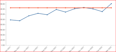
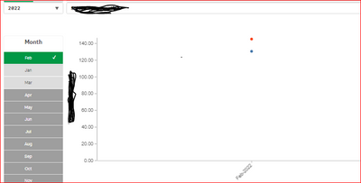
I am using Vizlib line graph which shows 12 month data usage - Here i used datausage of 2 types in the y-axis as measures and the month as dimension in x-axis. I also used vizlib filter selector for month and year . Everything works correctly when I do not have a month selected - all 12 months shows exact scale values but when I select a month, the line graph filters only shows two dots for that month. How do I have the line graph not filter and continue to show all 12 months based on the month/year selected?
Can anyone suggest me how to proceed further.
I attached the photos to show what I am explaining.
Thank you for the help
- Mark as New
- Bookmark
- Subscribe
- Mute
- Subscribe to RSS Feed
- Permalink
- Report Inappropriate Content
You should take a look at Set Analysis in order to make expressions ignore or change selections.
- Mark as New
- Bookmark
- Subscribe
- Mute
- Subscribe to RSS Feed
- Permalink
- Report Inappropriate Content
Hi Kranty,
In your above chart expression include month , year dimensions as below. So that it will ignore your filter selections.
for ex: sum ({<Month=,Year=>} sales).
Please mark this as a solution if it helps. So that other people can refer.
- Mark as New
- Bookmark
- Subscribe
- Mute
- Subscribe to RSS Feed
- Permalink
- Report Inappropriate Content
Hi vish123,
Thank you for the reply.
As mentioned earlier i have taken 1 dimension in x-axis as month and 2 measures in y-axis as dailycost,sales.
for ex: sum ({<Month=,Year=>} sales).
I am trying to use the provided example as sum({<smpt_month=,smpt_year=>}sales). but it is not working. Could you please help me any other formula using set expression.

