Unlock a world of possibilities! Login now and discover the exclusive benefits awaiting you.
- Qlik Community
- :
- Forums
- :
- Analytics & AI
- :
- Products & Topics
- :
- App Development
- :
- Re: Qlik Sense: Changing color in combo chart line...
- Subscribe to RSS Feed
- Mark Topic as New
- Mark Topic as Read
- Float this Topic for Current User
- Bookmark
- Subscribe
- Mute
- Printer Friendly Page
- Mark as New
- Bookmark
- Subscribe
- Mute
- Subscribe to RSS Feed
- Permalink
- Report Inappropriate Content
Qlik Sense: Changing color in combo chart line while keeping bar color assigned based on expression
Hi,
I've added an image below of a combo chart that has color codes in the bars based on a dimension in an expression. The problem is that the same colors are also applied to the line, making the line hard to visualize. Can the colors in the line be updated to a different color so that the line becomes clearer? Black would be ideal. Can the colors in the line also be thicker so that the line becomes more visible? I'm fairly new to Qlik Sense and haven't found a way to update the line color without removing the assigned bar colors. We need to keep the colors in the bar chart in place.
Thanks for any feedback on this!
- Mark as New
- Bookmark
- Subscribe
- Mute
- Subscribe to RSS Feed
- Permalink
- Report Inappropriate Content
hi
to the best of my knowledge , you can't create a diffrent colors expression to the lines and bars
- Mark as New
- Bookmark
- Subscribe
- Mute
- Subscribe to RSS Feed
- Permalink
- Report Inappropriate Content
I have the same Problem, Is any update guys? ![]()
- Mark as New
- Bookmark
- Subscribe
- Mute
- Subscribe to RSS Feed
- Permalink
- Report Inappropriate Content
You can add a master measure and assign a color to it, and then use the master measure in the chart. Dont forget to keep the 'color' settings under 'appearance' as default.
- Mark as New
- Bookmark
- Subscribe
- Mute
- Subscribe to RSS Feed
- Permalink
- Report Inappropriate Content
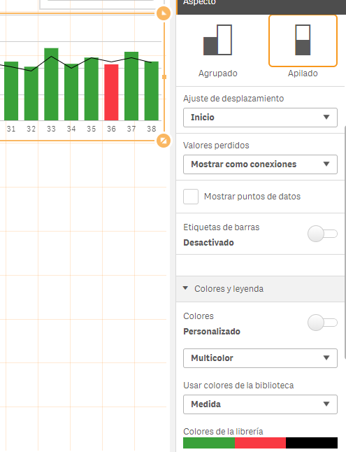
You Need to do different master measures for each color instead of one:
1.- Measure1 equal bars (lightblue)
2.- Mesure2 equal bars (blue)
3.- Measure3 equal bars (orange)
4.- Measure4 equal line (black)
Color by library colors
And use Stacked type of bars
Example with 3 measures:
1.- Measure 1= if(Condition>=0,Sales) color Green
2.- Measure 2= if(Condition<0,Sales) color Red
3.- Measure 3= SalesLastYear color Black
Unfortunately the thicknes of the line is the same predetermined

- Mark as New
- Bookmark
- Subscribe
- Mute
- Subscribe to RSS Feed
- Permalink
- Report Inappropriate Content