Unlock a world of possibilities! Login now and discover the exclusive benefits awaiting you.
- Qlik Community
- :
- Forums
- :
- Analytics & AI
- :
- Products & Topics
- :
- App Development
- :
- Risk Heatmap
- Subscribe to RSS Feed
- Mark Topic as New
- Mark Topic as Read
- Float this Topic for Current User
- Bookmark
- Subscribe
- Mute
- Printer Friendly Page
- Mark as New
- Bookmark
- Subscribe
- Mute
- Subscribe to RSS Feed
- Permalink
- Report Inappropriate Content
Risk Heatmap
Hello,
I am looking for a solution (without using a Qlik Branch extension) to create Risk Heatmaps. I have managed to develop a tool using a pivot table, which dispays the total counts of risks in each grid section.
Measure:
Count ({1} Aggr ( Count ( CaseID ), Impact, Likelihood)) * Count(CaseID)
I would now like to display the response progress for an individual risk, which shows three locations on the grid. E.g.

Is it possible to display the three points (could be X/0 instead of dots etc). Can someone help me with the formula?
Or does anyone have any better solutions for displaying risk management data?
Thank you for your help!
Carly
- Mark as New
- Bookmark
- Subscribe
- Mute
- Subscribe to RSS Feed
- Permalink
- Report Inappropriate Content
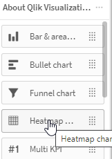
Depending on what version of Qlik Sense you are using, there is an actual Heatmap chart available in the Qlik Visualization bundle so you don't have to use a 3rd party extension. It will not allow you to overlay points on it.
As far fetched as it may seem you could use a custom map with the 16 cells. It won't display the counts, but would color just like a Heatmap, and you could then have a point layer and a line layer.
- Mark as New
- Bookmark
- Subscribe
- Mute
- Subscribe to RSS Feed
- Permalink
- Report Inappropriate Content
Hello,
Unfortunately I am not looking for a traditional heatmap which is coloured based on the count. It needs to be coloured based on the grid position and just display the count.
Thank you,
Carly
- Mark as New
- Bookmark
- Subscribe
- Mute
- Subscribe to RSS Feed
- Permalink
- Report Inappropriate Content
Maybe you could use the custom map with custom background?
- Mark as New
- Bookmark
- Subscribe
- Mute
- Subscribe to RSS Feed
- Permalink
- Report Inappropriate Content
Hi Carly,
May I know how you managed to make the background color on the pivot table ?
It would be helpful as I need to build the risk heatmap for my team.
Thank you very much.

