Unlock a world of possibilities! Login now and discover the exclusive benefits awaiting you.
- Qlik Community
- :
- Forums
- :
- Analytics & AI
- :
- Products & Topics
- :
- App Development
- :
- Showing Movement Between Unfiltered and Filtered D...
- Subscribe to RSS Feed
- Mark Topic as New
- Mark Topic as Read
- Float this Topic for Current User
- Bookmark
- Subscribe
- Mute
- Printer Friendly Page
- Mark as New
- Bookmark
- Subscribe
- Mute
- Subscribe to RSS Feed
- Permalink
- Report Inappropriate Content
Showing Movement Between Unfiltered and Filtered Data in a Scatter Plot
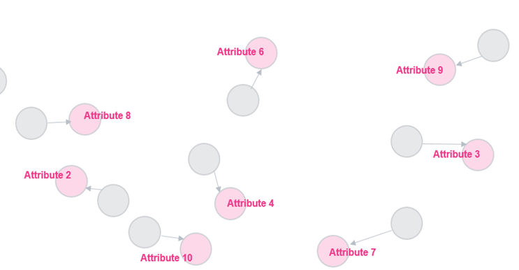
I'm wondering if there's a way to overlay or combine two scatter plots to show movement between the overall data (no filters applied) and the filtered data. For example, in the image below, the gray circles represent the overall/unfiltered data, the pink circles represent the filtered data, and the arrows represent the movement between the two data sets for each attribute. I believe this capability is a stretch, and adding the arrows is even more of a stretch, but I wanted to reach out to the community to see if anyone else had any ideas. For context, this scatter plot is looking at the comparison of these attributes with Importance on the x-axis and Satisfaction on the y-axis (not included in this image).
