Unlock a world of possibilities! Login now and discover the exclusive benefits awaiting you.
- Qlik Community
- :
- Forums
- :
- Analytics & AI
- :
- Products & Topics
- :
- App Development
- :
- Re: YTD - Quaters in one Pivot table
- Subscribe to RSS Feed
- Mark Topic as New
- Mark Topic as Read
- Float this Topic for Current User
- Bookmark
- Subscribe
- Mute
- Printer Friendly Page
- Mark as New
- Bookmark
- Subscribe
- Mute
- Subscribe to RSS Feed
- Permalink
- Report Inappropriate Content
YTD - Quaters in one Pivot table
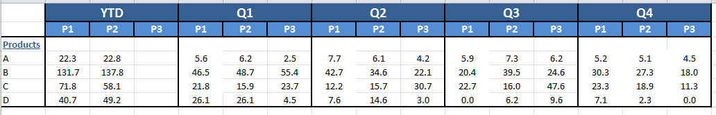
Hi, a little help on this. Is there a way to generate a view on a pivot table like the attached image in qlik sense? Any help/solution using script coding in conjunction with front end syntax will totally be appreciated.
Accepted Solutions
- Mark as New
- Bookmark
- Subscribe
- Mute
- Subscribe to RSS Feed
- Permalink
- Report Inappropriate Content
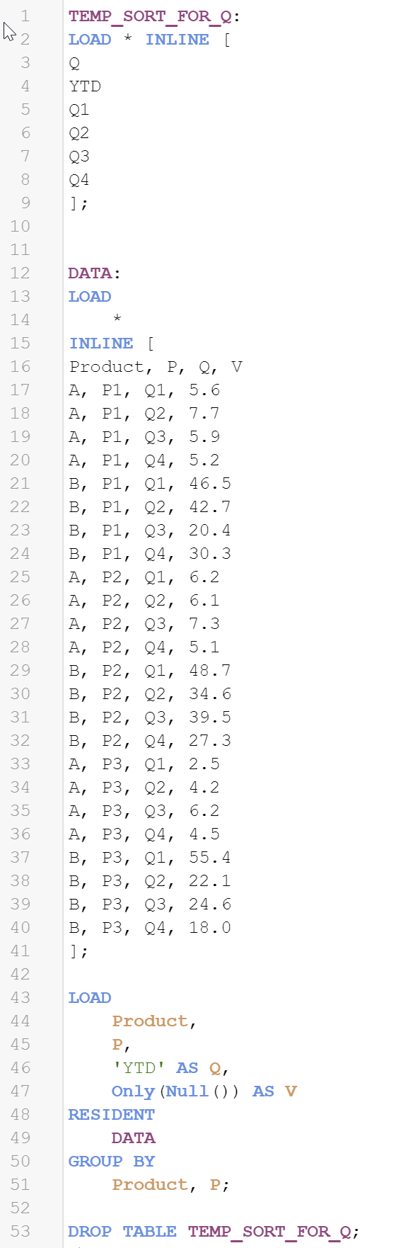
Yes - forgot that but it can be made to work with YTD by creating some placeholder rows in your data table by populating extra rows for Product and P with all combinations of their values and Q as a constant string 'YTD' and lastly Value with a Null() value or zero (dosen't matter as this will be calculated in the measure in the chart.
The measure expression would be:
If( Q = 'YTD' , Sum(TOTAL <Product,P> V) , Sum(V) )
- Mark as New
- Bookmark
- Subscribe
- Mute
- Subscribe to RSS Feed
- Permalink
- Report Inappropriate Content
petter-s Any help on this please?
- Mark as New
- Bookmark
- Subscribe
- Mute
- Subscribe to RSS Feed
- Permalink
- Report Inappropriate Content
This is straight forward and standard use of the pivot table.
You have a table layout like this:
Product, Quarter, P, Value
A, Q1, P1, 99
And then you create a pivot table:
Select Product as dimension
Select Value as measure with a Sum aggregation
Then select both Quarter and P as columns - and presto - you have exactly the kind of table you made a screenshot of.
- Mark as New
- Bookmark
- Subscribe
- Mute
- Subscribe to RSS Feed
- Permalink
- Report Inappropriate Content
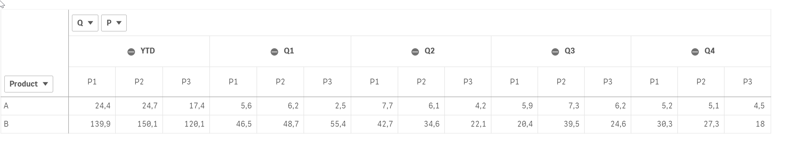
Yes. That works exactly. The only problem is, it only displays the Quarters. But I need a YTD header for P1, P2, P3 also. So first, YTD values, then individual quarter values for P1,P2,P3. So if you will look at the screenshot again, the first column header is YTD. Thanks
- Mark as New
- Bookmark
- Subscribe
- Mute
- Subscribe to RSS Feed
- Permalink
- Report Inappropriate Content
Yes - forgot that but it can be made to work with YTD by creating some placeholder rows in your data table by populating extra rows for Product and P with all combinations of their values and Q as a constant string 'YTD' and lastly Value with a Null() value or zero (dosen't matter as this will be calculated in the measure in the chart.
The measure expression would be:
If( Q = 'YTD' , Sum(TOTAL <Product,P> V) , Sum(V) )
- Mark as New
- Bookmark
- Subscribe
- Mute
- Subscribe to RSS Feed
- Permalink
- Report Inappropriate Content
Thank you very much Petter. Worked like a charm. You the best!