Unlock a world of possibilities! Login now and discover the exclusive benefits awaiting you.
- Qlik Community
- :
- Forums
- :
- Analytics & AI
- :
- Products & Topics
- :
- App Development
- :
- Re: sense scatter chart measure sorting - cummulat...
- Subscribe to RSS Feed
- Mark Topic as New
- Mark Topic as Read
- Float this Topic for Current User
- Bookmark
- Subscribe
- Mute
- Printer Friendly Page
- Mark as New
- Bookmark
- Subscribe
- Mute
- Subscribe to RSS Feed
- Permalink
- Report Inappropriate Content
sense scatter chart measure sorting - cummulative measure
Hi.
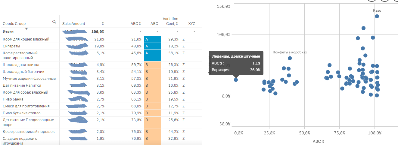
I have some trouble with scatter chart showing ABC-XYZ percents by some dimension (say goods group).
First, I have created simple table with goods group as a dimension and Sales Amount as descending measure. I calculate cummulative sales total and cummulative sales percent for ABC rank. It is simple and it works:
RangeSum(Above($(eSomeSalesExpression), 0, RowNo())) / $(eSomeSalesTotalExpression)
In my scatter chart i have to use ABC percent on X-axis and XYZ variation coef on Y-axis. I tried using same expression as above for "measure 1", but i clearly saw that Scatter does not sort data as Table. As a result i have incorrect data in scatter chart.
I could not find any possibility to sort through some scatter chart property.
Is there any workaround how to make scatter chart work properly?
- Mark as New
- Bookmark
- Subscribe
- Mute
- Subscribe to RSS Feed
- Permalink
- Report Inappropriate Content
Can you provide screen shot of both the Tables, scatter plot and your simple table?
- Mark as New
- Bookmark
- Subscribe
- Mute
- Subscribe to RSS Feed
- Permalink
- Report Inappropriate Content
Sales data is painted over but believe me it is sorted in descending order.
As u see first dimension field value is not the same.
- Mark as New
- Bookmark
- Subscribe
- Mute
- Subscribe to RSS Feed
- Permalink
- Report Inappropriate Content
Not an expert in range sum expression but
RangeSum(Above($(eSomeSalesExpression), 0, RowNo())) / $(eSomeSalesTotalExpression)
This expression would take the rows and above function as it is a table
But in other charts as Bar/Scatter/Pie you'd not find the Row or above.
You may have to change the expression to get the same result.
Maybe stalwar1 or any other expert can help you write a new expression?
- Mark as New
- Bookmark
- Subscribe
- Mute
- Subscribe to RSS Feed
- Permalink
- Report Inappropriate Content
If the expression is completely wrong I think chart should have no bubbles at all. But it has.
Still thinking the problem is sorting.
I'll wait for experts to come.
- Mark as New
- Bookmark
- Subscribe
- Mute
- Subscribe to RSS Feed
- Permalink
- Report Inappropriate Content
In Qlikview, Above() can interfere with sorting in objects like pivot tables. Perhaps above interferes with sorting in certain Sense objects as well?