Unlock a world of possibilities! Login now and discover the exclusive benefits awaiting you.
- Qlik Community
- :
- Forums
- :
- Analytics & AI
- :
- Products & Topics
- :
- Connectivity & Data Prep
- :
- Re: How To Setup Combo Chart?
- Subscribe to RSS Feed
- Mark Topic as New
- Mark Topic as Read
- Float this Topic for Current User
- Bookmark
- Subscribe
- Mute
- Printer Friendly Page
- Mark as New
- Bookmark
- Subscribe
- Mute
- Subscribe to RSS Feed
- Permalink
- Report Inappropriate Content
How To Setup Combo Chart?
Hello,
In Qlik Sense, I drag in Combo Chart, but I'm unable to select one measure on one axis and another measure on another axis. Is there something I might have missed? Maybe a link or video on how to set this up would be much appreciated.
Thanks.
- « Previous Replies
-
- 1
- 2
- Next Replies »
Accepted Solutions
- Mark as New
- Bookmark
- Subscribe
- Mute
- Subscribe to RSS Feed
- Permalink
- Report Inappropriate Content
Hi John,
Please mark the response as Correct or Helpful so that it helps other members of the community...
Thanks
chandra
- Mark as New
- Bookmark
- Subscribe
- Mute
- Subscribe to RSS Feed
- Permalink
- Report Inappropriate Content
May be look here: Combo chart properties ‒ Qlik Sense
- Mark as New
- Bookmark
- Subscribe
- Mute
- Subscribe to RSS Feed
- Permalink
- Report Inappropriate Content
After further reviewing it seems that you can either take both the measure on right or left axis, but Sense doesn't allow to have two separate axis.
- Mark as New
- Bookmark
- Subscribe
- Mute
- Subscribe to RSS Feed
- Permalink
- Report Inappropriate Content
Not sure if having both discrete measures on the same axis will make any sense, unless you have a sample that shows that it does. Is this limitation only in Sense, or does QV has the same issue?
Thanks for your response.
- Mark as New
- Bookmark
- Subscribe
- Mute
- Subscribe to RSS Feed
- Permalink
- Report Inappropriate Content
Hi John,
Is this what you are looking for in a combo chart.

Please let me know if you want qvf file attached ..
Thanks
Chandra
- Mark as New
- Bookmark
- Subscribe
- Mute
- Subscribe to RSS Feed
- Permalink
- Report Inappropriate Content
Thanks for sharing Chandra. I see two measures in your chart, but don't see two axis or two scales to show the discrete measures. I have one for GDP and one for Population or Age, so other charting tools I've used would show them on separate axis.
Thanks.
- Mark as New
- Bookmark
- Subscribe
- Mute
- Subscribe to RSS Feed
- Permalink
- Report Inappropriate Content
HI John,
I don't know if you have expanded the screen shot it has 2 scales and 2 metrics Actual and Plan one is primary axis and the other is secondary axis. I am attaching another screen shot. Please ignore if I did not understand properly...
Thanks
Chandra
- Mark as New
- Bookmark
- Subscribe
- Mute
- Subscribe to RSS Feed
- Permalink
- Report Inappropriate Content
Yes. That's precisely what I'm looking for. If you have QVF or steps to accomplish it, I would appreciate it.
- Mark as New
- Bookmark
- Subscribe
- Mute
- Subscribe to RSS Feed
- Permalink
- Report Inappropriate Content
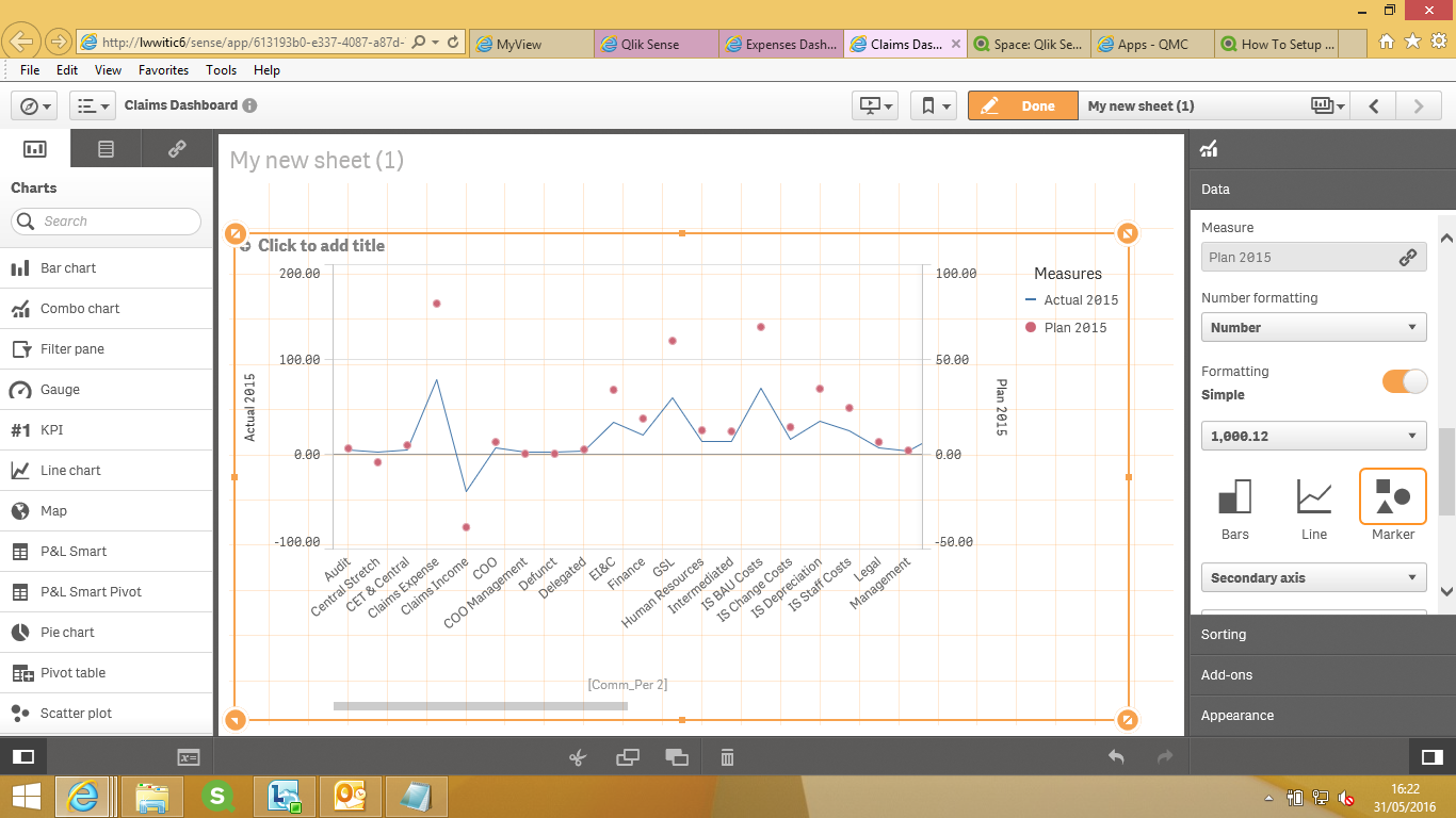
Hi John,
Please drag and drop the combo chart from the charts on the left hand side.
Please choose your dimension:
Next choose your two metrics from Right hand side pane and then choose how you want to represent
Line Bar or marker and immediately below choose Primary or Secondary Axis and repeat the same for the second metrics but change the representation choose marker for the second.
I have chosen actual 2015 as primary Plan 2015 as a circle for secondary:
Please see they are highlighted in Yellow on the left pane

- Mark as New
- Bookmark
- Subscribe
- Mute
- Subscribe to RSS Feed
- Permalink
- Report Inappropriate Content
Hi John,
Please mark the response as Correct or Helpful so that it helps other members of the community...
Thanks
chandra
- « Previous Replies
-
- 1
- 2
- Next Replies »