Unlock a world of possibilities! Login now and discover the exclusive benefits awaiting you.
- Qlik Community
- :
- Blogs
- :
- Technical
- :
- Design
- :
- Colour
- Subscribe to RSS Feed
- Mark as New
- Mark as Read
- Bookmark
- Subscribe
- Printer Friendly Page
- Report Inappropriate Content
Are you colourblind? Do you actually know if you’re colourblind? On the 3 occasions I have presented on this topic I have had a two male attendees admit to not knowing….. (until now...) that they were colourblind to some degree.
It is estimated that approximately 8% of men and 0.5% of women are colourblind. This large difference in probability is due to the fact that the genes that produce photopigments are carried on the X chromosome; if some of these genes are missing or damaged, color blindness will be expressed in males with a higher probability than in females because males only have one X chromosome, whereas women have two!
(http://en.wikipedia.org/wiki/Color_blindness)
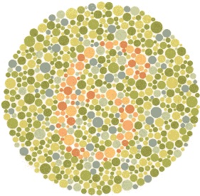
The most common way to determine level of colourblindness is to take an Ishihara test. The test consists of a number of plates that contain patterns of different coloured/shaded dots. These dots form to show numbers and shapes that you can…. or in the case of colour blind people…. can’t see.
Can you see a number in this plate…… I can’t…. I am actually colourblind, which is quite ironic considering I work with QlikView visualisations every day. A person with “normal” vision should see the number 6, colourblind people will see nothing.
You can take the tests online on a number of websites :
http://www.tedmontgomery.com/the_eye/colortst/colortst.html
http://colorvisiontesting.com/ishihara.htm
http://www.colour-blindness.com/colour-blindness-tests/ishihara-colour-test-plates/
One great example I found is the image below. I cannot see any difference between the two images due to me being Red-Green colourblind. People in the office who have perfect vision could see a massive difference in the colours.…
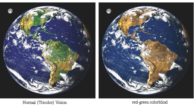
(Source: http://facweb.cs.depaul.edu/sgrais/colorvisiondefi.htm)
I often find that colour and the use of colour is something that is decided upon without much thought, hence me writing this. We have to be very careful when we decide on the colours we use in our charts and dashboards. In your QlikView objects, really think carefully about colours and the impact your choices will have on your users. Ensure you use colour blind friendly palettes, and avoid using colours that are “close” together in tone, next to each other in charts such as scatter and bar charts.
There are a number of resources on the web to help you choose friendly colour palettes..
http://jiminy.medialab.sciences-po.fr/tools/palettes/
So, choose your colours wisely, try not to use colours that are “close” together. Utilise the web resources to help determine your palette. If, like me, you are colour blind then these resources are a massive help!
Remember the number…. 8% of males are colourblind…this is a big number. This 8% could be the key decision makes or indeed the developers.
Wherever possible, colour should purvey meaning, not just used because it looks nice!
See more about this topic in this techincal brief Colour
ABY
You must be a registered user to add a comment. If you've already registered, sign in. Otherwise, register and sign in.