Unlock a world of possibilities! Login now and discover the exclusive benefits awaiting you.
- Subscribe to RSS Feed
- Mark as New
- Mark as Read
- Bookmark
- Subscribe
- Printer Friendly Page
- Report Inappropriate Content
Pivot Table Update
In previous blogs, I wrote on several visualizations throughout Qlik Sense, and our journey continues today. While in a previous blog we covered Buttons, Tables and KPIs, which can be found here, today we are going to look at a relative to the Table chart, Pivot Tables. In this blog we will be covering what puts the pivot in Pivot Tables, differences between Tables and Pivot Tables, and finally see how we can put Pivot Tables in action for your data.
What are Pivots? How are they different from Tables?
As we covered in my previous blog, Tables are a wonderful tool for visualizing your data, their simplistic nature allowing users to visualize a wide range of data easily. Tables are a wonderful tool for displaying and interacting with your raw data.
Pivot Tables provide another level of flexibility, offering users the ability to reorganize, or pivot, your data dynamically. But what does ‘Pivot’ mean? In Pivot Table, Pivot means users can interchange Dimensions to either side. In our chart, our first layer is the Year, with Product Type and Product Sub Group under all on the same side. With Pivot Tables, we can reorder our Dimensions, changing the focus of our chart.
With a Pivot Table, users can drag a Dimension from one side, to the other, giving a different perspective of their data.
In the above example we have moved the Providing a Row and Column interaction between the Product Type and the Year, as opposed to a Column and Column collapse as before.
When and how should I use Pivot Tables?
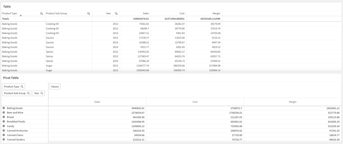
As said above, Pivot Tables are wonderful for getting a different perspective on your data. When working with Pivot Tables, remember their strengths are a change in perspective and organization. Below we have both a Table and Pivot Table with the exact same data shared between them, with the same Measures and Dimensions.
Both Table and Pivot Table visualizations serve a purpose. The Table display all of the data, all of the time, which can be useful in its own circumstances. The Pivot Tables shows a collapsed view, allowing users dynamically choose which data is shown to them. If we oversaw ordering for this company, we could quickly see which Product Type had the most Sales, Cost and Margins.
In our Pivot Table, we could drill down to see which Product Sub Groups are the highest in the Baking Goods Type. Drilling further, we can see the metrics for each year as well.
Perhaps the comparison between years is important to which products we will be ordering more of in the future. Using Pivot Tables, we can quickly ‘Pivot’ the Year Dimension to the other side of the chart to make comparison easier.
Now our chart has all three years on display, making it easy to compare the Sales, Cost and Margins of each year against each other. Additionally, we can move the Product Sub Group to the other side, to get views of each year, and the Sales, Cost and Margins of each Sub Group as well.
Again, the keys to the use of a Pivot Table are their ability to organize and their perspective changes, allowing you to view and use your data how you would like.
Conclusion
As you can see Pivot Tables by their very nature are extremely dynamic and flexible. How could you use Pivot Tables to visualize your data more effectively? Do you have any revelations that you’ve made because of Pivot Tables? If so, tell the community about it in the comments section below!
You must be a registered user to add a comment. If you've already registered, sign in. Otherwise, register and sign in.


