Unlock a world of possibilities! Login now and discover the exclusive benefits awaiting you.
Announcements
Qlik and ServiceNow Partner to Bring Trusted Enterprise Context into AI-Powered Workflows. Learn More!
- Qlik Community
- :
- Blogs
- :
- Technical
- :
- Design
- :
- Google Gauge - A Qlik Sense Extension
Employee
2016-08-19
04:45 PM
- Subscribe to RSS Feed
- Mark as New
- Mark as Read
- Bookmark
- Subscribe
- Printer Friendly Page
- Report Inappropriate Content
Since my last blog where I created a Google Annotation Chart (Google Annotation Chart - Qlik Sense Extension and Angular Directive), I thought it would be interesting to add more extensions based on Google's visualization library.
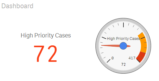
Here I created a simple gauge based on Google's Gauge found at Visualization: Gauge | Charts | Google Developers.
- Download the zip file as found at the end of this blog,
- unzip it in your extensions folder, C:\Users<user>\Documents\Qlik\Sense\Extensions\GoogleGaugeChart
- Open your Helpdesk app and drag and drop the extension into the canvas
- As for the first measure put
Count( {$<Priority={'High'}, Status -={'Closed'} >} Distinct %CaseId )with a label "High Priority Cases" - For the second measure, put
Count( {$<Status -={'Closed'} >} Distinct %CaseId ) - with a label "Total Closed Cases"
- Make selections and see the Gauge animate
Coming up: Extension settings...
Branch: http://branch.qlik.com/#!/project/57b76c10b3122e2cd1e7305d
Yianni
9 Comments
You must be a registered user to add a comment. If you've already registered, sign in. Otherwise, register and sign in.