Unlock a world of possibilities! Login now and discover the exclusive benefits awaiting you.
- Qlik Community
- :
- All Forums
- :
- GeoAnalytics
- :
- Bubble Layer/Chart Layer - Multiple Layers & Scali...
- Subscribe to RSS Feed
- Mark Topic as New
- Mark Topic as Read
- Float this Topic for Current User
- Bookmark
- Subscribe
- Mute
- Printer Friendly Page
- Mark as New
- Bookmark
- Subscribe
- Mute
- Subscribe to RSS Feed
- Permalink
- Report Inappropriate Content
Bubble Layer/Chart Layer - Multiple Layers & Scaling
Hi all,
my first post, so absolute newbie and also just started with Qlikview about a month ago, so please be gentle. I couldn't find a similar topic and couldn't find any answers in the instruction videos. So i hope i can find some answers in the community.
Problem:
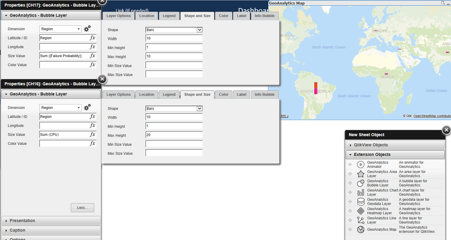
I'm trying to plot 2 different values on a geomap (i got basic Qlikview 12.20.21 and use pointgeom/default location server) so for example i want to show the amount of repair per sales vs cost per repair sold in a region/country etc. with the bars next to each other using the same scale or a defined scale.
At the moment whatever i do, multiple bubble or chart layers are always on top of each other and on top of that despite different sums (eg 0.1 repairs per sales / 20 cost per repair) the bars/bubbles are the same size only if i manipulate the max height I can see the two bars (see attached snap shot) but that won't ever give me the right scale.
I have thought about using dimension in a way that i can plot both with scale, but can't figure out how to arrange the data in alteryx/excel.
I hope you guys can help, I haven't got any exp with coding and played for 8hrs yesterday and couldn't work it out.
Cheers,
Thomas
- Mark as New
- Bookmark
- Subscribe
- Mute
- Subscribe to RSS Feed
- Permalink
- Report Inappropriate Content
Hi,
You're on the right track, the chart layer expects a second dimension for the types of the measures so it's a data model problem. Compare how to make a grouped bar chart and having the two measures next to each other.
One trick to solve is to use value list for the chart dimension:
=ValueList('Sales','COS')
and the chart expression to pick the right measure:
=pick(match(ValueList('Sales','COS'),'Sales','COS'),
sum(Sales),
sum(COS)
)
See the example.
Thanks,
Patric