Unlock a world of possibilities! Login now and discover the exclusive benefits awaiting you.
- Qlik Community
- :
- All Forums
- :
- GeoAnalytics
- :
- Library Colors for Dimension - Qlik Sense Geoanaly...
- Subscribe to RSS Feed
- Mark Topic as New
- Mark Topic as Read
- Float this Topic for Current User
- Bookmark
- Subscribe
- Mute
- Printer Friendly Page
- Mark as New
- Bookmark
- Subscribe
- Mute
- Subscribe to RSS Feed
- Permalink
- Report Inappropriate Content
Library Colors for Dimension - Qlik Sense Geoanalytics
I have a Geoanalytics map with all our locations plotted and it works well. I want to color code them by a specific type of vendor that services them (Produce company) and that works except for the coloring. In the current test, I have 46 vendors, well below the 100 Color scheme. However, it is reusing colors making it impossible to determine what vendor serves what location visually.
I also set up the dimension as a Master Item, assigned colors to each vendor then used that Master item for the colors and told Geoanalytics to use Library colors rather than the 100 Colors. It appears to still be using the 100 Color scheme and refuses to use the Library colors I have picked.
Now if I use the standard Map in Qlik Sense, it will use the library colors, but has other limitations which is why I am not using it.
Accepted Solutions
- Mark as New
- Bookmark
- Subscribe
- Mute
- Subscribe to RSS Feed
- Permalink
- Report Inappropriate Content
Got it working! Turns out that while we had been keeping up with the Qlik Sense updates, Geoanalytics had not been updated. Applied the latest update today and Library Colors are working!
- Mark as New
- Bookmark
- Subscribe
- Mute
- Subscribe to RSS Feed
- Permalink
- Report Inappropriate Content
So I deleted the Dimension and recreated it, but got the same results. Also tried to use Library colors in another app for a different dimension and got the same results. Is Library Colors broken in Geoanalytics?
- Mark as New
- Bookmark
- Subscribe
- Mute
- Subscribe to RSS Feed
- Permalink
- Report Inappropriate Content
Sorry for trouble. Library colors works in QGA, see also the attached example.
Can you post an example?
Thanks,
Patric
- Mark as New
- Bookmark
- Subscribe
- Mute
- Subscribe to RSS Feed
- Permalink
- Report Inappropriate Content
Here are some screen shots:
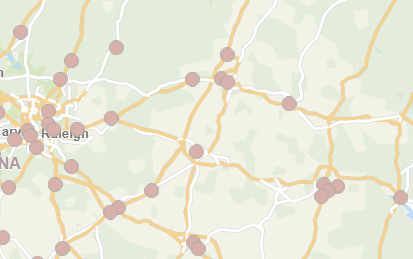
The plots on the map are for two different vendors and should be a different color. As you can see, they are the same color.
Here is the Color setting for the Bubble layer:
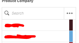
And here is the Dimension with the color set for the two vendors who are plotted on the above map. You can see their color doesn't match the color used on the map.
I tested the dimension in a bar graph and they worked fine there. I also created a new app and tried it the map again and it didn't work in that app either.
We use the Enterprise version and are up to date on the latest version of Qlik Sense.
- Mark as New
- Bookmark
- Subscribe
- Mute
- Subscribe to RSS Feed
- Permalink
- Report Inappropriate Content
If there are several possible color values, the chart layer with pies can be a good alternative.
Thanks,
Patric
- Mark as New
- Bookmark
- Subscribe
- Mute
- Subscribe to RSS Feed
- Permalink
- Report Inappropriate Content
Each point only has 1 Produce company, but each produce company can have multiple points. The points are locations served by the produce company. The idea is to map all our locations and color code them by their produce company so you can see who services what visually.
- Mark as New
- Bookmark
- Subscribe
- Mute
- Subscribe to RSS Feed
- Permalink
- Report Inappropriate Content
Got it working! Turns out that while we had been keeping up with the Qlik Sense updates, Geoanalytics had not been updated. Applied the latest update today and Library Colors are working!


