Unlock a world of possibilities! Login now and discover the exclusive benefits awaiting you.
- Qlik Community
- :
- All Forums
- :
- GeoAnalytics
- :
- geomap chart layer for pie charts per region not s...
- Subscribe to RSS Feed
- Mark Topic as New
- Mark Topic as Read
- Float this Topic for Current User
- Bookmark
- Subscribe
- Mute
- Printer Friendly Page
- Mark as New
- Bookmark
- Subscribe
- Mute
- Subscribe to RSS Feed
- Permalink
- Report Inappropriate Content
geomap chart layer for pie charts per region not showing percentage
Hi Guys ... hope you can help ...
I'm building a geomap layer with QlikView (not QlikSense) in my model. I want to show pie-charts per region (province) for my country based on total sales per product.
The pie chart shows up fine, but the information bubble only has the actual values, not the percentage contribution per product. I managed to find a formula that adds the percentage value to the dimension, but it only calculates over the entire dataset, not per province. As a result, the % values in the dimension is the same for all provinces.
I don't even care to show the value as in the image below if I can just have the % contribution instead... like FNB = 21% and Other = 79% ....
.

- Mark as New
- Bookmark
- Subscribe
- Mute
- Subscribe to RSS Feed
- Permalink
- Report Inappropriate Content
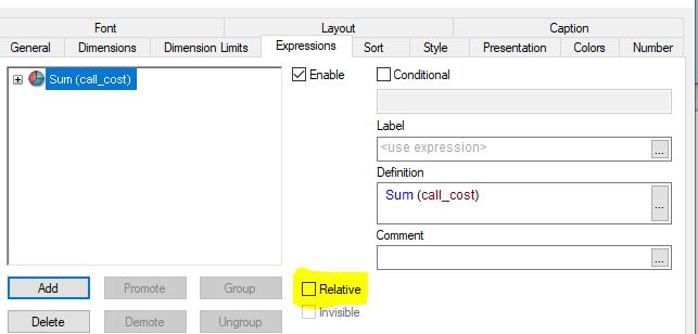
Hi @samuelll ,
To find the data in percentage, convert the expression in relative form. In the Expression tab, you can find the Relative Checkbox.
It might solve your problem of values in percentage. Please check the attached image
If it does, mark the answer as a solution so that it will help others.
Regards,
Rushi
- Mark as New
- Bookmark
- Subscribe
- Mute
- Subscribe to RSS Feed
- Permalink
- Report Inappropriate Content
Hi @rushikale0106 ... unfortunately that tick option only works for a normal chart. My problem is specific to a chart layer on a geomap where those additional options don't reflect/exist.
- Mark as New
- Bookmark
- Subscribe
- Mute
- Subscribe to RSS Feed
- Permalink
- Report Inappropriate Content
Modify the expression in this way to get percentage. Replace Country with your province field and COS with your measure.
round(sum(COS)/sum(total <Country> COS)*100)