Unlock a world of possibilities! Login now and discover the exclusive benefits awaiting you.
Apr 22, 2023 11:52:50 AM
stevedark
Mar 18, 2016 12:40:40 PM
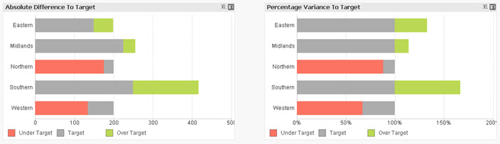
This example QlikView document shows how to create a bar chart that shows variance to target, both as an absolute value and as a percentage.
The charts produced look like this:
By showing both these charts you can see both how regions are comparing to each other and against the targets that have been set for them.
The example was created to accompany the Quick Intelligence blog post, that can be read here:
https://www.quickintelligence.co.uk/qlik-target-bar-chart/
The example is also available on Qlik Community as a Qlik Sense application.
A list of all our downloadable example files can be found here:
https://www.quickintelligence.co.uk/examples/
Hope you find this application useful.
Regards,
Steve
https://www.quickintelligence.co.uk/
the link given above for the QS version of this, does not appear to work anymore. I did a search and the proper link for the Qlik Sense version of this appears to be:
https://community.qlik.com/t5/Qlik-Sense-Enterprise-Documents/Qlik-Sense-App-Creating-a-Variance-To-...