Unlock a world of possibilities! Login now and discover the exclusive benefits awaiting you.
This forum is where any logged-in member can create a knowledge article.
Recent Documents
-
QlikView App: The Power Of Yellow (Show Alternatives)
The blog posting 'The Power Of Yellow' describes how Show Alternatives can be used to highlight data excluded by a selection on a field that would oth... Show MoreThe blog posting 'The Power Of Yellow' describes how Show Alternatives can be used to highlight data excluded by a selection on a field that would otherwise be included. This QlikView application illustrates this functionality.
This tequnique can be useful in making immediately apparent something that would otherwise be hard to spot, or require extra clicks to remove selections.
For a full description of how and why the feature can be used please see the original blog post at: http://www.quickintelligence.co.uk/the-power-of-yellow/
Steve Dark
-
Important Message Regarding QlikView Documents
For the interim, no new articles can be published. This is because we are consolidating knowledge articles to one location. If you have any question... Show More -
Do you Qualify?- How to use QUALIFY statement
What it is used for?The Qualify statement is used for switching on the qualification of field names, i.e. field names will get the table name as a pre... Show MoreWhat it is used for?
The Qualify statement is used for switching on the qualification of field names, i.e. field names will get the table name as a prefix.’

In situation where we have two (or more) Tables with the same field names:
Product Payment 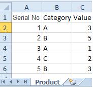
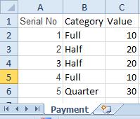
The Qualify statement will assign name of the Table to fields:
- To use the script below the Excel file must be saved in the same folder that your qvd file
Otherwise you will need to make changes the this path - [Qualify.xlsx]
QUALIFY *;
Product:
LOAD [Serial No],
Category,
Value
FROM
Qualify.xlsx
(ooxml, embedded labels, table is Product);
QUALIFY *;
Payment:
LOAD [Serial No],
Category,
Value
FROM
Qualify.xlsx
(ooxml, embedded labels, table is Payment);The Outcome:
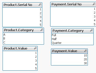
Table Viewer:
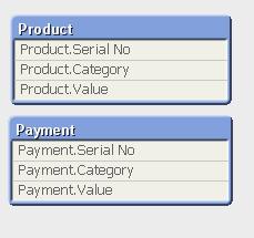
Read only if you need to know more....
If we have not used ‘QUALIFY’ statement in situation as above Qlikview would map both of the Tables with outcome like below:
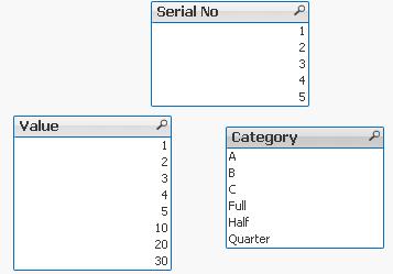
The end result -merge of those two Tables is correct only for the “Serial No” fields
The “Value” and “Category” fields although merged is none of use to us.
To fix this we can only Qualify fields that we do not want to associated:
QUALIFY Category,
Value;
Product:
LOAD [Serial No],
Category,
Value
FROM
Qualify.xlsx
(ooxml, embedded labels, table is Product);
QUALIFY Category,
Value;
Payment:
LOAD [Serial No],
Category,
Value
FROM
Qualify.xlsx
(ooxml, embedded labels, table is Payment);
or by using UNQUALIFY statement:
(which works as opposite to QUALIFY)
QUALIFY *;
UNQUALIFY [Serial No];
Product:
LOAD [Serial No],
Category,
Value
FROM
Qualify.xlsx
(ooxml, embedded labels, table is Product);
QUALIFY *;
UNQUALIFY [Serial No];
Payment:
LOAD [Serial No],
Category,
Value
FROM
Qualify.xlsx
(ooxml, embedded labels, table is Payment);In second example the ‘QUALIFY *’ part will add Table name to all fields and the UNQUALIFY statement will remove those names only from specified fields(this method is very useful if we got large numbers of fields)
Outcome is as below:
Fields:

Table Viewer:

Feeling Qlikngry?
-
Qlik Sense Document - Run Rate Tutorial
When showing data in a month on month style the current month can often have a large drop off. This can be prevented by providing a run rate for the ... Show MoreWhen showing data in a month on month style the current month can often have a large drop off. This can be prevented by providing a run rate for the current month. This is where the known values for the current period are extrapolated forward for the rest of the period, providing an estimate of where the period will end. For example, if you have a value of 1000 on day 10 of a 30 day month, you could calculate a run rate of 3000 for the month.
This solution was created in response to a question on Qlik Community, which you can find here:
Re: Last time value in time line chart
I have documented how this document works and the reasons why you might use it in a blog post here:
https://www.quickintelligence.co.uk/qlik-run-rate/
There is also a link to the QlikView version of this application on the blog post, and further discussions on why run rates are good to have.

I hope that you find it useful. You will find other applications that I have uploaded under my profile on QlikCommunity.
Steve
-
QlikView App - Generic Data Profiler
Often when building QlikView applications, or picking up applications which have been built by someone else I want to have a quick and easy way of vie... Show MoreOften when building QlikView applications, or picking up applications which have been built by someone else I want to have a quick and easy way of viewing the data that is in that application. To enable me to do this I have put together a page of objects that lists all tables and fields in the data model and then gives outline information about any selected field. These objects can be copied and pasted into any QlikView application to view the data model of that document.
I have documented how this document works and the reasons why you might use it in a blog post here:
https://www.quickintelligence.co.uk/qlikview-data-profiler/
Please see the blog post for further details on using this document.
There is now a Qlik Sense version of this app, which you can find on Qlik Community here:
Qlik Sense App: Generic Data Profiler
I hope that you find it useful. You will find other applications that I have uploaded under my profile on QlikCommunity, or on our Downloads Page.
Steve
https://www.quickintelligence.co.uk/blog/
PLEASE NOTE: The 'With Mask' version of the file includes an experimental tab that may or may not work well on large data sets. Please see comment below for details. If you are not sure which to download go for DataProfiler.qvw. Thanks!
-
QlikView App: Creating a Variance To Target Bar Chart
This example QlikView document shows how to create a bar chart that shows variance to target, both as an absolute value and as a percentage. The cha... Show MoreThis example QlikView document shows how to create a bar chart that shows variance to target, both as an absolute value and as a percentage.
The charts produced look like this:

By showing both these charts you can see both how regions are comparing to each other and against the targets that have been set for them.
The example was created to accompany the Quick Intelligence blog post, that can be read here:
https://www.quickintelligence.co.uk/qlik-target-bar-chart/
The example is also available on Qlik Community as a Qlik Sense application.
A list of all our downloadable example files can be found here:
https://www.quickintelligence.co.uk/examples/
Hope you find this application useful.
Regards,
Steve
-
How to use - Dimensionality()
Definition:Returns the number of dimension columns that have non-aggregation content. i.e. do not contain partial sums or collapsed aggregates.A typic... Show MoreDefinition:
Returns the number of dimension columns that have non-aggregation content. i.e. do not contain partial sums or collapsed aggregates.
A typical use is in attribute expressions, when you want to apply different cell formatting depending on aggregation level of data.
This function is only available in charts. For all chart types except pivot table it will return the number of dimensions in all rows except the total, which will be 0.
What does it mean?
We have Table with 4 dimensions(columns): Product,Category,Type,Sales
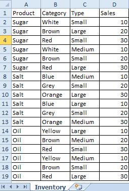
Now we want to create Pivot Table by using those Dimensions.
We are going to use only 3 of them(Product,Category,Type) and use 4th(Sales) in our expression.
The result is shown below:
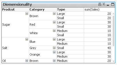
This Pivot Table has 3 dimensions so its maximum dimensionality is 3.
For better understating please see table below.
The function is used to show on which dimensionality level each of the Pivot Table row is:
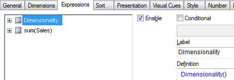
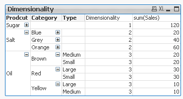
'Sugar' has dimensionality of 1 which is Total for that 'Product'.
'Salt' has dimensionality of 2 which is Total for each 'Category' of that 'Product'.
'Oil' has dimensionality of 3 which is single value for each 'Type' of the 'Product's' 'Category'.
So then more Dimension we use the greater dimensionality of our Pivot Table is.
Practical use:
1) To show the level of dimensionality:

Expression:
if(Dimensionality()=1 ,RGB(151,255,255),if(Dimensionality()=2 ,RGB(0,238,0),if(Dimensionality()=3,RGB(255,130,171))))
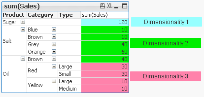
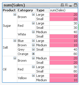
2) Highlight background of rows which on each level fall into certain condition:
Expression:
if(Dimensionality()=1 and sum(Sales)<150,RGB(151,255,255),if(Dimensionality()=2 and sum(Sales)<=20,RGB(0,238,0),if(Dimensionality()=3 and Sum(Sales)<=20,RGB(255,130,171))))
LEVEL1 --> Values <140 LEVEL 2 --> Values <=20 LEVEL 3 --> Values <=20 

- To use the script below the Excel file must be saved in the same folder that your qvd file
Otherwise you will need to make changes the this path - [Dimensionality.xlsx]
Directory;
LOAD Product,
Category,
Type,
Sales
FROM
[Dimensionality.xlsx]
(ooxml, embedded labels, table is Sheet1);
Felling Qlingry?
-
Google Map for India
Dear All,Sharing Nice example of static google map in qvw.Vikas -
Never look down – The Lookup() Story
What it is used for?To return values from another table field based on matching field value from current table.Typically used when only one field reco... Show More
What it is used for?To return values from another table field based on matching field value from current table.
Typically used when only one field records from another table are needed.
(You are dropping this (second) table later on.(see below) )
How does it look like?

How is it design?
- dual - this is not actual part of the function but prefix used to indicate what kind of value this function returns –in this case it means that this function can return numbers and characters
- Lookup - function name
and four arguments:
- field_name – is the name of a field in the other table – in the table where we want the value to take from
- match_field_name- is the name of a field in the other table – this is the matching value to the next argument
<---->
- match_field_value - is the name of field in the this table-matching with previous argument
- [, table_name] - This is name of the other table (this argument is optional if omitted current table is used)
Preparation:
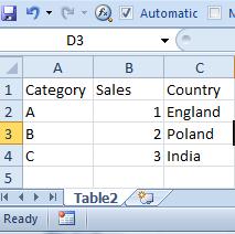
We have got two tables in Excel file.
For convenience let’s call them ‘Table1’ and ‘Table2’:
Table1 Table2 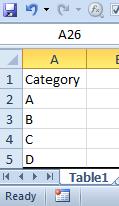
Remember

- To use the script below the Excel file must be saved in the same folder that your qvd file
Otherwise you will need to make changes the this path - [LookUp.xlsx]
Table2:
LOAD Category,
Sales,
Country
FROM
[Lookup.xlsx]
(ooxml, embedded labels, table is Table2);
Table1:
LOAD Category,
Lookup('Country','Category',Category,'Table2') as Country
FROM
[Lookup.xlsx]
(ooxml, embedded labels, table is Table1);
drop table Table2;Remember to... Look Up!
(This is where the name of this function has another meaning)
Table 2 must be above Table1!
or after Reload you will get script error.
How does it work?Formula:

Script:
Table2:
LOAD Category,
Sales,
Country
FROM
[Lookup.xls]
(ooxml, embedded labels, table is Table2);
Table1:
LOAD Category,
Lookup('Country','Category',Category,'Table2') as Country
FROM
[Lookup.xlsx]
(ooxml, embedded labels, table is Table1);
drop table Table2;Remember:

- First two arguments and the last one must be enclosed in apostrophes '' .
- You need to drop Table2 using: drop table statement or all fields from Table1 will be loaded, bringing unexpected results.
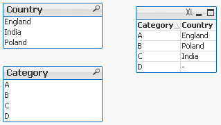
The final tables you should see are like this:
Pros:
- You can return any field from second table based on any matched field from first table -
You can look at first field in the table to return third one and to look at third field to return the first one.
Cons:
- Little bit confusing with the syntax
- Slower than Apply Map
- No ‘False’ return – If there is no match a Null is returned.
To overcome this drawback we can wrap the formula in IF function:
If(isnull(Lookup('Country','Category',Category,'Table2')),'No match',Lookup('Country','Category',Category,'Table2')) As Country
Exercise :
Return field ‘Sales’ from Table2 by using ‘Category’ field from Table1.
(Answer at the end of this article)
Appendix:
For many of you coming from Excel world and working with VLOOKUP this syntax is little difficult to understand at first.
Why we can not have:
Take value from this table go to the another table matched the field and return what we need?
So the syntax would have been:
Lookup(Category,Table2,Category,Country)
Would this not be simpler?
This is open question so please state your case....
Answer to Exercise:
Lookup('Sales','Category',Category,'Table2') as Sales
Still feeling hungry?
-
Benford's law
Hi Qlikers,This document demonstrates the Benford's law.To know more about Benford's law, please visit the below linkBenford's law - Wikipedia, the fr... Show MoreHi Qlikers,
This document demonstrates the Benford's law.
To know more about Benford's law, please visit the below link
Benford's law - Wikipedia, the free encyclopedia
Benford’s law can often be used as an indicator of fraudulent data, and can assist with auditing accounting data
Benford's law represents the distribution of 1st Digit of your data set. For eg. sales figure $ 11292 can be represented as 1.
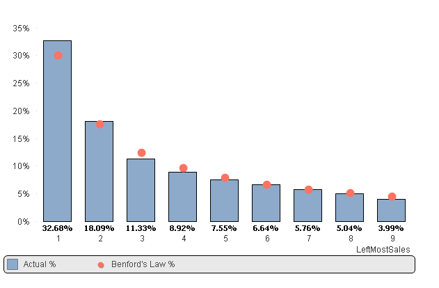
In above chart, we can identify that distribution of the digit 1 of actual data is higher than the Benford's law distribution for the digit 1. That means we need to investigate the transactions of the sales figures starting from digit 1.
Please find the attached sample data with QVW file
Also see,
-
How to use - MaxString & MinString
Bullet points:MaxString and MinString belongs to Qlikview String Aggregation function.They are equivalent to MAX and MIN for integersThey return the h... Show MoreBullet points:
- MaxString and MinString belongs to Qlikview String Aggregation function.
- They are equivalent to MAX and MIN for integers
- They return the highest and lowest string value
What actually a value of a string?
This is the value described by ANSI character standard where 0 ( NULL) is equal to 0 and ÿ to 255.
(For full ANSI character set please attached dosument)
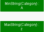
Taking only the standard English alphabet (A-z) ‘A’ will be the MIN and ‘z’ will be the MAX.
Remember:
In ANSI standard A < a and Z < z
(A=65,Z=90,a=97,z=122)
Language specific characters will be not recognized in the place where they are in your alphabet but they will be 'pushed' to the end
(see ANSI table)
MinString and MaxString works on dimensions (columns) only so you cannot use is to evaluate single character or strings .
(MaxString(‘a’,’z’…) is not supported
Examples:
1) MIN & MAX (textbox)
Data Expression Results 
MinString(Category)
MaxString(Category)
2) MIN and MAX of String per group (Straight table)
Data Expression Result 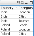
MinString(Category)
MaxString(Category)

3) With condition:
Return Max and Min string based on another column
We are looking for MIN and MAX string value from column Category where Country='Poland'
Data Expression Solution Result 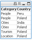
MinString( if(Country='Poland', Category, null()) )
MaxString( if(Country='Poland', Category, null()) )


4) With LEFT/RIGHT
When used with LEFT the result will be the same as without as the value will be still based on first characters.
Data Expression Solution Result 
=MinString( Right(Country,1))
=MaxString( Right(Country,1))


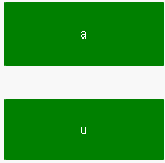
5) With MID
Data Expression Solution Result 
=MinString( Mid(Country,2,2))
=MaxString( Mid(Country,2,2))


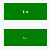
6) With Substring
When our data are little scrambled -TextBetween will return string between '.' and end of the row.
Data Expression Result 
=MinString(TextBetween(Country,'.','',1))
=MaxString(TextBetween(Country,'.','',1))

7) In set analysis
When Criteria of Sales is 2 return Country with highest and lowest string Value
Data Expression Result 
=MinString({<Sales={2}>} Country)
=MaxString({<Sales={2}>} Country)
😎 With Aggr()
For each Country return lowest and highest Category string value.
Data Expression Result 
=Aggr(Minstring(Category),Country)
=Aggr(Maxstring(Category),Country)

If know about other ways of using these functions please let me know.
-
Missing Manual - Before() and After()
Have you ever wondered how the examples from the Qlikview help may look like?Please see below and enjoy responsibly...Before () and After()Description... Show More Have you ever wondered how the examples from the Qlikview help may look like?
Please see below and enjoy responsibly...
Before () and After()

Description
Returns the value of expression evaluated with a pivot table's dimension values as they appear in the column before the current column within a row segment in the pivot table. This function returns NULL in all chart types except pivot tables.
On the first column of a row segment a NULL value will be returned, as there is no column before this one.
If the table is one-dimensional or if the expression is preceded by the total qualifier, the current row segment is always equal to the entire row.
If the pivot table has multiple horizontal dimensions, the current row segment will include only columns with the same values as the current column in all dimension rows except for the row showing the last horizontal dimension of the inter field sort order. The inter field sort order for horizontal dimensions in pivot tables is defined simply by the order of the dimensions from top to bottom.
Specifying an offset greater than 1 lets you move the evaluation of expression to columns further to the left of the current column. A negative offset number will actually make the before function equivalent to a after function with the corresponding positive offset number. Specifying an offset of 0 will evaluate the expression on the current column. Recursive calls will return NULL.
By specifying a third parameter n greater than 1, the function will return not one but a range of n values, one for each of n table columns counting to the left from the original cell. In this form, the function can be used as an argument to any of the special Chart Range Functions.

- Returns value from preceding (Before)or following (After) column
- Returns values only in Pivot Table otherwise NULL.
- Works only with Horizontal dimension.
- Equivalent to below() and above() for vertical Pivot Table dimensions.
Data Model:
(Copy and Pasted below code into Edit Script window and reload)
LOAD * inline
[
Product ,Category ,Sales
Salt ,White, 30
Salt, Brown ,40
Salt ,Red ,30
Sugar ,White ,10
Sugar ,Brown ,20
Sugar ,Red ,20
Wine ,White ,40
Wine ,Brown ,30
Wine ,Red ,10
]
Example 1:
Let's build a Pivot Tables with Product as dimension and expressions as below:
The left hand side shows an ordinary use of Sales the right hand side result from our new expression.
sum( Sales ) -----------> before(sum( Sales ) )
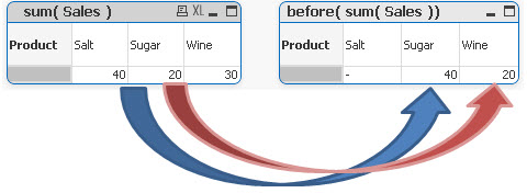
Salt value has been assigned to Sugar,
Sugar to Wine,
Salt is now NULL .(there is no column before this one)
sum( Sales ) -----------> after(sum( Sales ) )
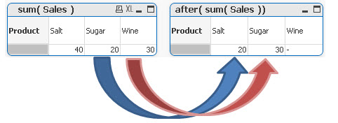
Here we see the opposite result:
Sugar value has been assigned to Salt,
Wine to Sugar
and Wine is NULL (no column after this one)
Example 2
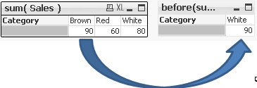
Specifying the second criteria as 2 we shifted all values by 2 columns right or left.
before( sum( Sales ), 2 )
after( sum( Sales ), 2 )

Example 3
before(total sum( Sales ) )
after(total sum( Sales ) )
When using with one dimension this expression returns values as if we have used ordinary before/after (Sum(Sales))
![2015-04-02 02_37_23-QlikView Personal Edition - [C__Users_Katarzyna_Desktop_Before.qvw_].png](/legacyfs/online/82748_2015-04-02 02_37_23-QlikView Personal Edition - [C__Users_Katarzyna_Desktop_Before.qvw_].png)
For more than one dimension the return value will be based on last column of the first(top) dimension and then appropriate columns for the second dimension.
![2015-04-02 03_07_52-QlikView Personal Edition - [C__Users_Katarzyna_Desktop_Before.qvw_].png](/legacyfs/online/82750_2015-04-02 03_07_52-QlikView Personal Edition - [C__Users_Katarzyna_Desktop_Before.qvw_].png)
Salt and Sugar have been omitted leaving Wine as the last column
Example 4
rangesum (Before(sum(Sales),1,2))
RangeSum() takes 3 parameters
-expression ---> Before/After(sum(Sales),
-offset of columns--->1
-number of columns to sum--->2
sum(Sales) rangesum (Before(sum(Sales),1,2))

In our example we are shifting our calculation one column to the right:
-Salt - As there is no column before Salt this column has been ignored
-Sugar -we are shifting our calculation one column to the left (Salt) and are summing previous two columns.
As there is no column before Salt the final result is value of Salt alone.
-Wine- by shifting calculations one column to the left(Sugar) and summing two previous columns we getting 100+50=150
sum(Sales) rangesum (after(sum(Sales),1,2)

In this example we are shifting our calculation one column to the right:
-Wine - As there is no column after Salt this column has been ignored
-Sugar -we are shifting our calculation one column to the right(Wine) and aresumming previous two columns.
As there is no column after Wine the final result is value of Wine alone.
-Salt- by shifting calculations one column to the right(Sugar) and summing two previous columns we getting 50+80=130
Still feeling hungry?
Do you Qualify?- How to use QUALIFY statement
Missing Manual - GetFieldSelections() + Bonus Example
MaxString & MinString - How to + examples
The second dimension... or how to use secondarydimensionality()
-
What if analysis in Qlik Sense
Dear all,Sharing simple example of What if analysis in Qlik Sense using Slider extensionGitHub - mhamano/qlik-sense-slider: Qlik Sense extension for a... Show MoreDear all,
Sharing simple example of What if analysis in Qlik Sense using Slider extension
GitHub - mhamano/qlik-sense-slider: Qlik Sense extension for a slider object
Hope will be good start for beginners
Vikas
-
QlikView App: Export Chart and Sheet to an Image File
This example shows how to call a macro that saves image files for a selected sheet and chart to a specified location on reload.The saved images could ... Show MoreThis example shows how to call a macro that saves image files for a selected sheet and chart to a specified location on reload.
The saved images could then be published via a web site or Wall Board, for example.
This QlikView was written in response to a post in the QlikView UK user group.
For other tutorial apps you can download and use, please see:
https://www.quickintelligence.co.uk/qlikview-examples/
Hope you find this app useful.
Steve Dark
-
QlikView App: At The Qlik Of A Button
This example has been produced to accompany the blog post QlikView Buttons, When, Why and How.The shared QlikView demonstrates how actions can be atta... Show MoreThis example has been produced to accompany the blog post QlikView Buttons, When, Why and How.
The shared QlikView demonstrates how actions can be attached a number of different types of objects and used to navigate and enrich a QlikView application. Download it and click around to see what you can find.
The blog article gives more information on Actions in QlikView, along with step by step instructions on how to implement some of what is displayed in this shared QlikView and a video walk through.
Please also see my other Community uploads here stevedarkand also listed on our website here https://www.quickintelligence.co.uk/examples/
Steve Dark
-
Bollinger Bands
Hi Qlikers,This document demonstrates the Bollinger Bands.Many traders use Bollinger Bands to determine overbought and oversold levels, selling when p... Show MoreHi Qlikers,
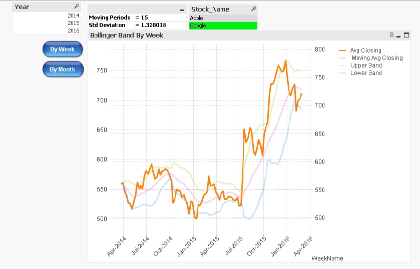
This document demonstrates the Bollinger Bands.
Many traders use Bollinger Bands to determine overbought and oversold levels, selling when price touches the upper Bollinger Band and buying when it hits the lower Bollinger Band.
Components of Bollinger Bands
1) Avg Stock Price
It's simple Avg of stock price.
2) Moving Avg of Stock Price
It's Moving Avg of Stock price over last n Period
3) Upper Band
Moving Avg of Stock Price + Std Deviation over last n Period * Std Deviation Multiplier
4) Lower Band
Moving Avg of Stock Price - Std Deviation over last n Period * Std Deviation Multiplier
Note :
1) User can select the Moving period and Std Deviation multiplier by own.
2) When you see the Bollinger Band by week, you can choose the Moving period from 1 to 50.
3) When you see the Bollinger Band by month, you can choose the Moving period from 1 to 10.
4) You can input the Std Deviation multiplier from 0.01 to 4.
Please see the attached Application
If you liked this then also see
-
Missing Manual - ValueLoop() & ValueList()
Have you ever wondered how the examples from the Qlikview help may look like?Please see below and enjoy responsibly...Valueloop() & VaueList()Both... Show MoreHave you ever wondered how the examples from the Qlikview help may look like?
Please see below and enjoy responsibly...
Valueloop() & VaueList()
Both of those functions belong to Synthetic Dimension Functions.
Synthetic Dimension is a type of Calculated Dimension
- the difference between "standard" Calculated Dimension and Synthetic one is that
the standard dimensions are based on values from existing fields
whereas for Synthetic Dimensions those values are created "on the fly".
The drawback here is that you can not mix standard dimensions with synthetic in the way you would expect.
(please see "Practical use").
ValueLoop()
Used:
Back End -No
Front End - Yes

Description(Qlikview Help)
Returns a set of iterated values which, when used in a calculated dimension, will form a synthetic dimension.The values generated will start with the from value and end with the to value including intermediate values in increments of step. In charts with a synthetic dimension created with the valueloop function it is possible to reference the dimension value corresponding to a specific expression cell by restating the valuloop function with the same parameters in the chart expression. The function may of course be used anywhere in the layout, but apart from when used for synthetic dimensions it will only be meaningful inside an aggregation function

Create series of numbers in a range given by criteria.

from - first value
to - last value
step - intermediate values criteria.
When step is missing 1 is assumed
Qlikview help examples are very straightforwards and easy to understand:
Example 1 Example 2 Example 3 valueloop ( 1, 3 )
From 1 to 3, (step is omitted so 1 is assumed):
valueloop ( 1, 5, 2 )
From 1 to 5, step 2:
1,1+2=3,3+2=5
valueloop ( 11 )
returns the value 11
![2015-08-25 07_56_30-QlikView Personal Edition - [QV1].png](/legacyfs/online/96879_2015-08-25 07_56_30-QlikView Personal Edition - [QV1].png)
![2015-08-25 07_58_37-QlikView Personal Edition - [QV1].png](/legacyfs/online/96880_2015-08-25 07_58_37-QlikView Personal Edition - [QV1].png)
![2015-08-25 07_59_56-QlikView Personal Edition - [QV1].png](/legacyfs/online/96881_2015-08-25 07_59_56-QlikView Personal Edition - [QV1].png)
Practical use
Example 1
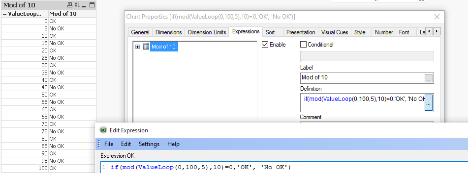
If you need to provide calculations to check if the MOD of values from 0 to 100 with step 5 is divided by 10 without remainder
Create Dimension: ValueLoop(0,100,5)
and Expression: if(mod(ValueLoop(0,100,5),10)=0,'OK', 'No OK')
See also:
How to create a Square Pie Chart
or
qlikfreak.wordpress.com/2014/06/17/infographics-in-qlikview-vol-2/
ValueList()
Used:
Back End -No
Front End - Yes

Description(Qlikview Help)
Returns a set of listed values which, when used in a calculated dimension,
will form a synthetic dimension. In charts with a synthetic dimension created with the valuelist function it is possible to reference the dimension value corresponding to a specific expression cell by restating the valuelist function with the same parameters in the chart expression. The function may of course be used anywhere in the layout, but apart from when used for synthetic dimensions it will only be meaningful inside an aggregation function

Create series of values from given list

v1 - list of values
Again, both of those examples are very easy to understand:
Header 1 Header 2 valuelist ( 1, 10, 100 )  &am... _ Qlik Community.png)
Header 1 Header 2 valuelist ( 'a', 'xyz', 55 )  &am... _ Qlik Community.png)
Practical use
Data Model
LOAD Date,
Year(Date) as Year,
Values
inline [
Date, Values
01/01/2009, 1
11/04/2009, 2
20/07/2009, 2
28/10/2009, 2
05/02/2010, 2
16/05/2010, 2
24/08/2010, 1
02/12/2010, 1
]
The usual way of creating straight table is be to add Year as Dimension and sum(Values) as expression.
This will return value for each Year.
![2015-08-25 00_38_57-QlikView Personal Edition - [C__Users_Katarzyna_Desktop_Files_vpl.qvw_].png](/legacyfs/online/96861_2015-08-25 00_38_57-QlikView Personal Edition - [C__Users_Katarzyna_Desktop_Files_vpl.qvw_].png)
But if we want o use Synthetic Dimension in the same way this will return only one Total value for both years.
![2015-08-25 00_47_25-Chart Properties [Sum(Values)].png](/legacyfs/online/96862_2015-08-25 00_47_25-Chart Properties [Sum(Values)].png)
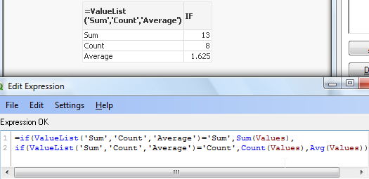
One of the way to use this function is to create list (similar to Statistics Box) with your own KPI's:
![2015-08-25 23_10_09-Chart Properties [1.625].png](/legacyfs/online/96974_2015-08-25 23_10_09-Chart Properties [1.625].png)
and then use nested IF statement to create your Metrics

=if(ValueList('Sum','Count','Average')='Sum',Sum(Values),
if(ValueList('Sum','Count','Average')='Count',Count(Values),Avg(Values)))
to get below result:
As nesting IF's can be tricky and cumbersome beyond 2 or 3 criteria we can use Pick/Match functions to improve our calculations:
=pick(match(ValueList('Sum','Count','Average'),'Sum','Count','Average')
,Sum(Values),Count(Values),Avg(Values))

Conclusion:
Although both of those function are not very often used
(they did not make to final 30 of rwunderlich survey
you can find a practical way of using them.
Feeling Qlikngry?
-
Bar or Equalizer ! - A different Bar Chart for your viewing pleasure
Hi,The Following blog was inspired by a recent post that allowed me to exercise my brain into trying something new(link to thread: Qlikview Chart)Belo... Show MoreHi,
The Following blog was inspired by a recent post that allowed me to exercise my brain into trying something new
(link to thread: Qlikview Chart)
Below is one of the two charts to be achieved in Qlikview. This led / music equalizer style looked pretty cool so I had to try
I finished with a chart like this. Close enough I'd say.
You can also adjust the number of bands you wish to see on the chart, but make sure you adjust the percentage scales for background colors
How did we achieve this chart?
The Idea is to break each value into multiple segments and then use background expression to make only alternate segments visible.
Simple isn't it.
So we've basically turned a simple single dimension one expression chart into a Stacked Chart with two Dimensions and one Expression.
Apply the same approach with Grid Charts which allow other visualization possibilities.
These are just for your viewing pleasure, hope you enjoy playing with them as much as I did.
Happy Qlik'in
Cheers
Vineeth
Vineeth Pujari
-
QlikView App: Current Selections Dynamic Display
This example shows an alternative way of showing current selections in your applications.It is useful to see a complete list of all selections on ever... Show MoreThis example shows an alternative way of showing current selections in your applications.
It is useful to see a complete list of all selections on every screen, but this can take a lot of space - leaving less room for analysis.
This shared QlikView uses a text box that sits neatly at the top of the page and shows what selections are currently in play. A large current selections box can then be shown or hidden dynamically by clicking the text box. This allows selections to be modified and removed in the standard way.
Using text boxes in itself can be a good way of conveying a lot of information in a small space. Attaching actions to items other than Buttons is a good way to a cleaner 'flat' UI. Combining the two things can work really well - as I hope this example shows.
Please see the other example apps I have uploaded also: Steve Dark
Regards,
Steve Dark
-
The second dimension... or how to use secondarydimensionality()
Prologue...Firstly I would like to say that probably it would be easier to call this function Horizontal Dimensionality (or HDim or even SecDim)This c... Show MorePrologue...
Firstly I would like to say that probably it would be easier to call this function Horizontal Dimensionality (or HDim or even SecDim)
This could clear some clouds - when you first see this function you may feel that this another level for dimensionality function.
(for those who wants to know more about the dimensionality function please see this document
What it is used for?
Returns the number of dimension pivot table rows that have non-aggregation content. i.e. do not contain partial sums or collapsed aggregates. This function is the equivalent of the dimensionality function for horizontal pivot table dimensions.
The secondarydimensionality() function always returns 0 when used outside of pivot tables.
What does it mean?
Where dimensionality shows number of vertical dimensions, secondarydimensionality shows number of horizontal dimensions.
Lets take our sample data.

We have four dimensions(columns):
Product,Category,Type and Sales.
Each Product have 2 Categories
Each Category can have up to 3 Types
Let's create Pivot Table using 3 of those Dimension Product,Category and Type and use Sales as our Expression.

This Pivot Table has 3 dimensions so its maximum dimensionality is 3.
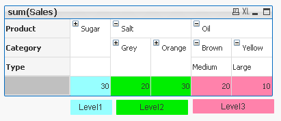
'Sugar' has dimensionality of 1 which is Total for that 'Product'.
'Salt' has dimensionality of 2 which is Total for each 'Category' of that 'Product'.
'Oil' has dimensionality of 3 which is single value for each 'Type' of the 'Product's' 'Category'
So in few words : secondarydimensionality (and dimensionality) is the number of dimensions used in a Table
For better understating please see table below:
The function is used to show on which dimensionality level each of the Pivot Table row is:


Practical use:
1) To show the level of dimensionality:

Expression:
if(secondaryDimensionality()=1,RGB(151,255,255),if(secondaryDimensionality()=2,RGB(0,238,0),
if(secondaryDimensionality()=3,RGB(255,130,171))))
2) Highlight background of rows which on each level fall into certain condition:
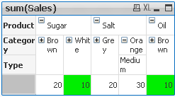
Expression:
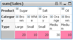
if(Dimensionality()=1 and sum(Sales)<150,RGB(151,255,255),if(Dimensionality()=2 and sum(Sales)<=20,RGB(0,238,0),if(Dimensionality()=3 and Sum(Sales)<=20,RGB(255,130,171))))
LEVEL 1 --> Values <35 LEVEL 2 --> Values <=15 LEVEL 3 --> Values <=20 
- To use the script below the Excel file must be saved in the same folder that your qvd file
Otherwise you will need to make changes the this path - secondarydimensionality.xlsx
Directory;
LOAD Product,
Category,
Type,
Sales
FROM
secondarydimensionality.xlsx
(ooxml, embedded labels, table is Sheet1);
Still feeling hungry?
Do you Qualify?- How to use QUALIFY statement
Missing Manual - GetFieldSelections() + Bonus Example
MaxString & MinString - How to + examples
The second dimension... or how to use secondarydimensionality()


