Unlock a world of possibilities! Login now and discover the exclusive benefits awaiting you.
- Qlik Community
- :
- All Forums
- :
- Mobile Discussions
- :
- Re: Qlik Sense Mobile - Not Friendly
- Subscribe to RSS Feed
- Mark Topic as New
- Mark Topic as Read
- Float this Topic for Current User
- Bookmark
- Subscribe
- Mute
- Printer Friendly Page
- Mark as New
- Bookmark
- Subscribe
- Mute
- Subscribe to RSS Feed
- Permalink
- Report Inappropriate Content
Qlik Sense Mobile - Not Friendly
Hi guys,
I stumbled across an interesting one.
Our CEO has multiple companies which have their own BI Teams. We use Qlik Sense and one of the other ones uses Power BI.
For mobile reports etc. it seems that Power BI has the upper hand.
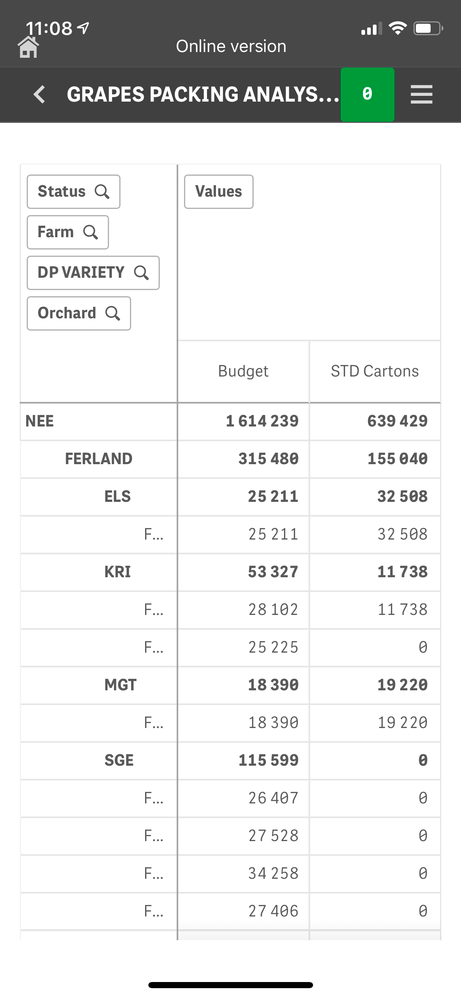
For example the Pivot table displays MUCH better via Power BI on mobile than Sense. This is sad.
Hope that Qlik does something about this and quickly.
It just seems like Power BI's mobile App is better then Qlik Sense Mobile.
- « Previous Replies
-
- 1
- 2
- Next Replies »
- Mark as New
- Bookmark
- Subscribe
- Mute
- Subscribe to RSS Feed
- Permalink
- Report Inappropriate Content
Hello @WernerDC,
In order to properly comment with regards to your screenshot, can you provide a bit more information?
What is the Qlik Sense version in use?
Which devices does this occur on? Have you tried viewing directly on the Browser on the device? Do you get the same result?
Does your company use any type of EMM software such as Microsoft InTune or MobileIron?
I appreciate your responses so we can look into your concern.
Regards,
Eva
- Mark as New
- Bookmark
- Subscribe
- Mute
- Subscribe to RSS Feed
- Permalink
- Report Inappropriate Content
Hi Eva,
Thank you for your response.
We are on the Nov 2019 release. This occurs on a iPhone. I have just tested on a Samsung and the same thing occurs.
We do not use any of those you mentioned.
It just seems like the Apps dont adjust to mobile as well as they do on Power BI.
Kind regards
- Mark as New
- Bookmark
- Subscribe
- Mute
- Subscribe to RSS Feed
- Permalink
- Report Inappropriate Content
Hi Eva,
Here are more pictures for you.
1. You will see that the values on the left are being cut off. Now I can rotate the screen but that is not preferable.
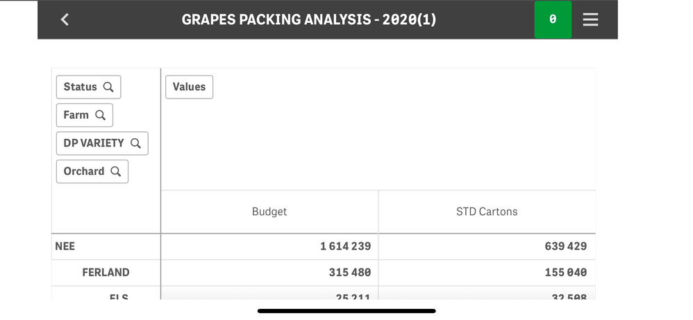
2. Is where I rotated the screen but look at the header now. It almost takes up the whole screen and you cant shift it away. This means you only have a very small window to look at the data.
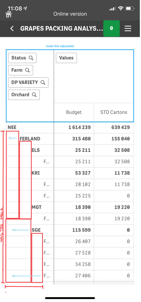
3. My suggestion is that the values to the left of the table should be right under each other and not diagonal. This will give you way more space to work with. Also let the header by customize-able.
Kind regards
- Mark as New
- Bookmark
- Subscribe
- Mute
- Subscribe to RSS Feed
- Permalink
- Report Inappropriate Content
Hi,
We do have similar experience with my senior management. We get on to use Mashup that allow us to change the look and feel. Nevertheless, Pivot table is really a let down and hope Qlik can provide some improvement.
On your item 3, you can turn off the indent in Edit Pivot Table.
Regards
- Mark as New
- Bookmark
- Subscribe
- Mute
- Subscribe to RSS Feed
- Permalink
- Report Inappropriate Content
Hi Eva_B,
Do you have any solution to this yet?
We are getting pressured from our management and they keep stating that Power BI has the upper hand here.
Please advise
- Mark as New
- Bookmark
- Subscribe
- Mute
- Subscribe to RSS Feed
- Permalink
- Report Inappropriate Content
Hi Eva_B,
Another frustration is that when you scroll on your mobile it scroll WAY TO FAST.
Please bring a setting for adjusting the scroll speed.
Regards
- Mark as New
- Bookmark
- Subscribe
- Mute
- Subscribe to RSS Feed
- Permalink
- Report Inappropriate Content
Hello @WernerDC -
Sorry for my late response as I was out of the office.
Have you created a Case for Qlik Support on the Portal for this issue?
The Engineers may need access to your Environment to do a deep-dive analysis on why the output is not showing correctly.
Regards,
Eva
- Mark as New
- Bookmark
- Subscribe
- Mute
- Subscribe to RSS Feed
- Permalink
- Report Inappropriate Content
@WernerDC thanks for your feedback. We are looking into ways to improve the pivot, in Feb 2020 it's possible to set font size and color for header and the cell and column alignment. A toggle for the dimension buttons and to change column width are most likely coming in later releases. The tree space problem is more delicate as the +/- buttons needs to be clickable with fingers.
Thanks,
Patric
- Mark as New
- Bookmark
- Subscribe
- Mute
- Subscribe to RSS Feed
- Permalink
- Report Inappropriate Content
My experience with Qlik Sense Mobile is similar to @WernerDC's. The way the Qlik Sense Mobile it is right now, it is difficult for users to interact with the apps in an efficient way.
Since a dashboard rarely fits nicely on mobile right away, it could be helpful to have the posibility to pick "phone layout" when editing the app, like Power BI does. Is there a way to suggest features to the Qlik Sense roadmap?
- « Previous Replies
-
- 1
- 2
- Next Replies »


