Unlock a world of possibilities! Login now and discover the exclusive benefits awaiting you.
- Qlik Community
- :
- Forums
- :
- Analytics
- :
- New to Qlik Analytics
- :
- Re: Accumulated Line Chart Appearance
- Subscribe to RSS Feed
- Mark Topic as New
- Mark Topic as Read
- Float this Topic for Current User
- Bookmark
- Subscribe
- Mute
- Printer Friendly Page
- Mark as New
- Bookmark
- Subscribe
- Mute
- Subscribe to RSS Feed
- Permalink
- Report Inappropriate Content
Accumulated Line Chart Appearance
Hi,
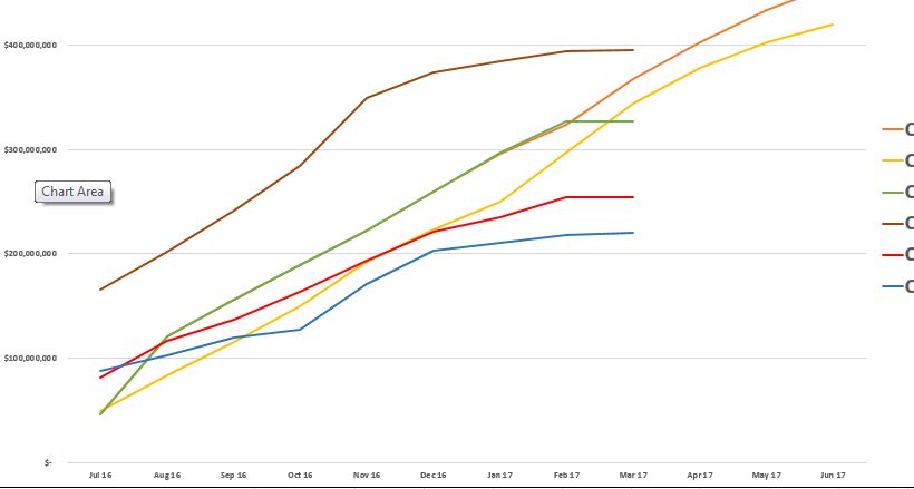
I am trying to create an accumulated Line chart in QlikSense displaying 5 metrics against MonthYear.
Some of my metrics have values only for a few months and I want to display that line only till the last month the data is available. Attached is a sample chart created in Excel.
I am using the below formula for accumulation but it shows one extra data point as 0 (PFA). Also, another problem with this formula might be if there is a data point after a few missing months, it would not rangesum correctly.
= rangesum(above(sum(Value), 0, NumericCount(Value)))
Can someone suggest a better way to achieve this.
- Mark as New
- Bookmark
- Subscribe
- Mute
- Subscribe to RSS Feed
- Permalink
- Report Inappropriate Content
Hello Shashank,
Try the below condition in your set analysis:
MonthYear={'>=$(=YearStart(Max(MonthYear)))<=$(=AddYears(Max(MonthYear),0))'}
It will give you accumulated Line chart
- Mark as New
- Bookmark
- Subscribe
- Mute
- Subscribe to RSS Feed
- Permalink
- Report Inappropriate Content
maybe this:
= rangesum(above(sum(Value), 0, RowNo() ) )
- Mark as New
- Bookmark
- Subscribe
- Mute
- Subscribe to RSS Feed
- Permalink
- Report Inappropriate Content
May be this
If(Sum(Value) > 0, RangeSum(Above(Sum(Value), 0, NumericCount(Value))))
- Mark as New
- Bookmark
- Subscribe
- Mute
- Subscribe to RSS Feed
- Permalink
- Report Inappropriate Content
Dual(If(MonthYear=Max(MonthYear), Country, ''),Sum(value))
**Note :
you should change the fields country ,value according to your need.