Unlock a world of possibilities! Login now and discover the exclusive benefits awaiting you.
- Qlik Community
- :
- Forums
- :
- Analytics
- :
- New to Qlik Analytics
- :
- Re: Barchart X axis item title (legend) change dir...
- Subscribe to RSS Feed
- Mark Topic as New
- Mark Topic as Read
- Float this Topic for Current User
- Bookmark
- Subscribe
- Mute
- Printer Friendly Page
- Mark as New
- Bookmark
- Subscribe
- Mute
- Subscribe to RSS Feed
- Permalink
- Report Inappropriate Content
Barchart X axis item title (legend) change direction and showing rank number
Hi
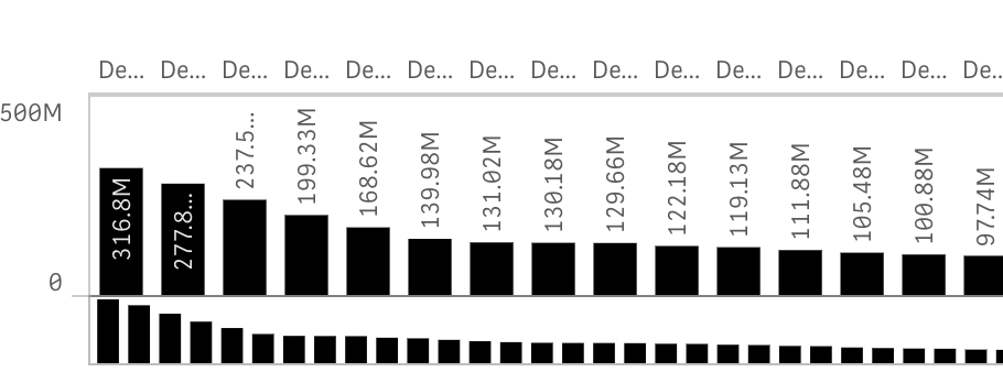
Any one can give a suggestion, if my graph is too narrow. even though I let it show X axis title and legend, I still can not see
any chance we can have it show up any way

and also sometimes, have little bit more space but not enough I got this (the full name should be Dealer 1,.Dealer 2...) but now only have De..

could I change the horizontal to vertical (like excel) then I can see the full name
at the same time is any change in this graph we can have the Ranking number showing up (because, people cam easy distinguish 5 but after top 5, then it takes effect to say which bar is number 10??) So is there any chance to show the ranking number on Bar chart?
- Mark as New
- Bookmark
- Subscribe
- Mute
- Subscribe to RSS Feed
- Permalink
- Report Inappropriate Content
Bare in mind you can always expand the chart full screen to view the visualization completely.
So you could make your chart very small so only the chart title is displayed then the user will need to click on it to expend and view.
Regards
Andy
- Mark as New
- Bookmark
- Subscribe
- Mute
- Subscribe to RSS Feed
- Permalink
- Report Inappropriate Content
Hi Andy,
thank you.But even with full extension of one app
I still can not read the name (need to change it to vertical)
and also I still want to have the rank number of the item for easy reference
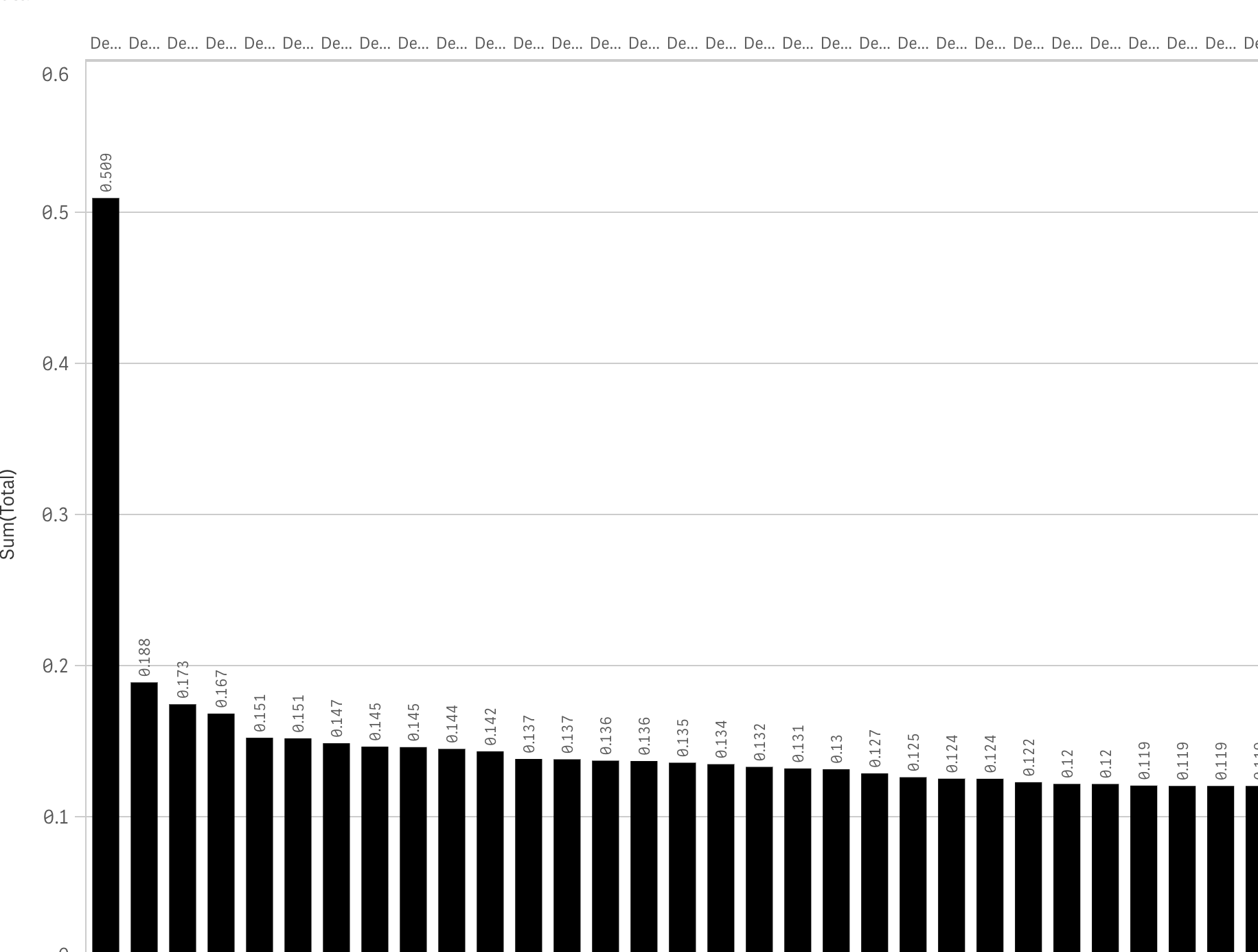
here is the full screen view for a single graph

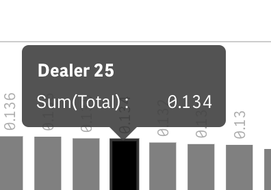
only when I hove over the item I get the full name

Regards,
- Mark as New
- Bookmark
- Subscribe
- Mute
- Subscribe to RSS Feed
- Permalink
- Report Inappropriate Content
Try increasing the width of the bars?
- Mark as New
- Bookmark
- Subscribe
- Mute
- Subscribe to RSS Feed
- Permalink
- Report Inappropriate Content
how? reduce the amount of Bar?
but I do not want to increasing the width of the bars
- Mark as New
- Bookmark
- Subscribe
- Mute
- Subscribe to RSS Feed
- Permalink
- Report Inappropriate Content
I'm sorry - just realized this was a Sense discussion - the width of the bars can be controlled in Qlikview but not in sense. If you want to show lesser number of bars - you can use dimension limitations.
- Mark as New
- Bookmark
- Subscribe
- Mute
- Subscribe to RSS Feed
- Permalink
- Report Inappropriate Content
As Branzir suggests reducing the number of bars on the chart via dimension limitation will help make the visualisation easier to read.
- Mark as New
- Bookmark
- Subscribe
- Mute
- Subscribe to RSS Feed
- Permalink
- Report Inappropriate Content
Good evening ,
I believe you can concatenate the name of the measure with the value, and it will be easier to see!
Example in line graph, note that it only has the name for the most recent date, but I believe you can do it with each measure.
Dual(If(Dia=Max(TOTAL Dia), 'nome' & ':'& num(sum(if(Nome ='nome',Total)),'#.##0')
,num(sum(if(Nome ='nome',Total)),'#.##0'))
,num(sum(if(Nome ='nome',Total)),'#.##0'))

Note: Edited by Community Moderator to include English translation as a courtesy. Please use English in main forums.
- - - - - -
Boa Noite ,
Acredito que você possa concatenar o nome da medida com o valor , ai ficara mais fácil a visualização !
Exemplo em gráfico de linha , note que ele traz o nome somente para a data mais recente , porem acredito que você consiga fazer a cada medida .
Dual(If(Dia=Max(TOTAL Dia), 'nome' & ':'& num(sum(if(Nome ='nome',Total)),'#.##0')
,num(sum(if(Nome ='nome',Total)),'#.##0'))
,num(sum(if(Nome ='nome',Total)),'#.##0'))
