Unlock a world of possibilities! Login now and discover the exclusive benefits awaiting you.
- Qlik Community
- :
- Forums
- :
- Analytics
- :
- New to Qlik Analytics
- :
- Re: Color expression for stacked bar chart (expres...
- Subscribe to RSS Feed
- Mark Topic as New
- Mark Topic as Read
- Float this Topic for Current User
- Bookmark
- Subscribe
- Mute
- Printer Friendly Page
- Mark as New
- Bookmark
- Subscribe
- Mute
- Subscribe to RSS Feed
- Permalink
- Report Inappropriate Content
Color expression for stacked bar chart (expression measures) - Qlik Sense Desktop
Hi Qlik Community!
Fairly new Qlik Sense user and first time posting in the community.
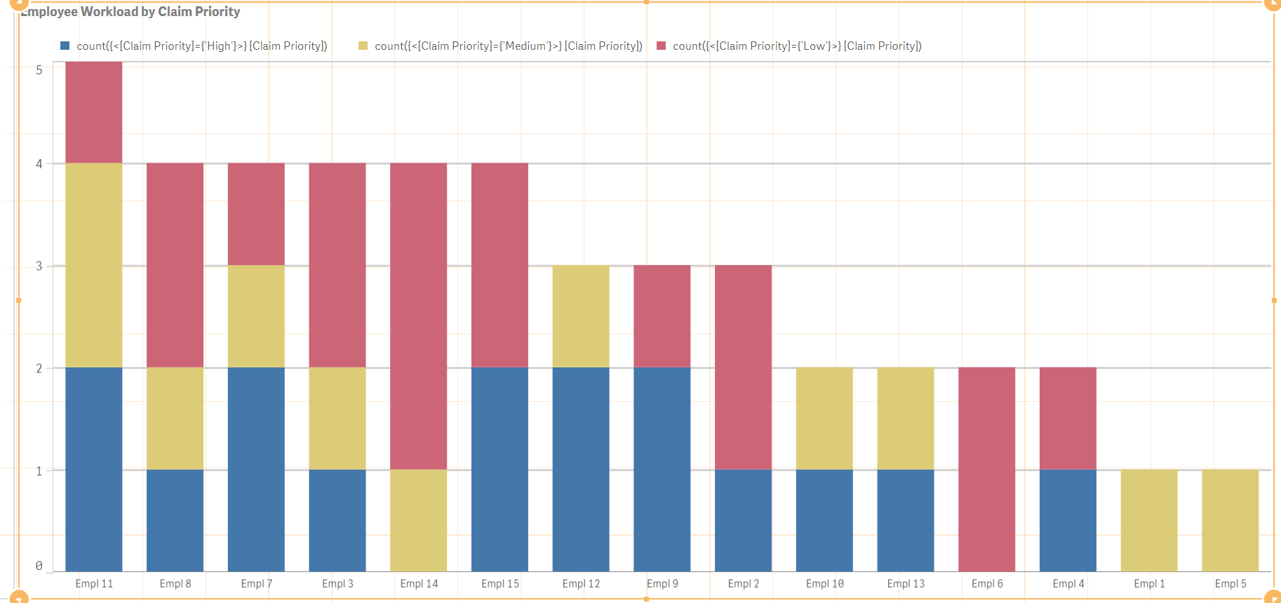
I have a stacked bar graph with a single Dimension. There are three measures of the expression form: count({<[Claim Priority]={'High'}>} [Claim Priority]) (other two just have "High" changed to "Medium" and "Low", respectively).
Essentially, for each Dimension I have the full count of the field "Claim Priority" stacked into their High, Medium, and Low counts. I would like the colors of each of these to be red, yellow, green, respectively.
Using the multicolored selection for Appearance->Colors does get the graph into the three distinct colors but not the colors I am hoping for. Current state of the graph can be seen here:
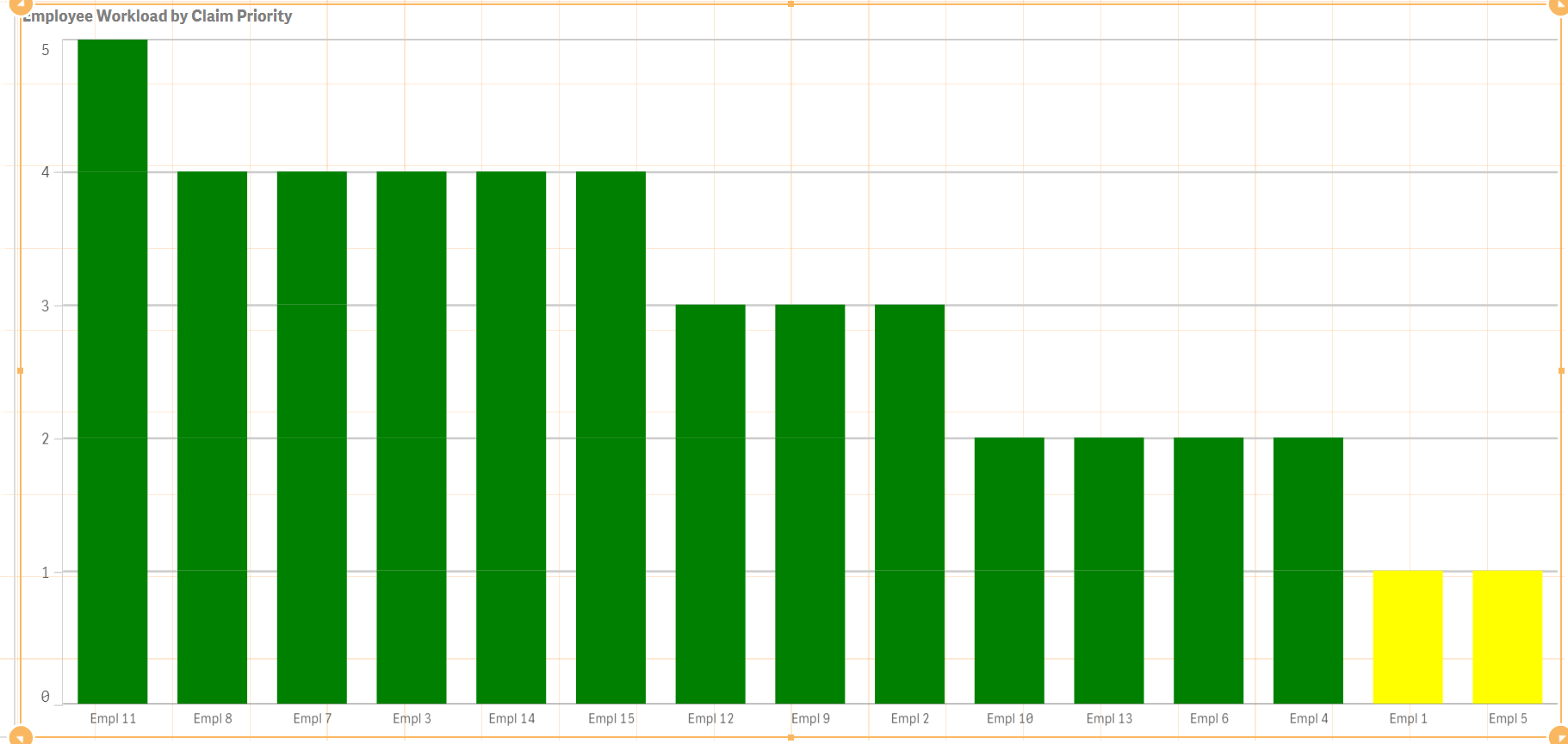
I think using Colors By Expression is what I need to do, but the following expression leads to the below graph:
if(([Claim Priority]='High'),red(),(if(([Claim Priority]='Medium'),yellow(),green())))
Could you please help me out with this? Some digging around has indicated I may need to include a step in the data load script but if I can just adjust the color expression that would be the preferred route.
Thanks!
Accepted Solutions
- Mark as New
- Bookmark
- Subscribe
- Mute
- Subscribe to RSS Feed
- Permalink
- Report Inappropriate Content
Hi Garrett,
In this case you need to create a synthetic Dimension by using Valuelist Function. If you have a Qlik Sense Version of 3.2. There you can create a Individual measures in the Master Items and assign specific colors. For Now I have created using synthetic dimension and assigned colors. Hope this helps you.
Thanks
hari !
- Mark as New
- Bookmark
- Subscribe
- Mute
- Subscribe to RSS Feed
- Permalink
- Report Inappropriate Content
Your condition is not correct, Use this
if([Claim Priority]='High',red(),if([Claim Priority]='Medium',yellow(),green())
- Mark as New
- Bookmark
- Subscribe
- Mute
- Subscribe to RSS Feed
- Permalink
- Report Inappropriate Content
Thanks for your prompt reply Anil!
I tried that and it indicated an expression error. It just needed an extra ")" at the end, but even with that the graph remained as the second image in my post.
- Mark as New
- Bookmark
- Subscribe
- Mute
- Subscribe to RSS Feed
- Permalink
- Report Inappropriate Content
May be typo error by end
if([Claim Priority]='High',red(),if([Claim Priority]='Medium',yellow(),green()))
- Mark as New
- Bookmark
- Subscribe
- Mute
- Subscribe to RSS Feed
- Permalink
- Report Inappropriate Content
That extra ")" was what I had added and it still results in the second image shown in my initial post.
- Mark as New
- Bookmark
- Subscribe
- Mute
- Subscribe to RSS Feed
- Permalink
- Report Inappropriate Content
Can you add QVF, Please?
- Mark as New
- Bookmark
- Subscribe
- Mute
- Subscribe to RSS Feed
- Permalink
- Report Inappropriate Content
File added to original post - thank you.
- Mark as New
- Bookmark
- Subscribe
- Mute
- Subscribe to RSS Feed
- Permalink
- Report Inappropriate Content
Hi Garrett,
In this case you need to create a synthetic Dimension by using Valuelist Function. If you have a Qlik Sense Version of 3.2. There you can create a Individual measures in the Master Items and assign specific colors. For Now I have created using synthetic dimension and assigned colors. Hope this helps you.
Thanks
hari !
- Mark as New
- Bookmark
- Subscribe
- Mute
- Subscribe to RSS Feed
- Permalink
- Report Inappropriate Content
Thank you! That is a great feature to know - I really appreciate your help.