Unlock a world of possibilities! Login now and discover the exclusive benefits awaiting you.
- Qlik Community
- :
- All Forums
- :
- Visualization and Usability
- :
- Re: Dynamically choosing dimensions for graphs / t...
- Subscribe to RSS Feed
- Mark Topic as New
- Mark Topic as Read
- Float this Topic for Current User
- Bookmark
- Subscribe
- Mute
- Printer Friendly Page
- Mark as New
- Bookmark
- Subscribe
- Mute
- Subscribe to RSS Feed
- Permalink
- Report Inappropriate Content
Dynamically choosing dimensions for graphs / tables
Hi there,
I have noticed in one of the Qlik Sense demos (https://sense-demo.qlik.com/sso/sense/app/0be2146a-8ea0-4aca-8853-200f957f7307) on the 4th tab (Details) that it is possible to dynamically select dimensions for graphs / tables.
I have a simple bar chart showing the sum(Sales). However, I want to be able to dynamically select whether I want to see the graph by weekday or sales rep by clicking on the relevant dimension in a list box (?) on the page. The demo also allows you to select which measure to display in the graph. It would appear to me that the available options for dimensions and measures are presented in two different list boxes.
So, my questions are:
- How do I create a list of available dimensions (and measures) as it was done in the demo?
- How do I create such a graph / table to be able to choose which dimension I want to use on my x-axis?
I have been searching the internet, but haven't found a solution yet. Can anyone please point me in the right direction or even better to a link that explains the above in a bit more detail?
Thank you,
Jacques
- « Previous Replies
-
- 1
- 2
- Next Replies »
Accepted Solutions
- Mark as New
- Bookmark
- Subscribe
- Mute
- Subscribe to RSS Feed
- Permalink
- Report Inappropriate Content
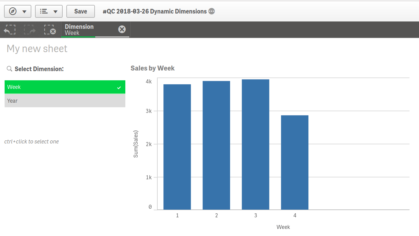
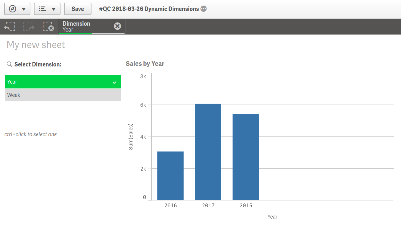
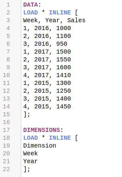
It is quite easy to achieve what you are looking for with using a disconnected table (non-associated or data island) to select a dimension and use the selection as a reference in the dimension. I have created a minimalistic app to show how it works:
- Mark as New
- Bookmark
- Subscribe
- Mute
- Subscribe to RSS Feed
- Permalink
- Report Inappropriate Content
Interesting,
I already used an extension called QuickAdHoc, but I had issues with it in the past..
Maybe omarbensalem know exactly what is the extension used on the example above ?
- Mark as New
- Bookmark
- Subscribe
- Mute
- Subscribe to RSS Feed
- Permalink
- Report Inappropriate Content
I am hesitant in using an extension as I am not using the desktop version of Qlik Sense. I know one can do it by adding "alternative" dimensions and measures, but the execution is messy. I really like the way that it was done in the demo app.
- Mark as New
- Bookmark
- Subscribe
- Mute
- Subscribe to RSS Feed
- Permalink
- Report Inappropriate Content
pretty sure it is an extension used on the app above.. and they are designed to be used also on the server, there is a section called extension on the server, It is all about scalability in the case of server upgrades..
- Mark as New
- Bookmark
- Subscribe
- Mute
- Subscribe to RSS Feed
- Permalink
- Report Inappropriate Content
Ahh, ok. Thanks anyway. Take care.
- Mark as New
- Bookmark
- Subscribe
- Mute
- Subscribe to RSS Feed
- Permalink
- Report Inappropriate Content
It is quite easy to achieve what you are looking for with using a disconnected table (non-associated or data island) to select a dimension and use the selection as a reference in the dimension. I have created a minimalistic app to show how it works:


- Mark as New
- Bookmark
- Subscribe
- Mute
- Subscribe to RSS Feed
- Permalink
- Report Inappropriate Content
thank you petter-s for this.
It is like creating the ad-hoc on qlikview..
do you have an idea on the extension used on the demo app above ?
- Mark as New
- Bookmark
- Subscribe
- Mute
- Subscribe to RSS Feed
- Permalink
- Report Inappropriate Content
To achieve this there is 2 ways:
1) create inline tables containing dimensions and measures and use them to pick what u want to see:
exp:
load * inline [
Dim,DimID
Week,1
Month,2
];
put this new field "Dim" as a filter and in u chart:
as a dimension:
if(DimID=1,UrWeekDayDim,UrMonthDim)
2) the second way is to use this extension (a very good one I always use):
- Mark as New
- Bookmark
- Subscribe
- Mute
- Subscribe to RSS Feed
- Permalink
- Report Inappropriate Content
Ahh fantastic. That's great. Thank you very much. ![]()
- Mark as New
- Bookmark
- Subscribe
- Mute
- Subscribe to RSS Feed
- Permalink
- Report Inappropriate Content
Hi Petter,
Last question on your solution. It works really great for Dimensions. I also want to be able to select which measure I want represented in the graph. However, I am having problems with the script as I don't know how to define a measure in the Data Load Editor. I've tried a similar approach as to how you did the Dimensions. E.g.
......
];
MEASURES:
LOAD * Inline [
Measures
Avg([Time Out])-Avg([Time In])
sum(StagNo)/count(Distinct Date)
]
In the above,
Avg([Time Out])-Avg([Time In]) calculates the average time a vehicle spends offloading at a depot
and
sum(StagNo)/count(Distinct Date) calculates the average number of orders per day.
Thanks again for your assistance,
Jacques
- « Previous Replies
-
- 1
- 2
- Next Replies »