Unlock a world of possibilities! Login now and discover the exclusive benefits awaiting you.
- Qlik Community
- :
- Forums
- :
- Analytics
- :
- New to Qlik Analytics
- :
- Re: How to compress data in timeline using variabl...
- Subscribe to RSS Feed
- Mark Topic as New
- Mark Topic as Read
- Float this Topic for Current User
- Bookmark
- Subscribe
- Mute
- Printer Friendly Page
- Mark as New
- Bookmark
- Subscribe
- Mute
- Subscribe to RSS Feed
- Permalink
- Report Inappropriate Content
How to compress data in timeline using variable e.g. 0-10 minutes?
Hi,
My log file has about 720000 rows per day, so I need to give user opportunity to average/count data over time e.g. 1/5/10 minutes average or 3/5/7 minutes count. Selections can be predefined integers or slider between min and max.
But I don't have an idea how or where this procedure would be best to do, in data loading script (e.g. something similar like master calendar but instead of date to do it for time) or in visualization phase or somewhere else?
Data has four fields: Timestamp, TagID, Reader, RSSI.
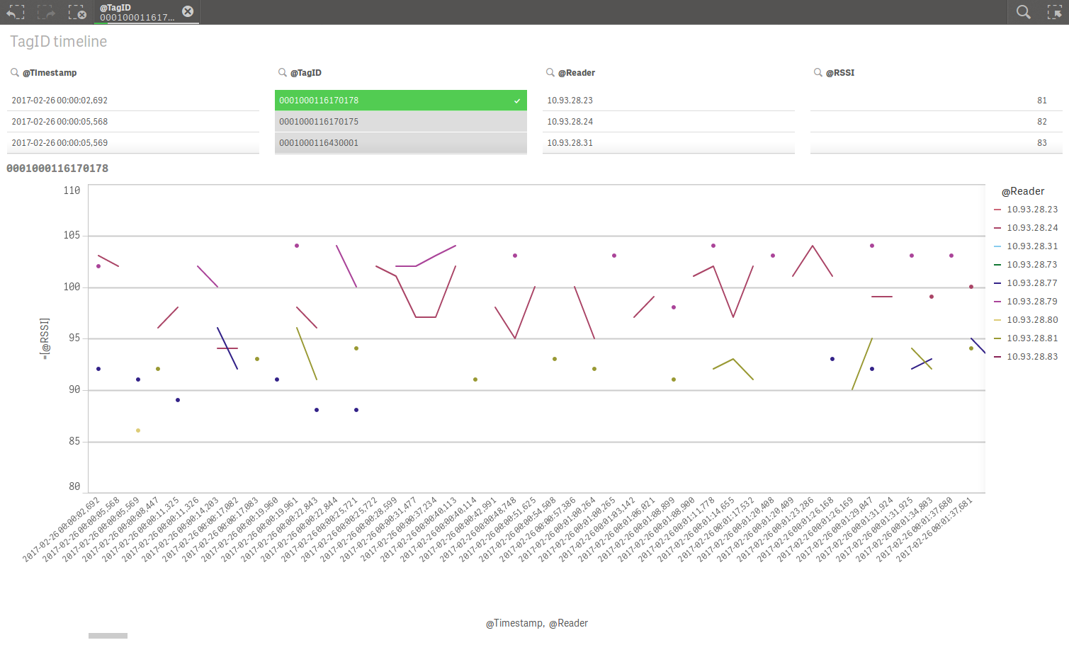
1) In first sheet I would like to average RSSI values over time and then update line chart respectively for e.g. 5 minutes average.

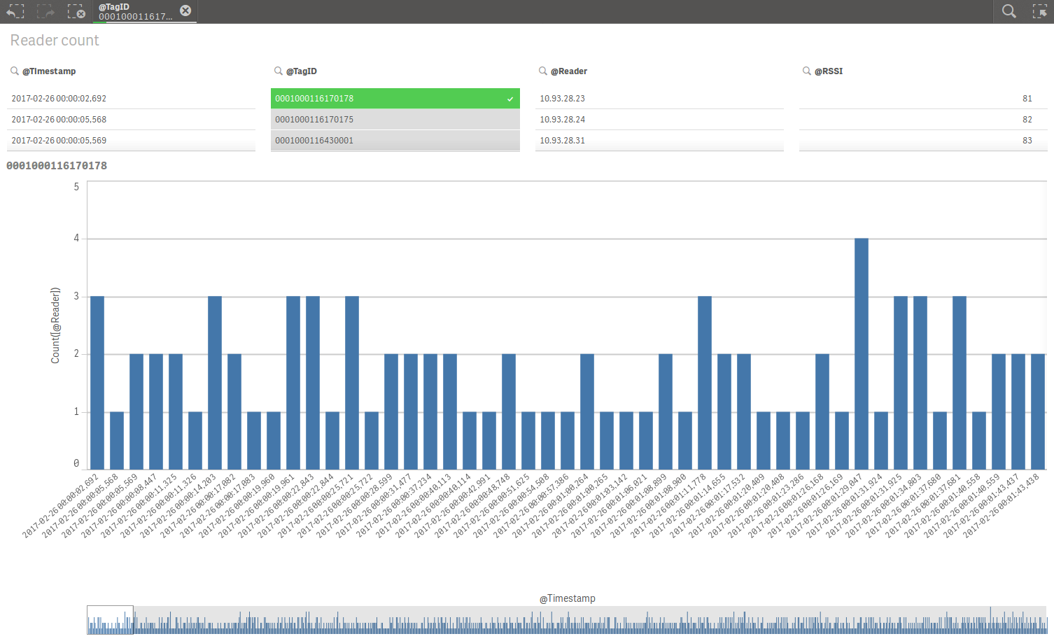
2) In second sheet I would like to count Readers over time then update bar chart respectively for e.g. 5 minutes average.

I would appreciate any help or tips or links to reference material. Thanks in advance.
Marko
- Mark as New
- Bookmark
- Subscribe
- Mute
- Subscribe to RSS Feed
- Permalink
- Report Inappropriate Content
If you have created any sample app then provide sample app with sample data to test.
- Mark as New
- Bookmark
- Subscribe
- Mute
- Subscribe to RSS Feed
- Permalink
- Report Inappropriate Content
Hi,
Here is sample app and data for tests. Please note that data has only 18 seconds so average can be adjusted from minutes to seconds.
Marko
- Mark as New
- Bookmark
- Subscribe
- Mute
- Subscribe to RSS Feed
- Permalink
- Report Inappropriate Content
I suggest using a master-calendar and a master timetable by splitting the timestamp into a date and a time:
date(floor(Timestamp)) as Date,
time(frac(Timestamp)) as Time
How to use - Master-Calendar and Date-Values
- Marcus
- Mark as New
- Bookmark
- Subscribe
- Mute
- Subscribe to RSS Feed
- Permalink
- Report Inappropriate Content
Hi Marcus,
Thanks for the tip. It took a while to figure it out but those links helped.
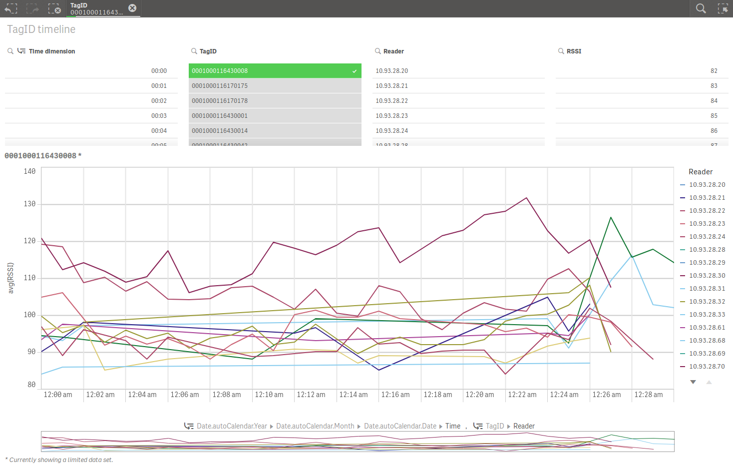
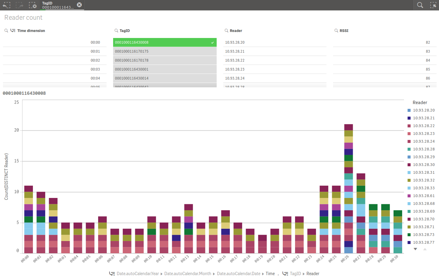
Now I do a static one minute interval in data load script and using that as chart x-axis.
Data load script:
[viasec-server-log]:
LOAD
[@1] & ' ' & [@2] AS Timestamp,
date(floor([@1])) AS Date,
time(floor(time#([@2],'hh:mm:ss,fff'),1/24/60),'hh:mm') AS Time, //one minute interval
[@4] AS Reader,
[@9] AS Keyword,
[@12] AS TagID,
[@14] AS RSSI
FROM [lib://qlikid_markoseppala/viasec-server_test2.log]
(txt, codepage is 28591, no labels, delimiter is spaces, msq)
WHERE [@9]='com.viasec.module.syris.DefaultSyrisEngine';
1) Line chart

2) Bar chart

In similar manner I could do other static intervals e.g. 1/3/5/10 minutes
time(floor(time#([@2],'hh:mm:ss,fff'),1/24/60),'hh:mm') AS Time_1m, //one minute interval
time(floor(time#([@2],'hh:mm:ss,fff'),1/24/20),'hh:mm') AS Time_3m, //three minute interval
time(floor(time#([@2],'hh:mm:ss,fff'),1/24/12),'hh:mm') AS Time_5m, //five minute interval
time(floor(time#([@2],'hh:mm:ss,fff'),1/24/6),'hh:mm') AS Time_10m, //ten minute interval
Can these different time intervals integrated to same chart easily and give user possibility to switch between dimensions?
Marko
- Mark as New
- Bookmark
- Subscribe
- Mute
- Subscribe to RSS Feed
- Permalink
- Report Inappropriate Content
You could use a cyclic dimension-group to give the user the possibility to choose various dimensions within the same object. I don't know if this feature is already natively implemented within the last release - if not it could be emulated:
Emulating cyclic dimension group in Qlik Sense Desktop
Makes Sense to go round in circles
- Marcus