Unlock a world of possibilities! Login now and discover the exclusive benefits awaiting you.
- Qlik Community
- :
- All Forums
- :
- Visualization and Usability
- :
- Re: Multiple Expressions QLik Sense
- Subscribe to RSS Feed
- Mark Topic as New
- Mark Topic as Read
- Float this Topic for Current User
- Bookmark
- Subscribe
- Mute
- Printer Friendly Page
- Mark as New
- Bookmark
- Subscribe
- Mute
- Subscribe to RSS Feed
- Permalink
- Report Inappropriate Content
Multiple Expressions QLik Sense
Very new to Qlik Sense and basically still evaluating if this is the product for our company.
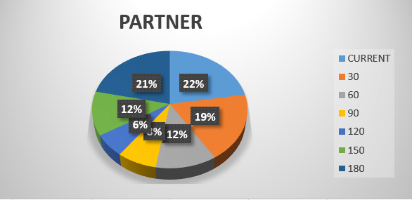
I have been trying to see if the pie cart in the image is possible. Any ideas on how to do this with Qlik Sense?
The Pie chart represents a summary of accounting age analysis by AGE of our clients by "partner" who's client it is. (Represented as a percentage of total amount outstanding)
The database has the following fields:
partner ID
client ID
d0 (Total amount in current for this client)
d30 (Total amount in 30 days for this client)
d60 (Total amount in 60 days for this client)
d90 (Total amount in 90 days for this client)
d120 (Total amount in 120 days for this client)
d150 (Total amount in 150 days for this client)
d180 (Total amount in 180 days for this client)
I just cannot seem to get this right with Qlik Sense pie chart. I have tried via a pivot, but you cannot get Qlik sense to do a pie chart based of that pivot results?
Is there a way to do this with maybe special expression or some code?

- Mark as New
- Bookmark
- Subscribe
- Mute
- Subscribe to RSS Feed
- Permalink
- Report Inappropriate Content
Can you load your data in as
Partner id
Client id
Days
Total amount
Then you will be able to generate the chart you are looking for.
- Mark as New
- Bookmark
- Subscribe
- Mute
- Subscribe to RSS Feed
- Permalink
- Report Inappropriate Content
BTW. Maybe it's worth to consider not to use pie chart here? They are effective only in few specific cases.
https://www.perceptualedge.com/articles/visual_business_intelligence/save_the_pies_for_dessert.pdf
- Mark as New
- Bookmark
- Subscribe
- Mute
- Subscribe to RSS Feed
- Permalink
- Report Inappropriate Content
Hi Mike,
how should look your expected output? give an example like a screenshot?
beck
- Mark as New
- Bookmark
- Subscribe
- Mute
- Subscribe to RSS Feed
- Permalink
- Report Inappropriate Content
You can use ValueList in this case;
Please refer to this thread :
- Mark as New
- Bookmark
- Subscribe
- Mute
- Subscribe to RSS Feed
- Permalink
- Report Inappropriate Content
Hi Andy Weir
I could arrange it that way by maybe using a per-process or maybe on load.
What is your idea if the data is as you ask? Would I then take the days as the expression?
- Mark as New
- Bookmark
- Subscribe
- Mute
- Subscribe to RSS Feed
- Permalink
- Report Inappropriate Content
Hi beck, not sure what you mean, I did attach a sample of the Pie Chart I'm looking for
- Mark as New
- Bookmark
- Subscribe
- Mute
- Subscribe to RSS Feed
- Permalink
- Report Inappropriate Content
Hi omar, thanks for that link ![]()
I am going to try that over the weekend and let you know if it works, I think it might just !
- Mark as New
- Bookmark
- Subscribe
- Mute
- Subscribe to RSS Feed
- Permalink
- Report Inappropriate Content
HI Mike,
look at this: Introduction to Qlik Sense - Module 2 (Charts) - YouTube
- Mark as New
- Bookmark
- Subscribe
- Mute
- Subscribe to RSS Feed
- Permalink
- Report Inappropriate Content
I would do it on load perhaps concatenating a series of loads into the one table so the data looks like this
Partner Id, Client Id , Days, Total Amount
| A | A | 30 | 100 |
| A | A | 60 | 50 |
| A | A | 90 | 80 |
| B | A | 30 | 250 |
| B | A | 60 | 70 |
| B | A | 90 | 35 |
I would then make Days your Dimension and then Sum your Total Amount as a Measure for your Piechart
You can then filter on one or more Partners or clients to get your desired result.
If you need to generate one per client then I think there is a trellis extension in Qlik Branch you can install and use although Ive not used it yet. You should be able to the CLient Id as a dimension then the Days Dimension and Total Amount as a Measure.