Unlock a world of possibilities! Login now and discover the exclusive benefits awaiting you.
- Subscribe to RSS Feed
- Mark as New
- Mark as Read
- Bookmark
- Subscribe
- Printer Friendly Page
- Report Inappropriate Content
During a recent conversation with colleagues the topic of chart types that should be avoided when Average is used was discussed. Do you know which charts you should avoid using if you want to show the Average? In both Qlik Sense and QlikView there are 3 chart types:
- Stacked Bar chart
- Pie chart
- Treemap (Qlik Sense) and Block chart (QlikView)
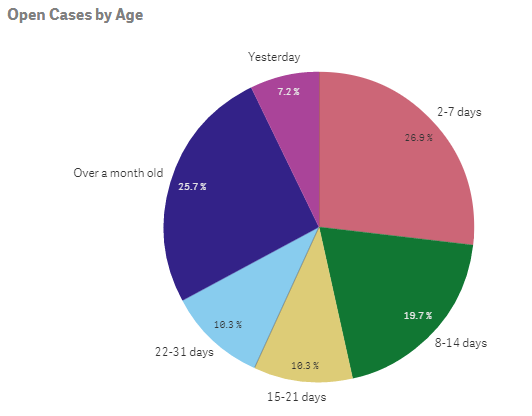
In these charts, the sum of the different parts should equal the total (100%). When Average is used in the expression of these charts that is not the case – the sum of the parts does not equal the total. (Note that this does not include a Grouped Bar chart only a Stacked Bar chart). For example, in the Helpdesk Management demo, the pie chart below is used to show the number of open cases by age. If the number of open cases (or percentages as displayed in the chart) were totaled they would equal all of the open cases and 100%.
Let’s take a look at another example in a stacked bar chart. In the Human Capital Management demo, the Demographics sheet has several visualizations that display demographics of employees based on their gender (red = unknown gender, yellow = female, blue = male).
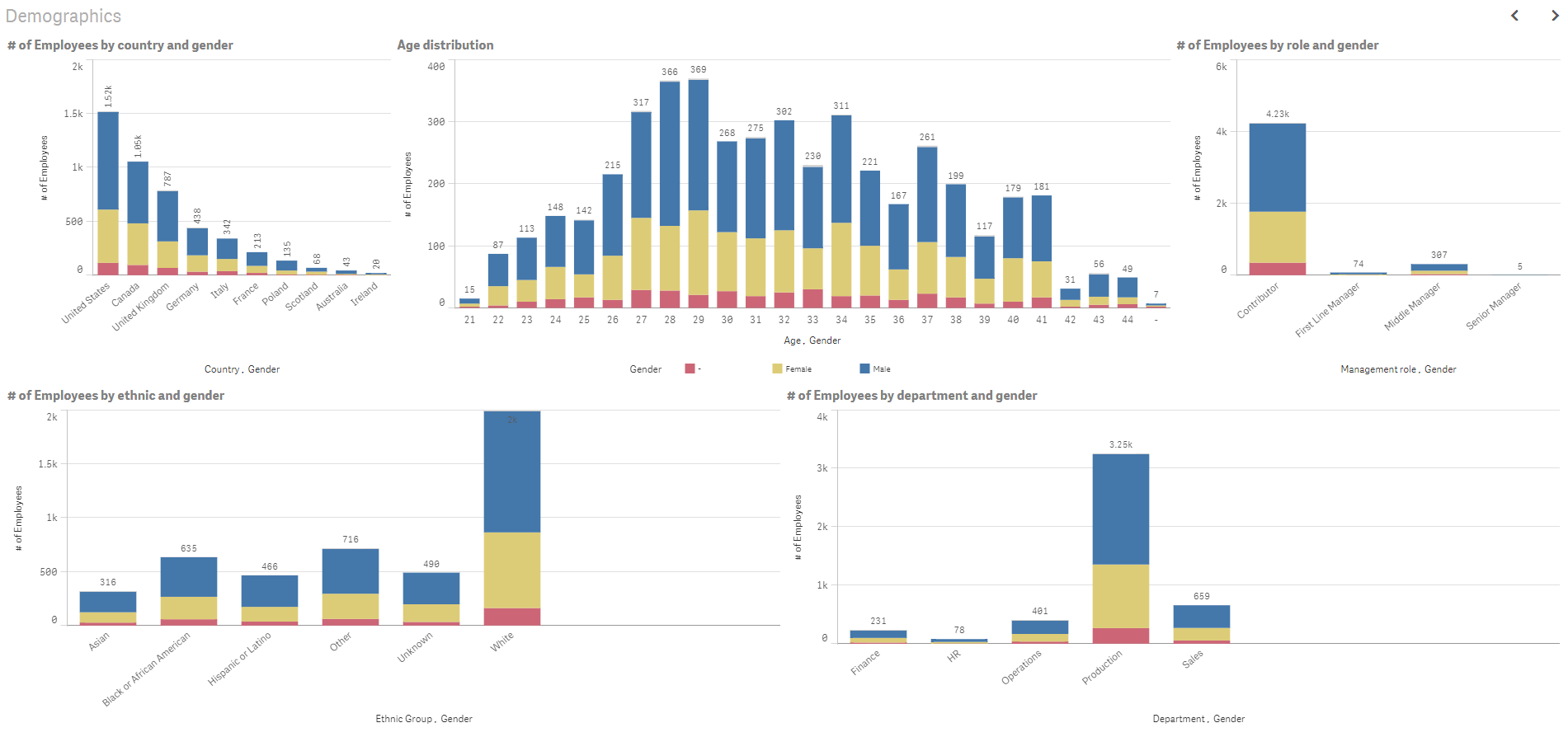
Each bar represents the total number of employees for the specified dimension but it is further broken down by the gender dimension so you can see how the parts add up to the whole.
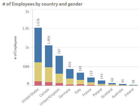
In the chart above there are 1.52K employees in the United States (904 are male, 494 are female and 114 are unknown). The gender totals add up to the total number of employees in the respective country.
Now there may be exceptions to this rule depending on the story that you are telling with your data but in most cases, it is fair to say that you should not use Average in the expression of a Stacked Bar chart, Pie chart, Treemap or Block chart. So this does not mean you should shy away from the Average (Avg) function because there are many instances when it can and should be used but when you want to display the ratio to the total, avoid using Average.
Thanks,
Jennell
You must be a registered user to add a comment. If you've already registered, sign in. Otherwise, register and sign in.