Unlock a world of possibilities! Login now and discover the exclusive benefits awaiting you.
- Qlik Community
- :
- All Forums
- :
- GeoAnalytics
- :
- Change Color of the Area layer
- Subscribe to RSS Feed
- Mark Topic as New
- Mark Topic as Read
- Float this Topic for Current User
- Bookmark
- Subscribe
- Mute
- Printer Friendly Page
- Mark as New
- Bookmark
- Subscribe
- Mute
- Subscribe to RSS Feed
- Permalink
- Report Inappropriate Content
Change Color of the Area layer
Hi Guys,
We're using GEO Analytics and QlikView to plot the turnover of our customers by zipcode of the customer adress.
We would like to use a Color Scale from Red(lowest) to Green(highest). In QV the standard color modes/ shemes doesn't support this color scale. Is there an easy way to change the color scale to our requested scale?
- Tags:
- color formatting
Accepted Solutions
- Mark as New
- Bookmark
- Subscribe
- Mute
- Subscribe to RSS Feed
- Permalink
- Report Inappropriate Content
Hello,
The idea is to convert your values to a scale between 0 and 1, the formula to do this is:
(x-min(x))/(max(x)-min(x))
So applying to your data:
x: aggr(sum(sales),zip)
min(x): min(total(aggr(sum(sales),zip)))
max(x): max(total(aggr(sum(sales),zip)))
Replacing in the formula to get the "scaled sum(sales)":
(aggr(sum(sales),zip)-min(total(aggr(sum(sales),zip))))/(max(total(aggr(sum(sales),zip)))-min(total(aggr(sum(sales),zip))))
Finally: ColorMix1((aggr(sum(sales),zip)-min(total(aggr(sum(sales),zip))))/(max(total(aggr(sum(sales),zip)))-min(total(aggr(sum(sales),zip)))),red(),green())
Here is how it looks, applied to a simple example with States: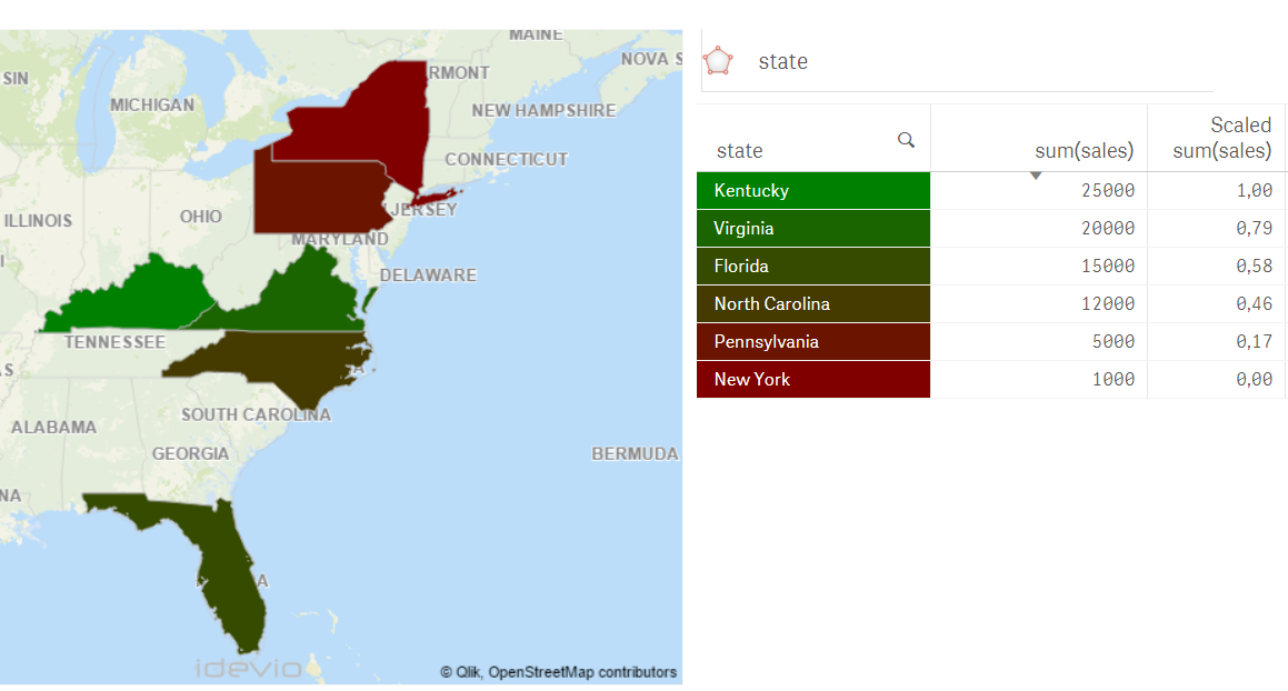
Best Regards,
Ana Yakushi
Qlik GeoAnalytics
- Mark as New
- Bookmark
- Subscribe
- Mute
- Subscribe to RSS Feed
- Permalink
- Report Inappropriate Content
Hello Guy,
You can use this expression to define the color of the areas on the map (change the Color Mode in the Area Layer's properties to "By Expression")
=ColorMix1(value ,lowest_value_color, highest_value_color)
In your case:
=ColorMix1(your_value,red(), green())
The value has to be scaled from 0 to 1.
Hope it helps.
Best Regards,
Ana Yakushi
Qlik GeoAnalytics
- Mark as New
- Bookmark
- Subscribe
- Mute
- Subscribe to RSS Feed
- Permalink
- Report Inappropriate Content
Hello Ana,
Thanks for your quick reply. Its almost seems to work for us. Now we're just figuring out our way to set our value correct.
There are multiple zipcodes with a sum (Sales). Like this:
Zipcode: sum(Sales)
1 15.000
2 1.000
3 25.000
Now we're looking for a way to plot zipcode '2' with color Red(Lowest sum(Sales)) and zipcode '3' with color Green(Highest sum(Sales)).
Can you please help us a little with a correct formula for our value?
Thanks a lot!
- Mark as New
- Bookmark
- Subscribe
- Mute
- Subscribe to RSS Feed
- Permalink
- Report Inappropriate Content
Hello,
The idea is to convert your values to a scale between 0 and 1, the formula to do this is:
(x-min(x))/(max(x)-min(x))
So applying to your data:
x: aggr(sum(sales),zip)
min(x): min(total(aggr(sum(sales),zip)))
max(x): max(total(aggr(sum(sales),zip)))
Replacing in the formula to get the "scaled sum(sales)":
(aggr(sum(sales),zip)-min(total(aggr(sum(sales),zip))))/(max(total(aggr(sum(sales),zip)))-min(total(aggr(sum(sales),zip))))
Finally: ColorMix1((aggr(sum(sales),zip)-min(total(aggr(sum(sales),zip))))/(max(total(aggr(sum(sales),zip)))-min(total(aggr(sum(sales),zip)))),red(),green())
Here is how it looks, applied to a simple example with States:
Best Regards,
Ana Yakushi
Qlik GeoAnalytics
- Mark as New
- Bookmark
- Subscribe
- Mute
- Subscribe to RSS Feed
- Permalink
- Report Inappropriate Content
Hello,
It's been six years so this thread might be dead. I tried your above solution adapting the expression to produce my own (see below) counting distinct applicants within each UK postcode district. However, I cannot seem to get it to colour neither the area layer of my map or a table. Would someone be willing to cast an eye over this please?
=ColorMix1((aggr(count(distinct DistinctApplicant),[Partial Postcode])
-min(total(aggr(count(distinct DistinctApplicant),[Partial Postcode]))))
/(max(total(aggr(count(distinct DistinctApplicant),[Partial Postcode])))
-min(total(aggr(count(distinct DistinctApplicant),[Partial Postcode])))),'#FF4F5C','#00CE9E')
Appreciated.
Matt