Unlock a world of possibilities! Login now and discover the exclusive benefits awaiting you.
- Qlik Community
- :
- All Forums
- :
- Qlik NPrinting
- :
- Re: NPrinting Pixel Perfect Report - Conditional d...
- Subscribe to RSS Feed
- Mark Topic as New
- Mark Topic as Read
- Float this Topic for Current User
- Bookmark
- Subscribe
- Mute
- Printer Friendly Page
- Mark as New
- Bookmark
- Subscribe
- Mute
- Subscribe to RSS Feed
- Permalink
- Report Inappropriate Content
NPrinting Pixel Perfect Report - Conditional display of images
In my Pixel Perfect Report, I have absolute figures for performance indicators. Next to the performance indicator there should be the image of an arrow going up or down, depending on the indicator being higher or lower compared to last year.
Unfortunately I cannot make the conditional display of these images work and I could not find a similar discussion in this forum. I have tried to use formulas as well as variables in data binding. I have also tried to make use of the formatting rules but nothing worked.
The report does not have nor need any levels.
I would be happy about any feedback on this! Thanks
- Tags:
- qliksense
Accepted Solutions
- Mark as New
- Bookmark
- Subscribe
- Mute
- Subscribe to RSS Feed
- Permalink
- Report Inappropriate Content
Hi,
So just to be clear. In Qlik NPrinting terminology "cycle" means create a different output file for each distinct value of a field or group of field. Refer to https://help.qlik.com/en-US/nprinting/June2019/Content/NPrinting/ReportsDevelopment/Cycling-your-rep....
Is this what you mean when you use the word "cycle"? Or do you want a single report file with inside charts for all distinct values of a field?
In the second case in PowerPoint templates you can use Pages to create a slide for each value. In PowerPoint (also in Word and Excel) you don't have a "conditional show" feature but you could create the arrow objects in QlikView or Qlik Sense and import them as images.
In PixelPerfect you can use formatting rules applied, for example, to images to show or hide them. Formulas used in formatting rules can include only fields from straight tables added to the level where the object is placed. So you must place the conditionally showed images in a level created with a straight table or field used in the formatting rule formula. For example, you can create a straight table with the location as dimension and the values to write the formatting rules as measures. Then add this table as level in the PixelPerfect template and develop the full report.
The choice between PixelPerfect or PowerPoint is yours. What I suggest it to develop a PixelPerfect if you want the final report in PDF and PowerPoint if you want to send a PowerPoint file.
I hope this helps.
If you need detailed suggestions about PixelPerfect, please post screenshots of the whole template.
Best Regards,
Ruggero
Best Regards,
Ruggero
---------------------------------------------
When applicable please mark the appropriate replies as CORRECT. This will help community members and Qlik Employees know which discussions have already been addressed and have a possible known solution. Please mark threads with a LIKE if the provided solution is helpful to the problem, but does not necessarily solve the indicated problem. You can mark multiple threads with LIKEs if you feel additional info is useful to others.
- Mark as New
- Bookmark
- Subscribe
- Mute
- Subscribe to RSS Feed
- Permalink
- Report Inappropriate Content
Hi,
Could you post some screenshots of your template?
Best Regards,
Ruggero
Best Regards,
Ruggero
---------------------------------------------
When applicable please mark the appropriate replies as CORRECT. This will help community members and Qlik Employees know which discussions have already been addressed and have a possible known solution. Please mark threads with a LIKE if the provided solution is helpful to the problem, but does not necessarily solve the indicated problem. You can mark multiple threads with LIKEs if you feel additional info is useful to others.
- Mark as New
- Bookmark
- Subscribe
- Mute
- Subscribe to RSS Feed
- Permalink
- Report Inappropriate Content
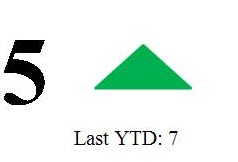
Hi Ruggero,
It should look something like in the attachment. When the current YTD figure is bigger than the one of last year, the arrow icon would be red and point downwards.
- Mark as New
- Bookmark
- Subscribe
- Mute
- Subscribe to RSS Feed
- Permalink
- Report Inappropriate Content
Hi,
In PixelPerfect templates you can a formatting rule to an image to made it visible or not. Formatting rules can use conditions only with values in the Levels node where the image is inserted.
So you need to:
- create a straight table in QlikView or Qlik Sense with a single row (because you want the image will appear only one time)
- refresh the connection cache
- open the Designer and add the straight table in the Levels node of the PixelPerfect template
- add the level detain related to the straight table in the template
- insert the image in the level detail band
- create the formatting rule to hide/show the green arrow based only on the values that are available in the straight table
Best Regards,
Ruggero
Best Regards,
Ruggero
---------------------------------------------
When applicable please mark the appropriate replies as CORRECT. This will help community members and Qlik Employees know which discussions have already been addressed and have a possible known solution. Please mark threads with a LIKE if the provided solution is helpful to the problem, but does not necessarily solve the indicated problem. You can mark multiple threads with LIKEs if you feel additional info is useful to others.
- Mark as New
- Bookmark
- Subscribe
- Mute
- Subscribe to RSS Feed
- Permalink
- Report Inappropriate Content
Thanks, Ruggero.
I tried the conditional display with a formatting rule, however, I am not sure this will solve the problem completely and let me achieve what I need.
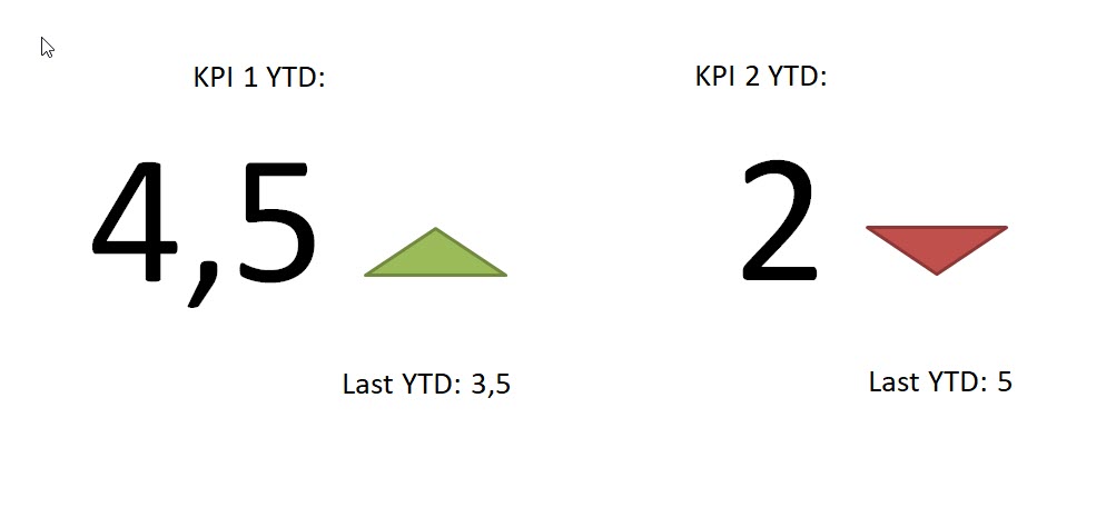
I have attached two more dummy screen shots to hopefully explain a bit better what I need.
1) One KPI, that is displayed over time plus the figure for the current year and the previous year. An arrow shall show if there is an improvment or not.
I will need to create a report (any report - does not have to be Pixel Perfect, I just need the conditional display) that can be cycled down to each location / office.
2) Several KPIs with arrows indicating the improvement from the previous year. Again, I would have to cycle down the report for each location / office.
It seems to me that this will not really work with the Pixel Perfect report. Power Point would actually be nice but I was not able to do any conditional display there. I also considered using a condition, which is working except for the cycle down part.
Do you have any suggestions on how to go on about this?
Thanks and best regards
- Mark as New
- Bookmark
- Subscribe
- Mute
- Subscribe to RSS Feed
- Permalink
- Report Inappropriate Content
Hi,
So just to be clear. In Qlik NPrinting terminology "cycle" means create a different output file for each distinct value of a field or group of field. Refer to https://help.qlik.com/en-US/nprinting/June2019/Content/NPrinting/ReportsDevelopment/Cycling-your-rep....
Is this what you mean when you use the word "cycle"? Or do you want a single report file with inside charts for all distinct values of a field?
In the second case in PowerPoint templates you can use Pages to create a slide for each value. In PowerPoint (also in Word and Excel) you don't have a "conditional show" feature but you could create the arrow objects in QlikView or Qlik Sense and import them as images.
In PixelPerfect you can use formatting rules applied, for example, to images to show or hide them. Formulas used in formatting rules can include only fields from straight tables added to the level where the object is placed. So you must place the conditionally showed images in a level created with a straight table or field used in the formatting rule formula. For example, you can create a straight table with the location as dimension and the values to write the formatting rules as measures. Then add this table as level in the PixelPerfect template and develop the full report.
The choice between PixelPerfect or PowerPoint is yours. What I suggest it to develop a PixelPerfect if you want the final report in PDF and PowerPoint if you want to send a PowerPoint file.
I hope this helps.
If you need detailed suggestions about PixelPerfect, please post screenshots of the whole template.
Best Regards,
Ruggero
Best Regards,
Ruggero
---------------------------------------------
When applicable please mark the appropriate replies as CORRECT. This will help community members and Qlik Employees know which discussions have already been addressed and have a possible known solution. Please mark threads with a LIKE if the provided solution is helpful to the problem, but does not necessarily solve the indicated problem. You can mark multiple threads with LIKEs if you feel additional info is useful to others.
- Mark as New
- Bookmark
- Subscribe
- Mute
- Subscribe to RSS Feed
- Permalink
- Report Inappropriate Content
Hi,
Thanks - I have created the arrows via text boxes in QlikView and now it is working, both in Powert Point and Pixel Perfect.
Best regards
- Mark as New
- Bookmark
- Subscribe
- Mute
- Subscribe to RSS Feed
- Permalink
- Report Inappropriate Content
Hi Ruggero,
It is possible to Hide/Show Images depends on variable (flag) which I can read the value on the fly (UI) with buttons as example in Qlik Sense
Button 1 ==> Value = 1
Button 2 ==> Value = 2
And I use the variable to Show/Hide objects in PixcelPerfect Report
I really need this solution but I don't know how to implement it with variable !
Thanks
- Mark as New
- Bookmark
- Subscribe
- Mute
- Subscribe to RSS Feed
- Permalink
- Report Inappropriate Content
Hi,
Please post a new conversation in the community for a new question, thanks 🙂
I double checked and you cannot use Qlik Sense variables in PixelPerfect formatting rules. You can only use columns from the table you are using to create the level. So you need to find a way to include the value of the variable in a column. I have not tested this idea.
Best Regards,
Ruggero
Best Regards,
Ruggero
---------------------------------------------
When applicable please mark the appropriate replies as CORRECT. This will help community members and Qlik Employees know which discussions have already been addressed and have a possible known solution. Please mark threads with a LIKE if the provided solution is helpful to the problem, but does not necessarily solve the indicated problem. You can mark multiple threads with LIKEs if you feel additional info is useful to others.