Unlock a world of possibilities! Login now and discover the exclusive benefits awaiting you.
- Qlik Community
- :
- All Forums
- :
- Qlik NPrinting
- :
- PixelPerfect pie chart bug on percentage label
- Subscribe to RSS Feed
- Mark Topic as New
- Mark Topic as Read
- Float this Topic for Current User
- Bookmark
- Subscribe
- Mute
- Printer Friendly Page
- Mark as New
- Bookmark
- Subscribe
- Mute
- Subscribe to RSS Feed
- Permalink
- Report Inappropriate Content
PixelPerfect pie chart bug on percentage label
Hi
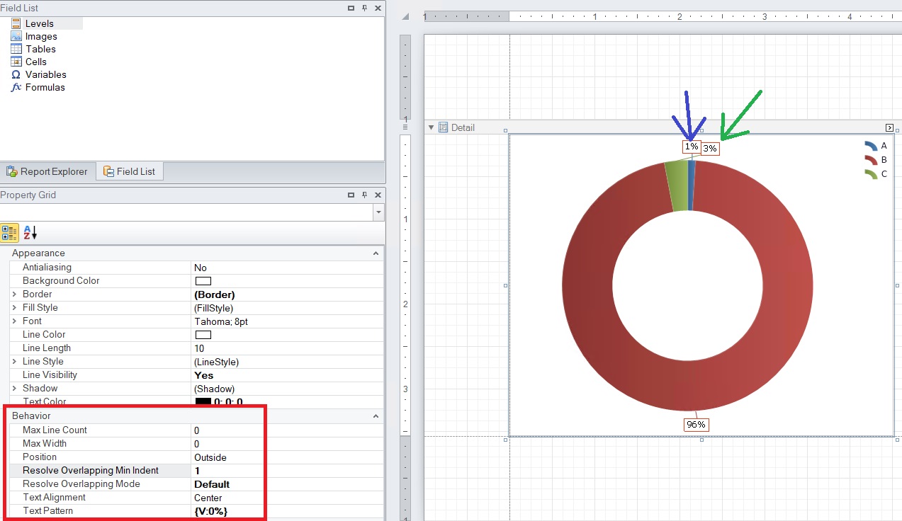
When a pie chart or a donut chart is natevely created in the PixelPerfect template, there is a bug displaying the last label of the percentage.
In fact if the last percentage and first percentage values are between 1% and 3% than their label get swapped clockwise after the first label. Wrongly displaying the labels.
The Resolve Overlapping Mode property behavior does not move the label to the right side. See attached images.
It happens on all NPrinting versions.
How can this be fixed?
Kind regards
Hatus Peters
- Tags:
- e
- Mark as New
- Bookmark
- Subscribe
- Mute
- Subscribe to RSS Feed
- Permalink
- Report Inappropriate Content
Hi @Hatus
Yes they were swapped but the tracing line is correct so label is attached to correct segment. Yes - it is not above the segment (as I guess you want it, but at the same time it is still correct providing the trace line from green segment to 3% box.)
@Ruggero_Piccoli - can you comment on that? I dont have experience with labels for such small values as I never use them in pie charts due to visualisation practices involving such small values in pie chart

cheers
- Mark as New
- Bookmark
- Subscribe
- Mute
- Subscribe to RSS Feed
- Permalink
- Report Inappropriate Content
Hi,
I have to develop an example to reproduce it, before I can suggest to test different option settings. The internal library who manages PixelPerfect reports is the same in all version of Qlik NPrinting so I suppose upgrading will not change the behaviour of cross linking the labels.
You could also test to reduce the size of the inner circle to have more space between it and the border of the chart.
Best Regards,
Ruggero
Best Regards,
Ruggero
---------------------------------------------
When applicable please mark the appropriate replies as CORRECT. This will help community members and Qlik Employees know which discussions have already been addressed and have a possible known solution. Please mark threads with a LIKE if the provided solution is helpful to the problem, but does not necessarily solve the indicated problem. You can mark multiple threads with LIKEs if you feel additional info is useful to others.
- Mark as New
- Bookmark
- Subscribe
- Mute
- Subscribe to RSS Feed
- Permalink
- Report Inappropriate Content
Hi @Ruggero_Piccoli and @Lech_Miszkiewicz
Thank you for the reply.
I tried many properties and it has to do finally with these properties: SweepDirection and Rotation
In order to get the pie chart in the correct direction I used SweepDirection=Clockwise and Rotation=270
It messed up the small values.
However, using SweepDirection=Counterclockwise and Rotation=90 I get the small values display correct BUT I have to reorder the data comming from Qlik table chart in the opposite order. It works like a mirror so to speak. I was expecting it to work 1-1 with the Qlik app.
See attachement.
- Mark as New
- Bookmark
- Subscribe
- Mute
- Subscribe to RSS Feed
- Permalink
- Report Inappropriate Content
Hi,
Data comes from Qlik Sense but the native PixelPerfect charts are created by the related library.
Best Regards,
Ruggero
Best Regards,
Ruggero
---------------------------------------------
When applicable please mark the appropriate replies as CORRECT. This will help community members and Qlik Employees know which discussions have already been addressed and have a possible known solution. Please mark threads with a LIKE if the provided solution is helpful to the problem, but does not necessarily solve the indicated problem. You can mark multiple threads with LIKEs if you feel additional info is useful to others.