Unlock a world of possibilities! Login now and discover the exclusive benefits awaiting you.
- Qlik Community
- :
- All Forums
- :
- Qlik NPrinting
- :
- Re: Qlik Nprinting powerpoint color using master m...
- Subscribe to RSS Feed
- Mark Topic as New
- Mark Topic as Read
- Float this Topic for Current User
- Bookmark
- Subscribe
- Mute
- Printer Friendly Page
- Mark as New
- Bookmark
- Subscribe
- Mute
- Subscribe to RSS Feed
- Permalink
- Report Inappropriate Content
Qlik Nprinting powerpoint color using master measure
I am using master measures in Qlik Sense to create a bar chart and the master measure has a color applied. In Nprinting I am bringing this into a table object. The "Keep source format" is checked, however the color set in the Qlik Sense chart is not seen in the Nprinting chart. I want to be able to add expressions to set the color, as doing it manually is very cumbersome. If this is not possible, is there a syntax available to set the color when the "Keep source format" is unchecked?
Please let me know.
Accepted Solutions
- Mark as New
- Bookmark
- Subscribe
- Mute
- Subscribe to RSS Feed
- Permalink
- Report Inappropriate Content
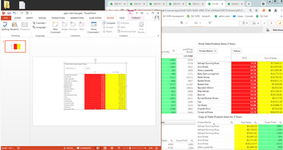
Check my updated response above. You can use straight tables and maintain colors.
I checked with R&D and pivot tables (as mentioned here https://help.qlik.com/en-US/nprinting/February2021/Content/NPrinting/ReportsDevelopment/Qlik-objects...) and other chart types - straight tables being the exception - have the same limitations
We are having the link above updated accordingly.
Sorry I can't give you better news on this.
kind regards...
- Mark as New
- Bookmark
- Subscribe
- Mute
- Subscribe to RSS Feed
- Permalink
- Report Inappropriate Content
Hi,
In master measure we can only set measure color. I think your requirement is to change the font color.
Regards,
Joshua.
- Mark as New
- Bookmark
- Subscribe
- Mute
- Subscribe to RSS Feed
- Permalink
- Report Inappropriate Content
you are confusing me:
In Nprinting I am bringing this into a table object. The "Keep source format" is checked, however the color set in the Qlik Sense chart is not seen in the Nprinting chart.
is it a table or chart?
When you convert in your QlikSense chart to a table do you get the results you want directly in Qlik Sense table? I belive you dont as a measure color does not translate to background colour of value in the table.
In my opinion the only way to have expressionbased colour of values/background in PPT Table is by having Qlik Sense table with the format set and using table object as source for NPrinting PPT report.
PowerPoint does not support conditional formatting so you cannot do it directly in PPT
cheers
- Mark as New
- Bookmark
- Subscribe
- Mute
- Subscribe to RSS Feed
- Permalink
- Report Inappropriate Content
Hi Lech,
Thanks for the reply. I created a Qlik Sense chart and that chart has master measures with colors. Alternatively, I tried to add colors to the bars in the Qlik Sense chart as well, instead of adding the colors at the master measure level. After this chart is created in QS, in NPrinting, under tables, I add this object ID and create a bar graph using these measures. The colors are lost when I add a bar graph in Nprinting. Adding colors for each of the bars manually is time consuming, hence I wanted to know how do I preserve the colors in NPrinting.
- Mark as New
- Bookmark
- Subscribe
- Mute
- Subscribe to RSS Feed
- Permalink
- Report Inappropriate Content
I think your best bet is to export your chart as an image object rather than as a table/chart object.
There are limitations but it looks like the list of limitations needs to be expanded.
Here are the officially listed limitations.
It appears that the pivot table chart limitations listed will also apply to your bar charts in all likelihood. I am checking with R&D and will be having the above link updated accordingly.
Now if you need something color coded, you can use straight tables to do this...straight tables do not appear to be affected by this limitation affecting pivot and other QS chart types.
See image below:
Kind regards...
- Mark as New
- Bookmark
- Subscribe
- Mute
- Subscribe to RSS Feed
- Permalink
- Report Inappropriate Content
Thanks @Frank_S . Unfortunately, using an image also has its limitations while resizing the chart in PPT. i appreciate your help in checking with R&D.
- Mark as New
- Bookmark
- Subscribe
- Mute
- Subscribe to RSS Feed
- Permalink
- Report Inappropriate Content
Check my updated response above. You can use straight tables and maintain colors.
I checked with R&D and pivot tables (as mentioned here https://help.qlik.com/en-US/nprinting/February2021/Content/NPrinting/ReportsDevelopment/Qlik-objects...) and other chart types - straight tables being the exception - have the same limitations
We are having the link above updated accordingly.
Sorry I can't give you better news on this.
kind regards...
- Mark as New
- Bookmark
- Subscribe
- Mute
- Subscribe to RSS Feed
- Permalink
- Report Inappropriate Content
Hi @Frank_S , thanks for the update. It seems that the colors are being retained on a straight table in NPrinting. Thats good to know.
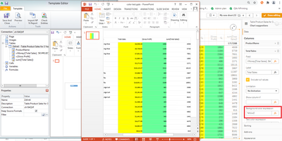
Can you please advise on the syntax of the format when "keep source format" is unchecked? I wanted to see if colors can be added there.
I have attached a screenshot on the highlighted section I have the question on.
- Mark as New
- Bookmark
- Subscribe
- Mute
- Subscribe to RSS Feed
- Permalink
- Report Inappropriate Content
- Use the formatting tools in Qlik Sense as shown in the 2nd image I provided above
- You can't add the color formats in NPrinting...only number formats.. See https://help.qlik.com/en-US/nprinting/February2021/Content/NPrinting/ReportsDevelopment/Designer-pro... Section: Format Field
- Mark as New
- Bookmark
- Subscribe
- Mute
- Subscribe to RSS Feed
- Permalink
- Report Inappropriate Content
Thanks @Frank_S for the reply.

