Unlock a world of possibilities! Login now and discover the exclusive benefits awaiting you.
- Qlik Community
- :
- All Forums
- :
- Qlik NPrinting
- :
- Qlik sense and Nprinting help
- Subscribe to RSS Feed
- Mark Topic as New
- Mark Topic as Read
- Float this Topic for Current User
- Bookmark
- Subscribe
- Mute
- Printer Friendly Page
- Mark as New
- Bookmark
- Subscribe
- Mute
- Subscribe to RSS Feed
- Permalink
- Report Inappropriate Content
Qlik sense and Nprinting help
Hi Team,
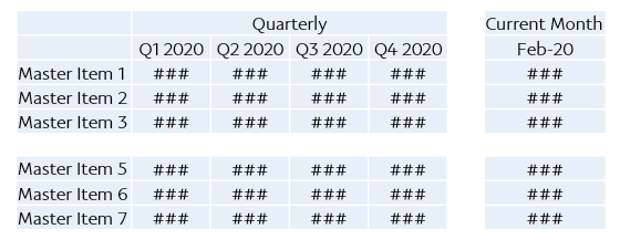
Can someone please help me to create a below chart in Qlik Sense and the same need to be convert into ppt using Nprinting.
- Tags:
- powerpoint
Accepted Solutions
- Mark as New
- Bookmark
- Subscribe
- Mute
- Subscribe to RSS Feed
- Permalink
- Report Inappropriate Content
Hi,
there are only 2 options:
- Use if image of pivot table - which I assume is not acceptable as it simply does not look good
- Use of native PPT table object.
Second option requires proper Qlik application development which includes:
- In Qlik build straight table
- as dimension use whatever dimensions you need
- for measures: in each expression use set analysis to create buckets for Q1,Q2,Q3,Q4, Current Month... and whatever else you need.
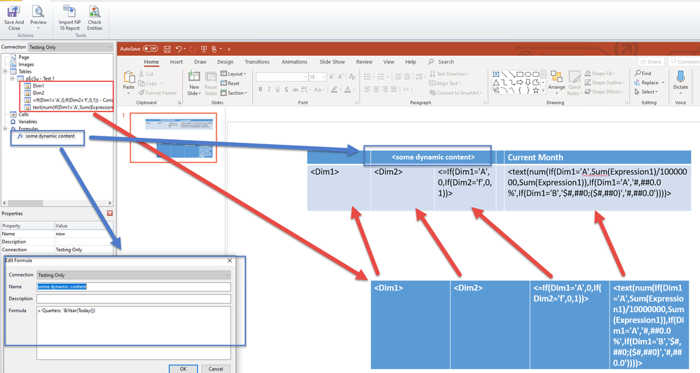
- for measure labels (like Q1 2020) you can hardcode it in Qlik or use Formula in labels to produce required value... note that they will be used as second row in your final table!!!
- Once your straight table is ready you can go to NPrinting development
- regenerate metadata and create PPT template
- bring in to Tables your new straight table object
- Expand with "+" sign table object to see individual columns:
- Choose to keep/not to keep source format (its up to you)
- Insert PPT table to PPT template
- Pull in individual columns to SECOND ROW in this table - the best way to do this is to select all required columns together, drag and drop them on PPT slide, and then individually copy and past <tags> values into required cells in your PPT tabel
- in your first row merge required cells ets.. an put labeling like Quarterly or Current Month
- If you require dynamic names there you can use formulas to
- Preview and thats it
Above isnstruction is just short description of required steps - but it seems quite straight forward.
My screenshot is just a random table for presentation purposes only and does not represent your quarters!!
cheers

