Unlock a world of possibilities! Login now and discover the exclusive benefits awaiting you.
- Qlik Community
- :
- Forums
- :
- Forums by Product
- :
- Products (A-Z)
- :
- Qlik Sense
- :
- Documents
- :
- Dashboard Design - QS CSS MasterClass (video)
- Move Document
- Delete Document
- Subscribe to RSS Feed
- Mark as New
- Mark as Read
- Bookmark
- Subscribe
- Printer Friendly Page
- Report Inappropriate Content
Dashboard Design - QS CSS MasterClass (video)
- Move Document
- Delete Document and Replies
- Mark as New
- Bookmark
- Subscribe
- Mute
- Subscribe to RSS Feed
- Permalink
- Report Inappropriate Content
Dashboard Design - QS CSS MasterClass (video)
Mar 3, 2021 2:02:32 PM
Mar 2, 2021 11:14:06 AM
Welcome to the QS CSS MasterClass.
Motivation:
In my career as a PreSales, I need to create quite a few "user-appealing-applications". Sometimes users request a specific design or specific functions I need to implement in Qlik Sense. As we all know, Qlik Sense is built for simplicity & self-service and sometimes it could be challenging to achieve the desired result. But through the last couple of years, there were a lot of tips and tricks around using CSS to create completely new designs and functions to implement a better information design concept.
This is where the MasterClass starts. I have created an application that gathers a couple of these tricks and explains them more in detail. In addition to that, it is very easy to understand because you can see the result directly within a Qlik Sense App. If you think this sounds interesting, take a couple of minutes and join my short tour through the app. I won't cover all aspects in detail. This tour will give you an overview of the documented and used tricks within the app.
Content:
The following list will give you a brief overview of what topics are focused on the specific sheet within the app.
| Sheet | Description |
| You can add CSS definitions to your app by using themes or by using so-called "helper- objects". On this sheet, I will explain when you should use which option. |
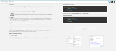 Hide (Helper-) Objects Hide (Helper-) Objects | A "helper-object" carries and injects the CSS definition on a specific sheet. This sheet helps you to hide this object and which objects can be used for it. |
| This example demonstrates how to add better guidance to your dashboards by segmenting your background. |
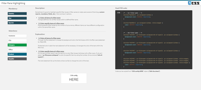
| Sometimes selections can be mandatory to consume a dashboard, or the creator likes to guide the user through the filter pane by using colored filter boxes. I show you how. |
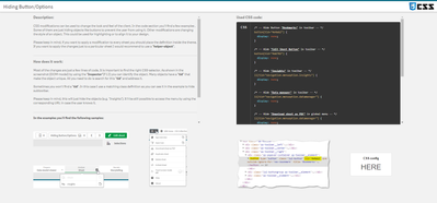 Hiding Button/Options Hiding Button/Options | How to hide objects like the selection bar or elements within context-menus in case these functions shouldn't be used in the app or on this sheet? |
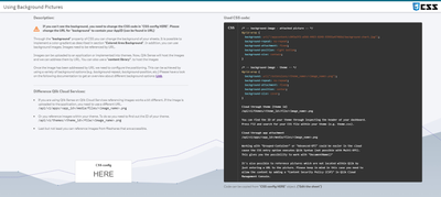 Using Background Pictures Using Background Pictures | Adding background-pictures to your dashboard can spice up the overall flavor of your dashboards. This can be used for segmentation or just to add some style. |
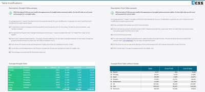 Table modifications Table modifications | In this section, we will completely change the look and feel of a straight- and pivot table. |
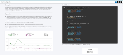 Moving Objects Moving Objects | Let's create an illusion by just moving our objects closer together. After that, I'll look like we just have one. |
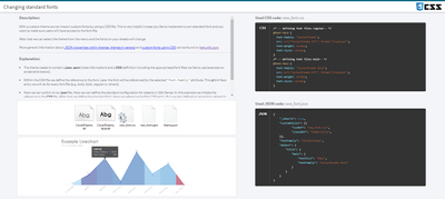 Changing standard fonts Changing standard fonts | This sheet explains the easiest way to implement your own font by using a custom theme. It's just a few lines of code. |
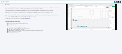 Custom Grid Layout Custom Grid Layout | No matching grid? This trick shows you how to create your own grid for a specific sheet by changing the metadata through Qlik Engine API Explorer. |
Installation:
Under "Attachments" you can find the required package. The zip package includes a qvf file (Qlik Sense - CSS MasterClass V 1.0.qvf) and an extension (ShowHTMLfromMeasure). After importing the extension and app we need to change a quick configuration because the app has a different ID on your system now.
Open sheet called "Using Background Pictures". Normally this sheet has a background image. This gets referenced over the internal app-ID. Click on "Edit Sheet" and select the displayed CSS box ("CSS config HERE"). Navigate to submenu "Styles" and change the used app-ID in "Styles (CSS)" to your app-ID (displayed in the URL). Now you should see a background picture on this sheet.
Usage:
Every sheet has the same structure. First, a description explains the trick in general and how it's working. On most of the sheets, you also get the explanation for the used CSS selectors. On the right-hand side, you can see the used code in a black code box. You can't copy the code from here. To do so enter the "edit-mode" and click on the "CSS config HERE" button. This object is always the "Helper-object" that carries the used and explained CSS code. Navigate to the "Styles" submenu and copy the code from the "Styles (CSS)" window. I recommend using an external editor to modify or review the CSS code.
In case you like to transfer the trick to your dashboard you just need to change the object ID. If you don't know how to find the object ID this will be explained on sheet "Hide (Helper-) Objects".
- Move Comment
- Delete Comment
- Mark as Read
- Mark as New
- Bookmark
- Permalink
- Report Inappropriate Content
@jackganev I'm afraid no.
Multi KPI only accepts CSS, and I've never succeded in styling bar chart values and/or labels just with CSS.
- Move Comment
- Delete Comment
- Mark as Read
- Mark as New
- Bookmark
- Permalink
- Report Inappropriate Content
@jackganev You can't change a canvas with css.
- Move Comment
- Delete Comment
- Mark as Read
- Mark as New
- Bookmark
- Permalink
- Report Inappropriate Content
Too bad, I still had a little hope asking here in the kkkkkkkk group
and how would it be just this part of changing the color of the label, values, everything I put in the chart above, can you help me with that, with examples, or something like that? I've never done that, help me please.
- Move Comment
- Delete Comment
- Mark as Read
- Mark as New
- Bookmark
- Permalink
- Report Inappropriate Content
@jackganev You just need to create a theme (or edit an existing one) and set your own values in the json file. Add it to the extensions folder for a Windows server install via QMC, or in QMC themes tab for Saas, and then, add the theme to your app, that's all !
A good start reading here :
And have a look at this nice online tool to start :
Explore themes here: https://sensetheme.com/gallery
Or start builind your own in editor: https://sensetheme.com/edit
Enjoy building it !
- Move Comment
- Delete Comment
- Mark as Read
- Mark as New
- Bookmark
- Permalink
- Report Inappropriate Content
@Ludo_
Perfect!!
Thank you very much!!
- Move Comment
- Delete Comment
- Mark as Read
- Mark as New
- Bookmark
- Permalink
- Report Inappropriate Content
@jackganev you can try this:
@import url('https://allfont.es/allfont.css?fonts=comic-sans-ms');
* {
font-family: 'Comic Sans MS', arial;
color: orangered;
}
It will modify everything, check the original post to only affect the object you need.
I guess you can also modify the color of the labels, but you will have to dive using the browser console.
Regards
- Move Comment
- Delete Comment
- Mark as Read
- Mark as New
- Bookmark
- Permalink
- Report Inappropriate Content
Is there any way of removing search icon from dimension column in straight table? I am able to modify font of actual glass icon but I am unable to remove that object all together.
Any ideas?
I know workarounds with creating measures or using pivot table with the tricks shown in video so those I am not interested in.
- Move Comment
- Delete Comment
- Mark as Read
- Mark as New
- Bookmark
- Permalink
- Report Inappropriate Content
you can try below code
tid=your straight table object id
div[tid="FZcdxkk"] .qv-object .lui-icon {
display: none;
}
- Move Comment
- Delete Comment
- Mark as Read
- Mark as New
- Bookmark
- Permalink
- Report Inappropriate Content
Hello @Lech_Miszkiewicz ,
If you want to hide the search icon for all straight tables in your app, you can add this CSS code to your theme (or in a Multi KPI object for a single sheet)
.qv-st-header-cell-search {display: none;}
- Move Comment
- Delete Comment
- Mark as Read
- Mark as New
- Bookmark
- Permalink
- Report Inappropriate Content
Hi @NitinK7,
Thanks for your reply.
I tried that, It only removes the glass icon but the actual placeholder is still there. I guess straight table dimensions are having headers split into 2 blocks:
- 1 for dimension label
- 2 for search (the red block)
It seems those 2 need to go together always.
I also tried using this:
div[tid="mnSMjFs"] .qv-st-header-cell-search {
display: none;
}
which resulted in my headers moving accros like on below image, which basicly means that dimension libel from the right jumped into position where search glass icon was.
My intent is basicly widen space as much as possible so my long labels can fit nicely and make search cell as narrow as possible


