Unlock a world of possibilities! Login now and discover the exclusive benefits awaiting you.
- Qlik Community
- :
- All Forums
- :
- QlikView App Dev
- :
- Re: 1 chart two expression from different data sou...
- Subscribe to RSS Feed
- Mark Topic as New
- Mark Topic as Read
- Float this Topic for Current User
- Bookmark
- Subscribe
- Mute
- Printer Friendly Page
- Mark as New
- Bookmark
- Subscribe
- Mute
- Subscribe to RSS Feed
- Permalink
- Report Inappropriate Content
1 chart two expression from different data sources
Hello,
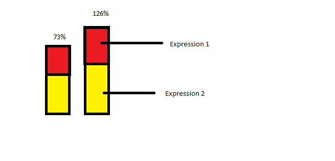
Quick Question, I have two data sets that have nothing to do with each other and way different columns, but I want to use both in a stacked chart as percentages, I just want their result percentage values of each expression stacked on top of each other, so 1 chart ,two data sets, 2 expressions, stack the percentages on top of each other. Qlikview charts wont let me becuase the dimension would only apply to one expression and not both, breaking the chart.
IS there some way to put a condition on a dimension to only apply to a particular expression?
I've done this before by creating 20+ variables for each situation on one data set, then and using those against the other data set in an expression, but that won't work in this case, way to many cases.
Does any one know how to include two data sets in one bar chart, without breaking it due to the dimension not applying to both?
Thanks ahead of time
- « Previous Replies
-
- 1
- 2
- Next Replies »
- Mark as New
- Bookmark
- Subscribe
- Mute
- Subscribe to RSS Feed
- Permalink
- Report Inappropriate Content
The second expression, what you want to see? All values of each dimension for first expression should be equal?
- Mark as New
- Bookmark
- Subscribe
- Mute
- Subscribe to RSS Feed
- Permalink
- Report Inappropriate Content
What to see would be a stacked chart with one section being the first expression, the other section of hte stacked chart would be the second expression, but the dimension can only apply to one data set , not both...
All values of each dimension would not be equal no, and I'm aggregating on them anyway, the reslut is a percentage %.
- Mark as New
- Bookmark
- Subscribe
- Mute
- Subscribe to RSS Feed
- Permalink
- Report Inappropriate Content
Something like if(Expression = Expression A, Dimension 1, if(Expression = Expression B, Dimension 2))
I want this to be my dimension if possible or something like it, I would like to utilize two dimensions in a bar chart, based on the expression, mine having 2 expressions
- Mark as New
- Bookmark
- Subscribe
- Mute
- Subscribe to RSS Feed
- Permalink
- Report Inappropriate Content
try mocking your chart up you want to see in paint or excel and post here I think it will help people to see an example.
- Mark as New
- Bookmark
- Subscribe
- Mute
- Subscribe to RSS Feed
- Permalink
- Report Inappropriate Content
Yes. Please provide a mock up. Sir.
- Mark as New
- Bookmark
- Subscribe
- Mute
- Subscribe to RSS Feed
- Permalink
- Report Inappropriate Content

- Mark as New
- Bookmark
- Subscribe
- Mute
- Subscribe to RSS Feed
- Permalink
- Report Inappropriate Content
Can you create a dummy column on both tables so you can join them?
- Mark as New
- Bookmark
- Subscribe
- Mute
- Subscribe to RSS Feed
- Permalink
- Report Inappropriate Content
thanks for the mockup can you add your axis to it. How you expect it to behave. I like the suggestion cooker has made to add a new column to join your tabl
- Mark as New
- Bookmark
- Subscribe
- Mute
- Subscribe to RSS Feed
- Permalink
- Report Inappropriate Content
what is the dimension of the chart. Is your dimension available in both data set?
- « Previous Replies
-
- 1
- 2
- Next Replies »