Unlock a world of possibilities! Login now and discover the exclusive benefits awaiting you.
- Qlik Community
- :
- All Forums
- :
- QlikView App Dev
- :
- Achieving bar offset in chart
- Subscribe to RSS Feed
- Mark Topic as New
- Mark Topic as Read
- Float this Topic for Current User
- Bookmark
- Subscribe
- Mute
- Printer Friendly Page
- Mark as New
- Bookmark
- Subscribe
- Mute
- Subscribe to RSS Feed
- Permalink
- Report Inappropriate Content
Achieving bar offset in chart
Hi all,
I'm trying to replicate the following Excel bar chart:
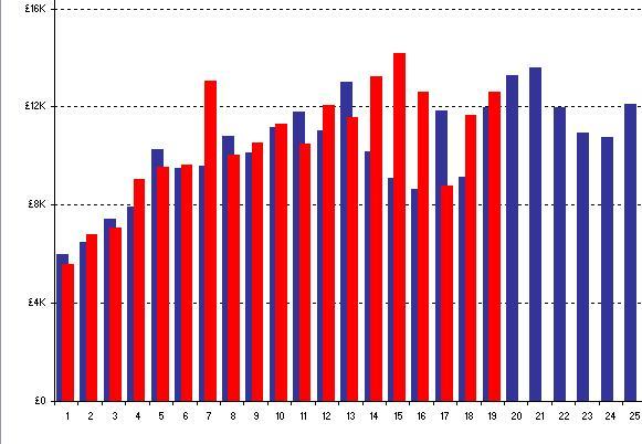
You can see that the bars are offset (left/right). Current year is red, previous year is blue. Visually, I think it is very effective.
I've played around with the Bar Offset in the expression and concluded that is not the way to achieve it.
Any ideas?
Thanks in advance.
- Tags:
- bar_chart
- bar_offset
- Mark as New
- Bookmark
- Subscribe
- Mute
- Subscribe to RSS Feed
- Permalink
- Report Inappropriate Content
I don't think you can do any better than place the bars side by side. If you REALLY must display it this way, I think you'll need to overlay two charts and make sure you carefully calculate the same static max and min for the two charts, and make sure they report on the exact same data points for each year, or use a static min and max on the X axis as well. If they don't like up properly in all conditions, you have problems. I wouldn't do that though. I'd use a line chart with two lines. I think that's much cleaner visually, much easier to interpret.
- Mark as New
- Bookmark
- Subscribe
- Mute
- Subscribe to RSS Feed
- Permalink
- Report Inappropriate Content
I agree, using two lines is the preferred method. On that particular graph, I have bars on one axis (current year & previous year) showing revenue and lines on a second axis for conversion. I like mixing bars and lines in this way.
As there is no direct way to achieve the offset, side by side will suffice.
Thanks for your help.
APS
- Mark as New
- Bookmark
- Subscribe
- Mute
- Subscribe to RSS Feed
- Permalink
- Report Inappropriate Content
I've adjusted the Bar Distance on the Presentation tab to -6 which is essentially what I was trying to achieve. It doesn't very clear though so I think I will stick with them being side by side.
- Mark as New
- Bookmark
- Subscribe
- Mute
- Subscribe to RSS Feed
- Permalink
- Report Inappropriate Content
Doh! Why did I never notice that you could adjust the bar distance to less than zero? Guess I'm still learning some of the basics!