Unlock a world of possibilities! Login now and discover the exclusive benefits awaiting you.
- Qlik Community
- :
- All Forums
- :
- QlikView App Dev
- :
- Adding Data Labels to Specific Points
- Subscribe to RSS Feed
- Mark Topic as New
- Mark Topic as Read
- Float this Topic for Current User
- Bookmark
- Subscribe
- Mute
- Printer Friendly Page
- Mark as New
- Bookmark
- Subscribe
- Mute
- Subscribe to RSS Feed
- Permalink
- Report Inappropriate Content
Adding Data Labels to Specific Points
Hello,
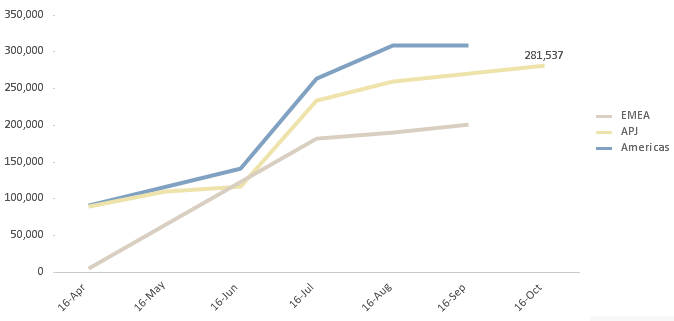
I'm trying to create a line chart showing actual revenue YTD compared to budget revenue for the entire year. I'd like to have a data point on the most recent month's value (both actual and budget) and the budgeted year-end revenue. However, when I add data labels, they appear on every month. I haven't had any success in the "Show Value" section of the expression.
Thanks!
Greg
- Mark as New
- Bookmark
- Subscribe
- Mute
- Subscribe to RSS Feed
- Permalink
- Report Inappropriate Content
Duplicate the expression that you only want the single label on. Then wrap the expression in something like if(Month=max(total Month),expression). Display the new expression as a line, and select text on data point. Since there will only be a single point, there will be no line plotted, and your text will be floating right above the REAL line, but only on a single data point.
- Mark as New
- Bookmark
- Subscribe
- Mute
- Subscribe to RSS Feed
- Permalink
- Report Inappropriate Content
Thanks John...I hadn't thought about doing it this way, but it make sense. The only problem now is that since I have full accumulation on (showing cumulative revenue YTD), the extra point only shows the non-cumulative value for that month. Is there a way to accumulate and show the value for the last point?
- Mark as New
- Bookmark
- Subscribe
- Mute
- Subscribe to RSS Feed
- Permalink
- Report Inappropriate Content
Sorry for the delay. Yes, you can do this. Sum(total Revenue) and sum(total Budget). "Total" tells it to ignore the chart dimensions, so it will give you the total for all selected months. Put that inside the IF statement to only display it on the final month, and you should get what you want. See attached.
- Mark as New
- Bookmark
- Subscribe
- Mute
- Subscribe to RSS Feed
- Permalink
- Report Inappropriate Content
It's actually pretty simple using "Show Value" - see attached. All you need to do is create an expression that returns true (any non-zero value) or false (zero).
- Mark as New
- Bookmark
- Subscribe
- Mute
- Subscribe to RSS Feed
- Permalink
- Report Inappropriate Content
A much better solution. Thanks, Oleg. 
- Mark as New
- Bookmark
- Subscribe
- Mute
- Subscribe to RSS Feed
- Permalink
- Report Inappropriate Content
How about adding the series title and the value as the last data label? Like "Revenue: $565".
Thanks. Ted.
- Mark as New
- Bookmark
- Subscribe
- Mute
- Subscribe to RSS Feed
- Permalink
- Report Inappropriate Content
Is there a way to keep these values from overlapping?

- Mark as New
- Bookmark
- Subscribe
- Mute
- Subscribe to RSS Feed
- Permalink
- Report Inappropriate Content
No direct way that I'm aware of.
You could make the chart larger and/or the font smaller so that labels are less likely to overlap, but it's not really a robust solution.
What I'd probably do in this case is put the percentages in the Year dimension itself so they're in the legend instead of in the chart. So instead of having a dimension of Year, I think you could use a calculated dimension like this (untested):
=aggr(dual("Year" & ': ' & num(Your Expression,'#0.00%'),Your Expression),"Year")
- Mark as New
- Bookmark
- Subscribe
- Mute
- Subscribe to RSS Feed
- Permalink
- Report Inappropriate Content
Hi Oleg,
Understand that I'm replying to a 6-7 year old post.. I found your solution to work perfectly, even for cases where I specify a secondary dimension. However, I ran into a situation where the max month is not the same across the secondary dimension (Geo in this case)... is there a way to solve this?
Thanks in advance!
-Jason