Unlock a world of possibilities! Login now and discover the exclusive benefits awaiting you.
- Qlik Community
- :
- All Forums
- :
- QlikView App Dev
- :
- Re: Additional condition to count set expression
- Subscribe to RSS Feed
- Mark Topic as New
- Mark Topic as Read
- Float this Topic for Current User
- Bookmark
- Subscribe
- Mute
- Printer Friendly Page
- Mark as New
- Bookmark
- Subscribe
- Mute
- Subscribe to RSS Feed
- Permalink
- Report Inappropriate Content
Additional condition to count set expression
Hello Qlik Community,
I want to have a chart (Pivot Table) which displays per Location (Dimension of the chart) the number of big suppliers.
A supplier is big when the purchasing volume is higher than 10000.
I only want to look at the purchasing volume of the last 12 month and I created a date flag for this.
I tried to solve this like this:
count(DISTINCT{<Location ={"=sum({<Last12Months={1}>}[Purchasing Volume]) > 10000"}, Last12Months={1}>} [Supplier Number])
However this does not work correctly.
Does anybody know a solution to this problem?
- Mark as New
- Bookmark
- Subscribe
- Mute
- Subscribe to RSS Feed
- Permalink
- Report Inappropriate Content
May be:
count(DISTINCT{<[Supplier Number] ={"=sum({<Last12Months={1}>}[Purchasing Volume]) > 10000"}, Last12Months={1}>} [Supplier Number])
Assuming, [Supplier Number] is a supplier identifier, like code or ID.
- Mark as New
- Bookmark
- Subscribe
- Mute
- Subscribe to RSS Feed
- Permalink
- Report Inappropriate Content
Thank you, however it is still not working correctly.

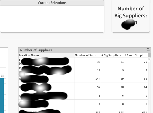
The first image shows the table when there is no current selection --> the figures are wrong
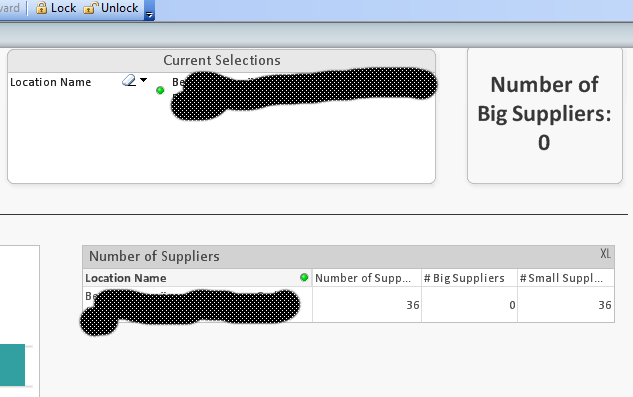
However when I make a selection to [Location Name] the figures change and are right:

I don't know why the figures change because the dimension of the chart is [Location Name] and the selction is made to this dimension.
So with my understanding, the figures shouldn't change.
For # Big Suppliers I use this expression:
=count(DISTINCT{<[Supplier Number]={"=sum({<Last12Months={1}>}TotalPVO)>10000"}, Last12Months={1}>}[Supplier Number])
Thank you!
- Mark as New
- Bookmark
- Subscribe
- Mute
- Subscribe to RSS Feed
- Permalink
- Report Inappropriate Content
Does anybody has an idea, why the values are changing, when I select one [Location Name] (one row in my chart)?
The values are calulated correctly only when one specific [Location Name] is selected. Otherwise, when there is no selection, the values in the chart are wrong..
Many thanks in advance for your help!