Unlock a world of possibilities! Login now and discover the exclusive benefits awaiting you.
- Qlik Community
- :
- All Forums
- :
- QlikView App Dev
- :
- Alternate States using scatter chart - Selections
- Subscribe to RSS Feed
- Mark Topic as New
- Mark Topic as Read
- Float this Topic for Current User
- Bookmark
- Subscribe
- Mute
- Printer Friendly Page
- Mark as New
- Bookmark
- Subscribe
- Mute
- Subscribe to RSS Feed
- Permalink
- Report Inappropriate Content
Alternate States using scatter chart - Selections
Hi,
I have three list boxes as Account, Peer1, Peer2.
Peer1 & Peer2 are the alternate states selections of Account.
i have to show selections made in all 3 list boxes in a scatter chart.
To achieve this, i have created a inline table as
Load * Inline [
AlternateStatesSortOrder, AlternateStates
1, Account
2, Peer1
3, Peer2 ];
and used the "AlternateStates" as the dimension of scatte chart and measures as
Measure1: Pick( Match (AlternateStates, 'Account', 'Peer1','Peer2'),
Sum ([Measure1]) //Account , SUM({Peer1}Measure1) //Peer1 , SUM ({Peer2}Measure1) //Peer1 )
Measure 2: Pick( Match (AlternateStates, 'Account', 'Peer1','Peer2'),
Sum ([Measure 2]) //Account , SUM({Peer1}[Measure 2]) //Peer1 , SUM ({Peer2}[Measure 2]) //Peer1 )
I am getting aggregatied value of Peer1, Peer2 selections in the chart but i want individual selections made by user in Peer1 and peer2 listboxs respectively.
Sample xlsx: Input file
Sample File. qvw:
Expected Result : Screenshot of expected result.
Please help me to achieve the expected result in qlikview document.
Accepted Solutions
- Mark as New
- Bookmark
- Subscribe
- Mute
- Subscribe to RSS Feed
- Permalink
- Report Inappropriate Content
Hi,
I can't see your attachments (could be a problem on my end...)
If I understood your problem correctly, you wanted to see the individual accounts selected in each one of the Alternate states? It's not happening currently because your Dimension is the Alternate State itself, so your chart ill always produce 3 values - one per state. I'm not too sure how you can visualize both the alternate States and the individual accounts in the same Scatter plot.
Here is what I'd try, even though it's a long shot:
1. Add one more alternate state - Peer 3, and do not select anything in the default state.
2. Keep the Chart in the Default State
3. Use Account as a dimension.
4. Build the 2 expressions with Set Analysis conditions that return a union (logical +) of the three Alternate States. So, the Account will be displayed if it was selected in any of the alternate states.
5. In the Background Color expression, build a condition that verifies if the Account belongs to the 1st State, or the 2nd State, or the 3rd State, and determine the color accordingly. This way, each bubble on the chart can represent a single account, and states can be differentiated by different colors.
good luck!
Oleg Troyansky
masterssummit.com
- Mark as New
- Bookmark
- Subscribe
- Mute
- Subscribe to RSS Feed
- Permalink
- Report Inappropriate Content
here are the attachements
- Mark as New
- Bookmark
- Subscribe
- Mute
- Subscribe to RSS Feed
- Permalink
- Report Inappropriate Content
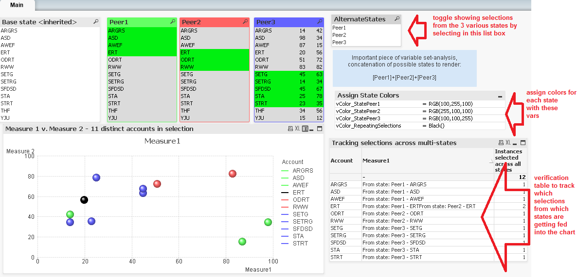
Following Oleg's blueprint for working this out, I put together a functional demonstration.
The one thing that still seems less than optimal is detecting and handling when the same account is selected more than once across multiple states. (It is working fine here when there are selections in all 3 alternate states, if the same account is selected twice in any of the two states, the account plots as black. But once the full lists of state selections are cleared out, everything renders as a repeater.)
While the Count() function allows a set-analysis argument to zero in on counts of a specific state, I found myself wishing I could use the same state-specific set-analysis arguments in functions like GetSelectedCount({[AltState]} Field), GetPossibleCount({[AltState]} Field), and GetFieldSelections ({[AltState]} Field) to have quick handles on whether the end user is making selections across multiple states. Is there a quicker way I am missing to get handles on the selections outside of the default state?
- Mark as New
- Bookmark
- Subscribe
- Mute
- Subscribe to RSS Feed
- Permalink
- Report Inappropriate Content
Hi,
User will select a value from Inherited State (Default State). then he will select the accounts in Peer1 and Peer2 ( these are alternate states).
Basically i want to plot a scatter chart with both Inherited State values (one value selected by user)+ Alternate state values (Peer1 and Peer2 alternate states of multiple selection).
please find below the attached files.
- Mark as New
- Bookmark
- Subscribe
- Mute
- Subscribe to RSS Feed
- Permalink
- Report Inappropriate Content
Laxmi,
unfortunately, I don't have enough free time to build the solution for you. My earlier point was to keep the inherited state free from any selections, to enable all the Accounts to be presented. When the default state is used for selections, the scope of available Account values will be limited to the selected values in the default state.
cheers,
Oleg Troyansky
masterssummit.com