Unlock a world of possibilities! Login now and discover the exclusive benefits awaiting you.
- Qlik Community
- :
- All Forums
- :
- QlikView App Dev
- :
- Re: Bar chart with part of bars filled with color
- Subscribe to RSS Feed
- Mark Topic as New
- Mark Topic as Read
- Float this Topic for Current User
- Bookmark
- Subscribe
- Mute
- Printer Friendly Page
- Mark as New
- Bookmark
- Subscribe
- Mute
- Subscribe to RSS Feed
- Permalink
- Report Inappropriate Content
Bar chart with part of bars filled with color
Hi expert,
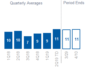
Could anyone please let me know how I can create a bar chart like below in QV?
I created the above chart in excel, the last two bars are not filled with colors. I did this by editing the data point. How can I do the same in QV?
Thanks,
Michael
Accepted Solutions
- Mark as New
- Bookmark
- Subscribe
- Mute
- Subscribe to RSS Feed
- Permalink
- Report Inappropriate Content
- Mark as New
- Bookmark
- Subscribe
- Mute
- Subscribe to RSS Feed
- Permalink
- Report Inappropriate Content
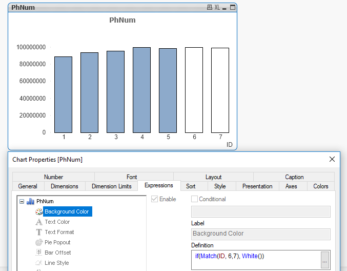
u should be able to do this by expanding the expression in the expression tab of your chart properties, then going to the background colour and creating an expression in there to control the colour.
For example:
IF(DimensionValue = {'1Q18','2Q18','3Q18','4Q18','1Q19','2019TD'} , RGB (0,0,255) , RGB(0,0,0) )
Note: I might not have the syntax exactly right for the test on the dimension values, you may need to use the match function here, but the principles are there to change the colour using the background expression.
- Mark as New
- Bookmark
- Subscribe
- Mute
- Subscribe to RSS Feed
- Permalink
- Report Inappropriate Content
Like this?
- Mark as New
- Bookmark
- Subscribe
- Mute
- Subscribe to RSS Feed
- Permalink
- Report Inappropriate Content
Hi,
thanks, this is exactly what I want.

