Unlock a world of possibilities! Login now and discover the exclusive benefits awaiting you.
- Qlik Community
- :
- All Forums
- :
- QlikView App Dev
- :
- Re: Calculated dimension of time ranges on x-axis
- Subscribe to RSS Feed
- Mark Topic as New
- Mark Topic as Read
- Float this Topic for Current User
- Bookmark
- Subscribe
- Mute
- Printer Friendly Page
- Mark as New
- Bookmark
- Subscribe
- Mute
- Subscribe to RSS Feed
- Permalink
- Report Inappropriate Content
Calculated dimension of time ranges on x-axis
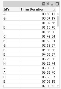
I have a table like shown below
| Time Duration | Id's |
|---|---|
| 00:45 | A |
| 00:35 | A |
| 01:10 | B |
| 01:16 | B |
I wanted to plot a graph with Time Duration on X-axis and Count(Id's) on Y-axis (as expression). But on X-axis i wanted time duration as time range, i.e. 0 < x < 1 and 1 < x < 2 (count of id's with time duration between 0 and 1 hour; and 1 and 2 hours).
I used class function to group time duration like, Class([Time Duration], Time#(1,'HH')). It worked, but the problem is with the visualization. The X-axis scale is showing like 0 < x < 0.0034 and 0.004 < x < 0.0063 (some decimal number, i just wanted to indicate the how it is being show). How to make Class function understand that it is time that i am trying to display.
- « Previous Replies
-
- 1
- 2
- Next Replies »
Accepted Solutions
- Mark as New
- Bookmark
- Subscribe
- Mute
- Subscribe to RSS Feed
- Permalink
- Report Inappropriate Content
- Mark as New
- Bookmark
- Subscribe
- Mute
- Subscribe to RSS Feed
- Permalink
- Report Inappropriate Content
Hi,
You can use Calculated Dimension in chart.
=if(Left(TIME,2)>=0 and Left(TIME,2)<1,'0<X<1',
if(Left(TIME,2)>=1 and Left(TIME,2)<2,'1<X<2',
if(Left(TIME,2)>=2 and Left(TIME,2)<3,'2<X<3')))
You need to write Conditional Statement for 0-23 hrs( I have shown just 3)
- Mark as New
- Bookmark
- Subscribe
- Mute
- Subscribe to RSS Feed
- Permalink
- Report Inappropriate Content
Hi Kuntal
Thank you for your quick response. This is a good idea. This works in the limits are known (for example, 24 hours in a day). But this field being duration/interval it can go beyond 24 hours. How can i handle this case.
- Mark as New
- Bookmark
- Subscribe
- Mute
- Subscribe to RSS Feed
- Permalink
- Report Inappropriate Content
Hi
You can use something like this for the dimension:
=Interval(Class([Time Duration], 1/24), 'HH')
or
=(Class([Time Duration], 1/24)) * 24
The class() function returns a dual with a value equal to the upper or lower limit of the range.
HTH
Jonathan
- Mark as New
- Bookmark
- Subscribe
- Mute
- Subscribe to RSS Feed
- Permalink
- Report Inappropriate Content
You can use following Expression
=Num(Left(TIME,2))&'<x<'&(Left(TIME,2)+1)
I think it will solve thepurpose.
- Mark as New
- Bookmark
- Subscribe
- Mute
- Subscribe to RSS Feed
- Permalink
- Report Inappropriate Content
Hi Jonathan
Thanks for your response. Is it possible to show it like '00:00 < x < 01:00'; '01:00 < x < 02:00'; so on.... This clearly explains to the viewer that the values are for Time Duration between 0 and 1 hour and so on. Just showing bars at 00:00; 01:00;02:00 and so on...is not making the intention very obvious.
- Mark as New
- Bookmark
- Subscribe
- Mute
- Subscribe to RSS Feed
- Permalink
- Report Inappropriate Content
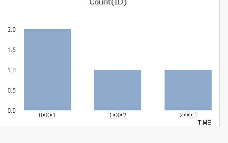
Hi Kuntal
I tried your suggestion and it is closer to what i want but not there yet. Here is how it looked. 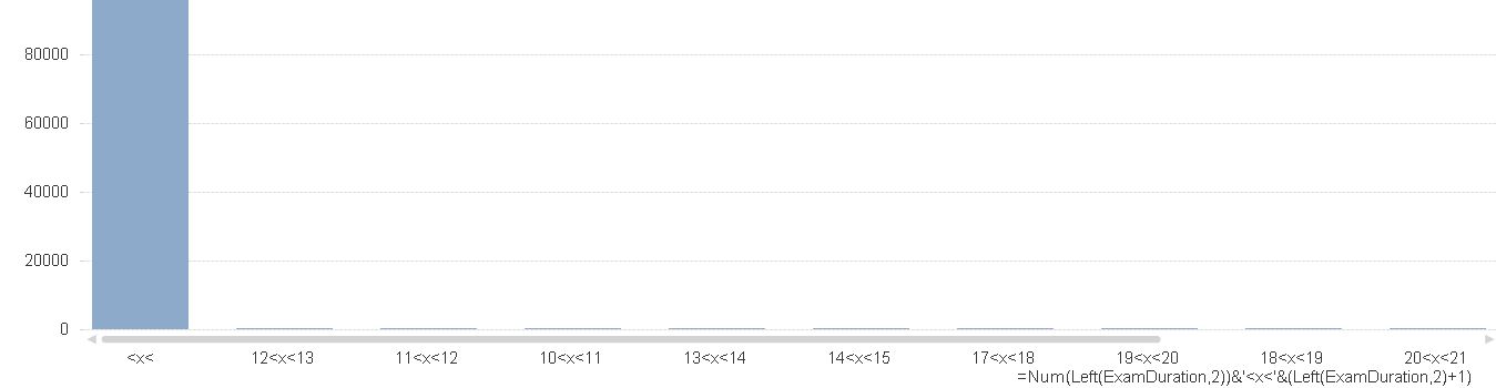
- Mark as New
- Bookmark
- Subscribe
- Mute
- Subscribe to RSS Feed
- Permalink
- Report Inappropriate Content
Can u pls send me a rough snapshot of data.
as I am getting the correct output. 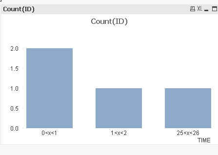
- Mark as New
- Bookmark
- Subscribe
- Mute
- Subscribe to RSS Feed
- Permalink
- Report Inappropriate Content
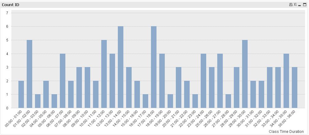
That data is too big, for a rough snapshot it looks something like the table i had in my first message. With the same data when i tried Jonathan's suggestion it looked liked below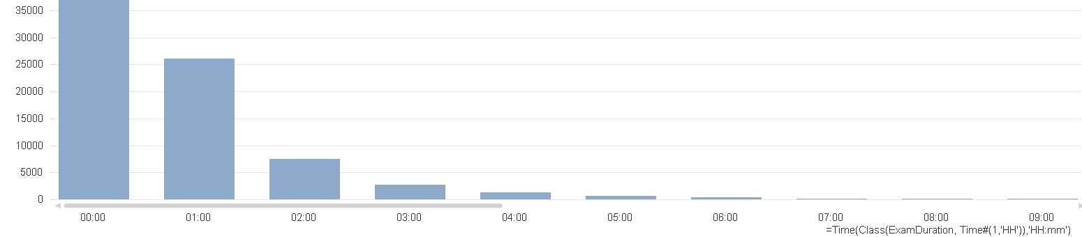
First bar says values between 00:00 and 00:01 hours and so on....
- Mark as New
- Bookmark
- Subscribe
- Mute
- Subscribe to RSS Feed
- Permalink
- Report Inappropriate Content
Hi,
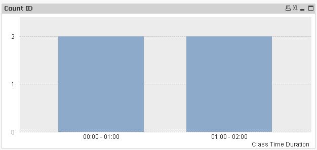
you might use
=Dual(
Interval(SubField(Class([Time Duration], 1/24),'<= x <',1),'hh:mm')&' - '&
Interval(SubField(Class([Time Duration], 1/24),'<= x <',2),'hh:mm'),
Class([Time Duration], 1/24)
)
as calculated dimension.
hope this helps
regards
Marco
- « Previous Replies
-
- 1
- 2
- Next Replies »