Unlock a world of possibilities! Login now and discover the exclusive benefits awaiting you.
- Qlik Community
- :
- All Forums
- :
- QlikView App Dev
- :
- Re: Change line chart style interactively (remove ...
- Subscribe to RSS Feed
- Mark Topic as New
- Mark Topic as Read
- Float this Topic for Current User
- Bookmark
- Subscribe
- Mute
- Printer Friendly Page
- Mark as New
- Bookmark
- Subscribe
- Mute
- Subscribe to RSS Feed
- Permalink
- Report Inappropriate Content
Change line chart style interactively (remove dimension)
Hi all,
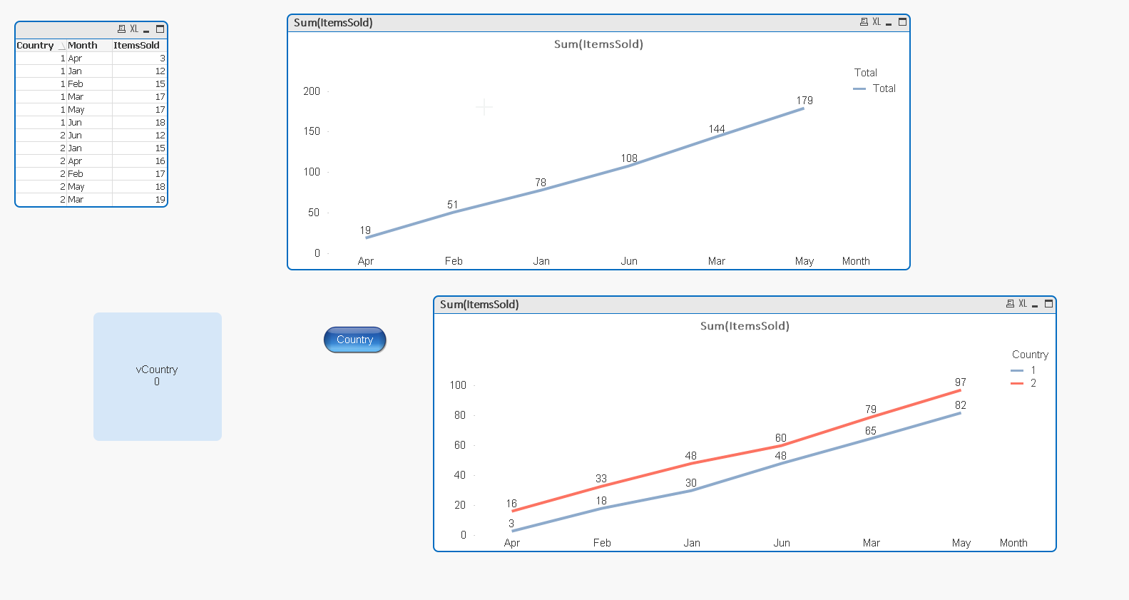
this is my data:
Country | Month | ItemsSold |
|---|---|---|
| 1 | Jan | 12 |
| 1 | Feb | 15 |
| 1 | Mar | 17 |
| 1 | Apr | 3 |
| 1 | May | 17 |
| 1 | Jun | 18 |
| 2 | Jan | 15 |
| 2 | Feb | 17 |
| 2 | Mar | 19 |
| 2 | Apr | 16 |
| 2 | May | 18 |
| 2 | Jun | 12 |
I show this data in a line chart. Month and Country are the dimension, ItemsSold is displayed on the y axis (accumulated).
Now I am looking for a way to change the style of the line chart so that the country dimension is somehow removed and the ItemsSold of all countries get accumulated per month, e.g. for January, the values shown in the graph should be 27, instead of 12 and 15.
1. How can I define to accumulate per month?
2. Is there a way to let the user interactively switch between these two styles?
Thank you,
Christian
- Mark as New
- Bookmark
- Subscribe
- Mute
- Subscribe to RSS Feed
- Permalink
- Report Inappropriate Content
PFA, and let me know your expected o/p?
- Mark as New
- Bookmark
- Subscribe
- Mute
- Subscribe to RSS Feed
- Permalink
- Report Inappropriate Content
Sorry, I can't open the attached file (QVPE). Can you please describe what to do or provide a link where it is explained how to implement the functionality described in my question?
Thank you
- Mark as New
- Bookmark
- Subscribe
- Mute
- Subscribe to RSS Feed
- Permalink
- Report Inappropriate Content
See this file
Is you need?
- Mark as New
- Bookmark
- Subscribe
- Mute
- Subscribe to RSS Feed
- Permalink
- Report Inappropriate Content
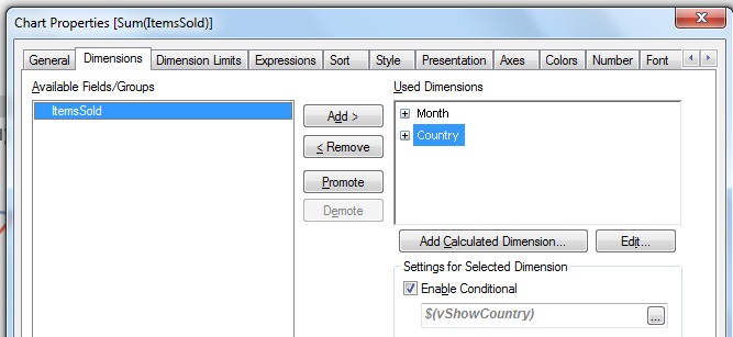
Hi Christian,
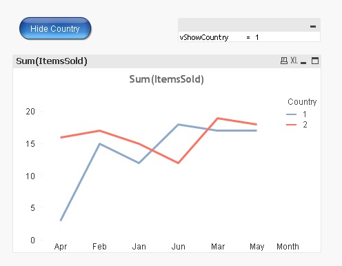
You can remove and restore the country dimension easily to your chart. Make the dimension conditional on a variable, say vShowCountry. Create this variable in Variable Overview (via Settings) and set it equal to 1. In the Dimensions tab set the Enable condition for the Country dimension:
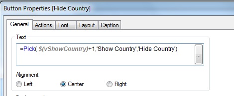
Add a button and set its text in the General tab:
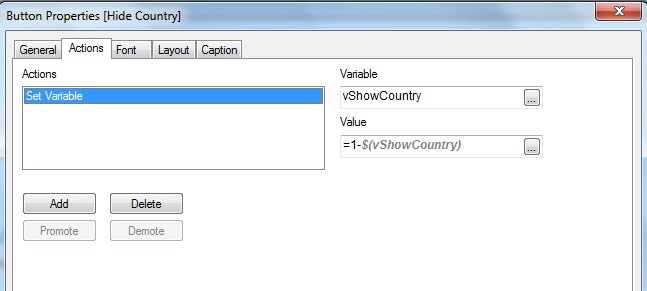
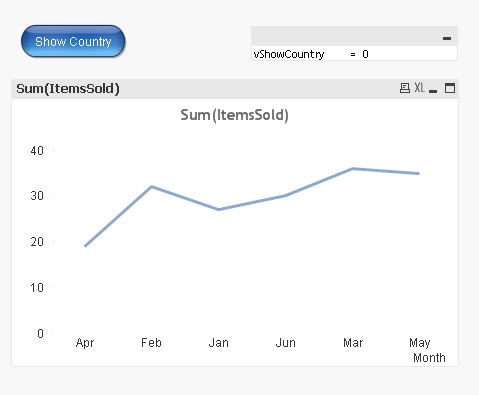
Add an action to set the value of the vShowCountry variable:
That should do it. You should see something like:
Click the button and you should then see:
Kind regards
Andrew
- Mark as New
- Bookmark
- Subscribe
- Mute
- Subscribe to RSS Feed
- Permalink
- Report Inappropriate Content
Hi Andrew,
thank you, this is exactly what I need. I tried and it worked immediately with my data.
Now I have a bonus requirement:
I need to show the y-axis in relativ mode, i.e. 0-100%.
With the setting as in your example, the values add up to 100% when there is only one line, i.e. country is removed from dimension.
If there are separat lines for each country, each line only goes up to the percentage which reflects the ration of items sold in this country compared to the overall items sold.
Is there a way to scale each of the separat lines, so that every one of the goes up to 100%?
In fact, what I want to have is an empirical distribution function (Empirical distribution function - Wikipedia, the free encyclopedia), similar to what is shown in this picture (complete different data, just to show an example).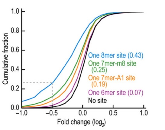
Thanks a lot,
Christian
- Mark as New
- Bookmark
- Subscribe
- Mute
- Subscribe to RSS Feed
- Permalink
- Report Inappropriate Content
Christian,
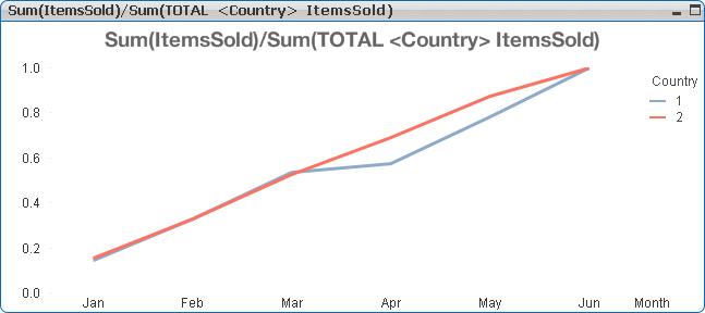
Is this what your'e looking for? Use the expression given in the legend and in the expression tab select Full Accumulation. You can tidy it up a little by setting the Static Max to 1 in the Axes tab.
The TOTAL qualifier disregards any chart dimensions except any listed in the <>. In this case
Sum(TOTAL <Country> ItemsSold)
is a constant value for each month : the total number of Items sold in a country over all months. As the numerator accumulates to this figure for successive months the ratio approaches unity.
Regards
Andrew
- Mark as New
- Bookmark
- Subscribe
- Mute
- Subscribe to RSS Feed
- Permalink
- Report Inappropriate Content
Andrew,
yes, this is exactly what I need. I guess in the TOTAL <>, I can also use multiple columns, in case that my original second dimension is not only country, but country & product, or any other combination?
Thank you very much,
Christian