Unlock a world of possibilities! Login now and discover the exclusive benefits awaiting you.
- Qlik Community
- :
- All Forums
- :
- QlikView App Dev
- :
- Chart with value realised, planned and percentage ...
- Subscribe to RSS Feed
- Mark Topic as New
- Mark Topic as Read
- Float this Topic for Current User
- Bookmark
- Subscribe
- Mute
- Printer Friendly Page
- Mark as New
- Bookmark
- Subscribe
- Mute
- Subscribe to RSS Feed
- Permalink
- Report Inappropriate Content
Chart with value realised, planned and percentage of realization
Hi,
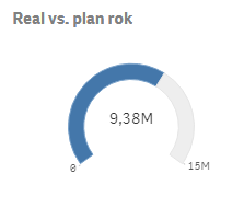
I would like to ask if there is a possibility or exists somewhere a chart that could give visualisation that is similar to the one below but with additional information. The chart presented on the picture presents value realised (9,38M) reffering to value planned (15M). I would like to include also a percent of realization of the plan.
Maciek
- Tags:
- chart
- realization
- Mark as New
- Bookmark
- Subscribe
- Mute
- Subscribe to RSS Feed
- Permalink
- Report Inappropriate Content
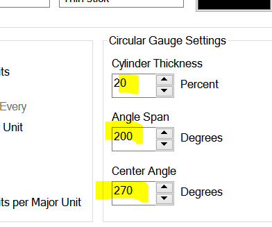
This is radar chart
Look on my blog:
The Black Friday graphics has a similar shape,
You need to play with this parameters:
and this
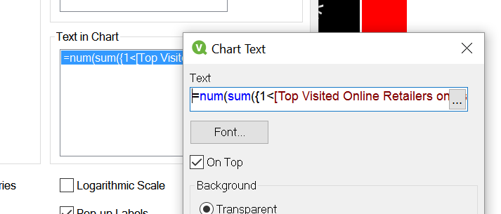
For the text options
- Mark as New
- Bookmark
- Subscribe
- Mute
- Subscribe to RSS Feed
- Permalink
- Report Inappropriate Content
Hi,
Thanks for your reply. There are radar charts with percentage on your visualization. I would like not to change value into percentage. I would like to have a chart, it doesn't have to be a radar chart, that can include all tree measures: realization,plan and percent of realization. It can look like my radar chart with percent value above 9,38M. This is a qlik sense visualization.
Maciek
- Mark as New
- Bookmark
- Subscribe
- Mute
- Subscribe to RSS Feed
- Permalink
- Report Inappropriate Content
But this is QlikView forum...
Start new topic in relevant subforum..
- Mark as New
- Bookmark
- Subscribe
- Mute
- Subscribe to RSS Feed
- Permalink
- Report Inappropriate Content
I haven't realized. Ok, thank you 🙂