Unlock a world of possibilities! Login now and discover the exclusive benefits awaiting you.
- Qlik Community
- :
- All Forums
- :
- QlikView App Dev
- :
- Combo chart with intervals on x axis
- Subscribe to RSS Feed
- Mark Topic as New
- Mark Topic as Read
- Float this Topic for Current User
- Bookmark
- Subscribe
- Mute
- Printer Friendly Page
- Mark as New
- Bookmark
- Subscribe
- Mute
- Subscribe to RSS Feed
- Permalink
- Report Inappropriate Content
Combo chart with intervals on x axis
Hi guys,
Please help me regarding combo chart with intervals on x axis
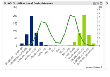
As you can see in image
1) on x axis - intervals are made positive on right side and negative on left side
2) bar with color blue shows debit amount
3) bar with green shows credit amt
4) line shows no of lines selected
Plz help me hoe to do this?
Regards,
Sachin
- Mark as New
- Bookmark
- Subscribe
- Mute
- Subscribe to RSS Feed
- Permalink
- Report Inappropriate Content
Hi Sachin, for 1) in the load script you can create buckets using dual to sort in buckets in correct order, in example:
Amounts:
LOAD Amount,
Dual(If(Amount<0, Num(Num('1'& Repeat('0', Long))*-1, '#.##0') & '...' & If(Long<=2, 0, Num(Num('1'& Repeat('0', Long-1))*-1, '#.##0')),
If(Long<=1, 0, Num(Num('1'& Repeat('0', Long-1)), '#.##0')) & '...' & Num(Num('1'& Repeat('0', Long)), '#.##0'))
, Index) as Bucket;
LOAD Amount,
Len(fabs(Amount)) as Long,
Len(Amount) * If(Amount<0, -1, 1) as Index;
LOAD * Inline [
Amount
-99000000
50000
-1
0
150000
];
For 2) and 3) you can use the bucket index in background color of the bars like:
If(Bucket<0, [BlueColorRGB], [GreenColorRGB])
For 4) I think you only need an expression like:
Count(Amount)
Hope this helps!