Unlock a world of possibilities! Login now and discover the exclusive benefits awaiting you.
- Qlik Community
- :
- All Forums
- :
- QlikView App Dev
- :
- Re: Creating a heat gantt chart
- Subscribe to RSS Feed
- Mark Topic as New
- Mark Topic as Read
- Float this Topic for Current User
- Bookmark
- Subscribe
- Mute
- Printer Friendly Page
- Mark as New
- Bookmark
- Subscribe
- Mute
- Subscribe to RSS Feed
- Permalink
- Report Inappropriate Content
Creating a heat gantt chart
Hi,
Hopefully you can help.
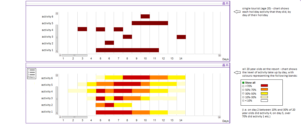
I have created a gantt chart within my document which shows what activity a customer did on what day. (The top chart within the image) <-- This was the easy bit!
What I am struggling on is to create the bottom chart in the image. I want to be able to show for all customers there activity pattern while on holiday. i.e. 100% of all tourists do activity 4 on days 7&8 but for some reason 15% of them do it on day 2.
I don't know if this can somehow be done on overlaying bars? As you can see for the top chart there are gaps between activities so I cannot use a stacked chart. Or maybe somehow use a formula in the colour of the bar (but I thought the bar all had to be one continuous colour?)
I have a worrying feeling that this cannot be done. I have managed to mock this up in a table and use a formula within the table to highlight the specific days, but typically in a table it only shows the days when you have activity so in the example provided days 1&2 in the first chart would not appear.
Any help would be greatly appreciated.
Thanks
PLEASE NOTE THAT THE ATTACHED IMAGE HAS BEEN MOCKED UP IN PAINT FOR ILLUSTRATIVE PURPOSES
- Mark as New
- Bookmark
- Subscribe
- Mute
- Subscribe to RSS Feed
- Permalink
- Report Inappropriate Content
Did you manage to get anywhere with this?
I'm looking to produce a similar thing with my Gantt chart but i can't see how to do it.
Thanks,
Peter