Unlock a world of possibilities! Login now and discover the exclusive benefits awaiting you.
Announcements
FLASH SALE: Save $500! Use code FLASH2026 at checkout until Feb 14th at 11:59PM ET. Register Now!
- Qlik Community
- :
- All Forums
- :
- QlikView App Dev
- :
- Date Changes Graph
Options
- Subscribe to RSS Feed
- Mark Topic as New
- Mark Topic as Read
- Float this Topic for Current User
- Bookmark
- Subscribe
- Mute
- Printer Friendly Page
Turn on suggestions
Auto-suggest helps you quickly narrow down your search results by suggesting possible matches as you type.
Showing results for
Anonymous
Not applicable
2018-01-11
08:56 AM
- Mark as New
- Bookmark
- Subscribe
- Mute
- Subscribe to RSS Feed
- Permalink
- Report Inappropriate Content
Date Changes Graph
Hi,
Every milestone has 'snapshot_date' and 'finish_date' and I want to upload it on a graph.
How can I create the graph attached?
Thanks for your help,
Liron
638 Views
1 Reply
Former Employee
2018-01-12
08:02 AM
- Mark as New
- Bookmark
- Subscribe
- Mute
- Subscribe to RSS Feed
- Permalink
- Report Inappropriate Content
You can visualize this as a Scatter chart:
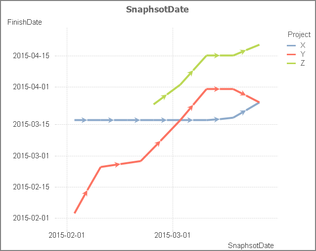
1) Select Milestone as first dimension, Project as second
2) Use Avg(SnapshotDate) and Avg(FinishDate) as measures
3) "Show arrows" on the Presentation tab
4) Uncheck "Force 0" for both axes on the Axes tab
5) "Show grid" for both axes on the Axes tab
6) Format both measures as Dates on the Numbers tab
See also Recipe for a Scatter Chart
Good luck!
HIC
458 Views