Unlock a world of possibilities! Login now and discover the exclusive benefits awaiting you.
- Qlik Community
- :
- All Forums
- :
- QlikView App Dev
- :
- Diagram / chart doesn't show all values
- Subscribe to RSS Feed
- Mark Topic as New
- Mark Topic as Read
- Float this Topic for Current User
- Bookmark
- Subscribe
- Mute
- Printer Friendly Page
- Mark as New
- Bookmark
- Subscribe
- Mute
- Subscribe to RSS Feed
- Permalink
- Report Inappropriate Content
Diagram / chart doesn't show all values
Hello dear community
I have the following problem:
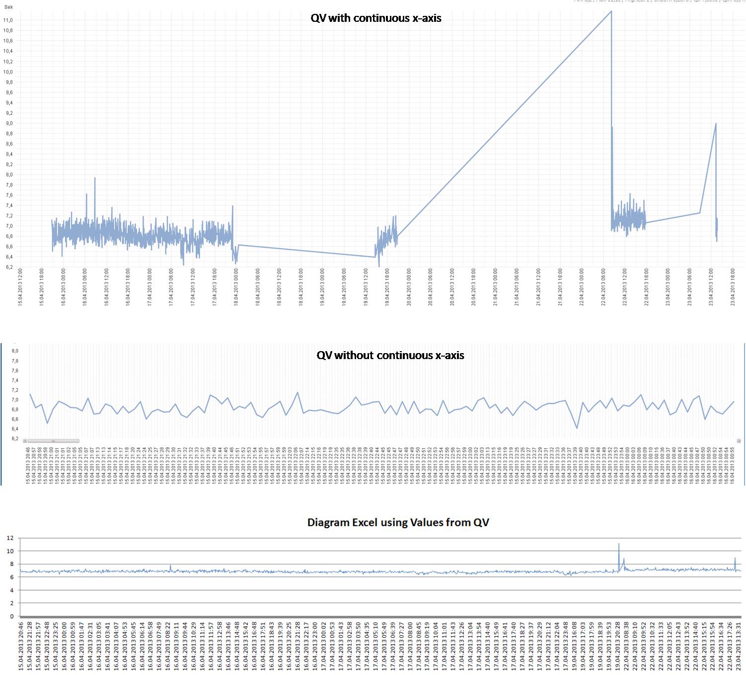
I want to show all avail. data in a diagram !without! using the continuous funktion or scrolling of the x-axis.
see also:
http://community.qlik.com/message/46518#46518
as you see, my data is not continuous and I do not want to see these breaks:

when not using continuous and xaxis scrolling , only the first 2 hrs are shown (complete data of selection = 2 days(1900 rows)):

Thx in advance
cheers chesterluck
- « Previous Replies
-
- 1
- 2
- Next Replies »
- Mark as New
- Bookmark
- Subscribe
- Mute
- Subscribe to RSS Feed
- Permalink
- Report Inappropriate Content
Somebody , anybody ![]()
I see that the imges are somehow not visible.
Here is what i mean:

I really don't know how to solve this problem. Please HELPP!!!!!
- Mark as New
- Bookmark
- Subscribe
- Mute
- Subscribe to RSS Feed
- Permalink
- Report Inappropriate Content
You need to add the missing dates in your date dimension with something like this:
MinMaxDate:
Load Min(Date) as MinDate, Max(Date) as MaxDate resident MyTable;
Let vMinDate = Peek('MinDate',-1,'MinMaxDate') - 1;
Let vMaxDate = Peek('MaxDate',-1,'MinMaxDate') ;
Drop Table MinMaxDate;
Join (MyTable)
Load Date(recno()+$(vMinDate)) as Date Autogenerate vMaxDate - vMinDate;
Replace MyTable with the table containing your date field and Date with the name of your date field.
Once all the missing dates are added your table you can disable the option Suppress Zero-Values on the Presentation tab in your chart.
talk is cheap, supply exceeds demand
- Mark as New
- Bookmark
- Subscribe
- Mute
- Subscribe to RSS Feed
- Permalink
- Report Inappropriate Content
I thought also about this possibility.
But I have appx. 500 000 000 raws in my table.
To join the data with a calender I would have not only to create missing dates but also hours, minutes and maybe seconds.
That would increase 'a lot' the script execution time....
Or am I wrong??
cheers chesterluck
- Mark as New
- Bookmark
- Subscribe
- Mute
- Subscribe to RSS Feed
- Permalink
- Report Inappropriate Content
That's right. So use a continuous x-axis instead if you want to show hours and minutes. If showing averages (or totals) per day is good enough, split the datetime field into a date and a time field and generate the missing dates for the date field.
talk is cheap, supply exceeds demand
- Mark as New
- Bookmark
- Subscribe
- Mute
- Subscribe to RSS Feed
- Permalink
- Report Inappropriate Content
Well therefore I wrote the thread. Look:
- the continuous scale is fine but the empty values are problematic
- Nor using the continuous scale would be also fine when not the x scroll bar.
- The option with suppressing Zero values (your 1st advice) is proplematic as I would have to create a calender with dates / hours / minutes / seconds = high script execution time....
So if there is no possibility I will probably have to export the data to an excel template an use a pivot chart in excel.
I honestly cant understand why QV is not supporting these kind of functionlities. Anyway thank you very much Gysbert.
- Mark as New
- Bookmark
- Subscribe
- Mute
- Subscribe to RSS Feed
- Permalink
- Report Inappropriate Content
chesterluck,
if you absolutely want to show all your data in the chart (like option 2 'Nor using the continuous scale would be also fine when not the x scroll bar.'), that should be possible.
See attached for a sample with 10000 data points. Of course you would need to 'zoom in' (i.e. select a sub-range of data) to see the datapoints in detail, i.e. there is a loss of information in this view.
Regards,
Stefan
- Mark as New
- Bookmark
- Subscribe
- Mute
- Subscribe to RSS Feed
- Permalink
- Report Inappropriate Content
unbelieveable it worked. I was using a line diagram, but had to use a combi diagram instead. Stefan can you explain why and how it makes a difference.
Already 1000 thanks to both experts ![]()
Cheers chesterluck
- Mark as New
- Bookmark
- Subscribe
- Mute
- Subscribe to RSS Feed
- Permalink
- Report Inappropriate Content
I've been struggling with this and was happy to find a solution - but I can't get it to work! I've downloaded the document and tried to make a similar chart as the one already there - but my version does NOT display all values. What am I doing wrong? How did you guys manage to get it to show all values?
- Mark as New
- Bookmark
- Subscribe
- Mute
- Subscribe to RSS Feed
- Permalink
- Report Inappropriate Content
Can you upload your file so i can have a look
- « Previous Replies
-
- 1
- 2
- Next Replies »