Unlock a world of possibilities! Login now and discover the exclusive benefits awaiting you.
- Qlik Community
- :
- All Forums
- :
- QlikView App Dev
- :
- Re: Displaying line charts only for selected dimen...
- Subscribe to RSS Feed
- Mark Topic as New
- Mark Topic as Read
- Float this Topic for Current User
- Bookmark
- Subscribe
- Mute
- Printer Friendly Page
- Mark as New
- Bookmark
- Subscribe
- Mute
- Subscribe to RSS Feed
- Permalink
- Report Inappropriate Content
Displaying line charts only for selected dimensions
Hi,
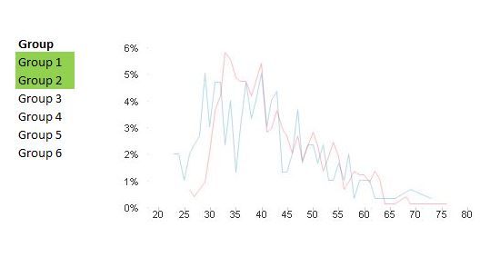
The chart below shows how the age of employees is distributed (as a % of the selected group). Rather than have a messy chart showing showing the line for all groups, I would like to allow users to select the groups they would like to compare, and show those only.
I've tried creating seperate expressions for each group (e.g. Count(DISTINCT {<[Group]={Group 1'}>}[Employee Number])), with corresponding conditional shows (e.g. Group='Group 1'), but this only works for single selections.
This seems like it would be a useful function in general. How could it be done?
Many thanks.
Accepted Solutions
- Mark as New
- Bookmark
- Subscribe
- Mute
- Subscribe to RSS Feed
- Permalink
- Report Inappropriate Content
Try using below expression in 'conditional' expression option
WildMatch(GetCurrentSelections(),'*MatchingValue*') .
I have attached a sample solution with sample data.
Hope this works for you.
- Mark as New
- Bookmark
- Subscribe
- Mute
- Subscribe to RSS Feed
- Permalink
- Report Inappropriate Content
Hi,
In expression, check the 'conditional' option and give appropriate condition to show and hide expression as per user selection.
- Mark as New
- Bookmark
- Subscribe
- Mute
- Subscribe to RSS Feed
- Permalink
- Report Inappropriate Content
That doesn't work. With the straightforward condition I quoted, the chart only works if one is selected. If a conditional select is the answer, it would need to work for multiple selections.
- Mark as New
- Bookmark
- Subscribe
- Mute
- Subscribe to RSS Feed
- Permalink
- Report Inappropriate Content
Try using below expression in 'conditional' expression option
WildMatch(GetCurrentSelections(),'*MatchingValue*') .
I have attached a sample solution with sample data.
Hope this works for you.
- Mark as New
- Bookmark
- Subscribe
- Mute
- Subscribe to RSS Feed
- Permalink
- Report Inappropriate Content
Perfect, thank you so much!
