Unlock a world of possibilities! Login now and discover the exclusive benefits awaiting you.
- Qlik Community
- :
- All Forums
- :
- QlikView App Dev
- :
- Re: Dynamic AVG (3 Rolling Months)
- Subscribe to RSS Feed
- Mark Topic as New
- Mark Topic as Read
- Float this Topic for Current User
- Bookmark
- Subscribe
- Mute
- Printer Friendly Page
- Mark as New
- Bookmark
- Subscribe
- Mute
- Subscribe to RSS Feed
- Permalink
- Report Inappropriate Content
Dynamic AVG (3 Rolling Months)
Hello,
I have the following table:
- Period: Date Format: MM-YYY
| Period | Total | Rental | Expenses | Key | FPC |
|---|---|---|---|---|---|
| 02-2016 | 224 | 117 | 65 | 17 | 25 |
| 03-2016 | 243 | 130 | 66 | 18 | 29 |
| 04-2016 | 264 | 148 | 69 | 18 | 29 |
| 05-2016 | 259 | 146 | 71 | 19 | 22 |
| 06-2016 | 277 | 159 | 74 | 19 | 24 |
| 07-2016 | 295 | 174 | 77 | 20 | 24 |
| 08-2016 | 274 | 154 | 79 | 20 | 22 |
| 09-2016 | 262 | 140 | 80 | 20 | 21 |
| 10-2016 | 296 | 169 | 82 | 21 | 24 |
| 11-2016 | 295 | 168 | 84 | 21 | 22 |
| 12-2016 | 392 | 249 | 86 | 22 | 35 |
| 01-2017 | 287 | 155 | 87 | 21 | 23 |
| 02-2017 | 285 | 152 | 88 | 22 | 23 |
| 03-2017 | 301 | 163 | 90 | 23 | 24 |
| 04-2017 | 328 | 187 | 93 | 23 | 25 |
| 05-2017 | 350 | 201 | 95 | 23 | 31 |
| 06-2017 | 346 | 194 | 96 | 24 | 31 |
| 07-2017 | 368 | 215 | 99 | 24 | 30 |
| 08-2017 | 352 | 199 | 100 | 24 | 29 |
| 09-2017 | 336 | 182 | 101 | 25 | 27 |
| 10-2017 | 372 | 213 | 103 | 26 | 31 |
| 11-2017 | 300 | 149 | 104 | 25 | 22 |
| 12-2017 | 297 | 147 | 105 | 24 | 20 |
| 01-2018 | 320 | 150 | 110 | 26 | 25 |
What I need is to create a Bar Chart with the AVG from Last 3 Months for each Period.
For example:
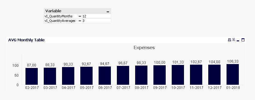
That means that for Period = 01-2018 with Value = 106,33, I get that result because if we look in the table, we have:
| Period | Expenses |
|---|---|
| 11-2017 | 104 |
| 12-2017 | 105 |
| 01-2018 | 110 |
(110 + 105 + 104) / 3 = 106,33
So I need to do this for each Period.
Do you know how could I do that?
Thank you!!!
PS: I attach a Sample File. The Sheet I need to complete is the 3rd one: Data By Average Months.
Accepted Solutions
- Mark as New
- Bookmark
- Subscribe
- Mute
- Subscribe to RSS Feed
- Permalink
- Report Inappropriate Content
May be use this
=RangeAvg(Above(Sum({<Period>}Expenses), 0, vI_QuantityAverages)) * Avg({<Period = {"$(='>=' & Num(MonthStart(Max(Period), -vI_QuantityMonths+1)) & '<=' & Max(Period))"}>}1)
- Mark as New
- Bookmark
- Subscribe
- Mute
- Subscribe to RSS Feed
- Permalink
- Report Inappropriate Content
Thank you!!!