Unlock a world of possibilities! Login now and discover the exclusive benefits awaiting you.
- Qlik Community
- :
- All Forums
- :
- QlikView App Dev
- :
- Re: Help required for Burndown Chart
- Subscribe to RSS Feed
- Mark Topic as New
- Mark Topic as Read
- Float this Topic for Current User
- Bookmark
- Subscribe
- Mute
- Printer Friendly Page
- Mark as New
- Bookmark
- Subscribe
- Mute
- Subscribe to RSS Feed
- Permalink
- Report Inappropriate Content
Help required for Burndown Chart
Hi all - hopefully a basic one!
I have the following Pivot Table
| Serial Number | Consumable | 06/12/17 | 05/12/17 | 04/12/17 | 03/12/17 |
|---|---|---|---|---|---|
| 123456789A | Part 1 | 26% | 31% | 32% | 32.5% |
| Part 2 | 65% | 65% | 71% | 72% | |
| Part 3 | 12% | 16% | 42% | 54% | |
| EIT999101012 | Part 1 | 29% | 33% | 33% | 41% |
| Part 2 | 99% | 99% | 99% | 99% | |
| Part3 | 75% | 77% | 79% | 81% | |
| XYZXYZTUITI123 | Part 2 | 43% | 47% | 52% | 55% |
| CYNCYNCYN101 | Part 1 | 99% | 100% | 100% | 100% |
Now I want to display this as a burndown chart so we can try to predict when they will hit 0%
How would I get this to display as just now they keep grouping into Consumable Parts?
I've had to enabled some If Statements to ensure the different unit types come out as a Percentage.
Any help would be appreciated!
Cheers
Craig
- Mark as New
- Bookmark
- Subscribe
- Mute
- Subscribe to RSS Feed
- Permalink
- Report Inappropriate Content
Sorry should have said!
I'd like the Percentage to be the burndown, but showing how a certain Serial Numbers Consumable is going.
Then I can do a report of what Serial Numbers have a consumable with a low percentage.
- Mark as New
- Bookmark
- Subscribe
- Mute
- Subscribe to RSS Feed
- Permalink
- Report Inappropriate Content
It might be easier if you could share a sample to look at this?
- Mark as New
- Bookmark
- Subscribe
- Mute
- Subscribe to RSS Feed
- Permalink
- Report Inappropriate Content
Hi Sunny, cant share as it contains customer / supplier data. Sorry
- Mark as New
- Bookmark
- Subscribe
- Mute
- Subscribe to RSS Feed
- Permalink
- Report Inappropriate Content
You can scramble the data and then share?
Preparing examples for Upload - Reduction and Data Scrambling
- Mark as New
- Bookmark
- Subscribe
- Mute
- Subscribe to RSS Feed
- Permalink
- Report Inappropriate Content
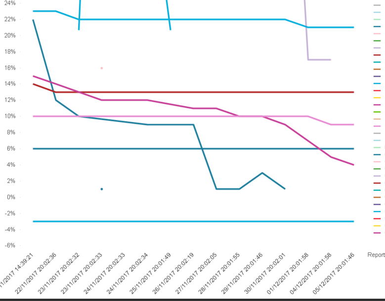
This is what currently is produced, but those lines are just consumable numbers only.
I don't want the client to have to add a filter of the serial number as they would rather only see data less than 25%