Unlock a world of possibilities! Login now and discover the exclusive benefits awaiting you.
- Qlik Community
- :
- All Forums
- :
- QlikView App Dev
- :
- Help with formatting of chart/graph
- Subscribe to RSS Feed
- Mark Topic as New
- Mark Topic as Read
- Float this Topic for Current User
- Bookmark
- Subscribe
- Mute
- Printer Friendly Page
- Mark as New
- Bookmark
- Subscribe
- Mute
- Subscribe to RSS Feed
- Permalink
- Report Inappropriate Content
Help with formatting of chart/graph
Hi all,
I have an interesting chart that I need to create for a client.
-Like this one, as done in excel.
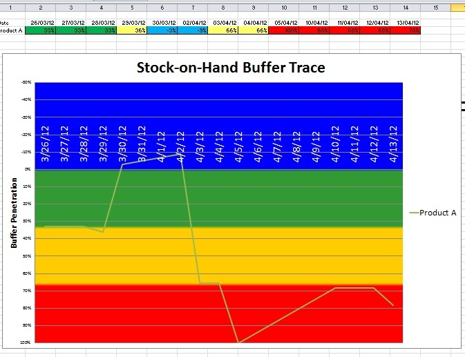
I currently have this expression which I use to create the background colours, in a straight-table for each cell value (Buffer Target %)
=
if((sum([Safety stock]) - Sum([Stock on Hand Quantity]))/sum([Safety stock]) <-0.00001
, RGB(0,128,255) //Blue
,IF((sum([Safety stock]) - Sum([Stock on Hand Quantity]))/sum([Safety stock]) <= 0.33
,RGB(0,255,0) //Green
,IF((sum([Safety stock]) - Sum([Stock on Hand Quantity]))/sum([Safety stock]) <= 0.67
,RGB(255,255,138) //Yellow
,IF((sum([Safety stock]) - Sum([Stock on Hand Quantity]))/sum([Safety stock]) <= 1
,RGB(255,128,128)//Red
,RGB(0,0,0)//Black
)
)
)
)
So, this could be used to create the background colours on the chart.
Any ideas would be appreciated.
- Mark as New
- Bookmark
- Subscribe
- Mute
- Subscribe to RSS Feed
- Permalink
- Report Inappropriate Content
He,
It's not exactly clear what you're trying to achieve. But it seems to me that you have to layer objects above each other.
For eg. make a stacked bar chart, which shows the back ground color. You should fiddle with the bar distance and cluster distance.
Create a second transparant line graph and layer it on top of the other graph. With the same size. Remove the x-as and hide the y axis from this chart. By using ctr-shift you can change the size of the data part of the graph to mach the size of the bar graph.
I couldn't come up with a way to inverse the y-axis. Maybe somebody else has an idea for that.
Hope this helps.
- Mark as New
- Bookmark
- Subscribe
- Mute
- Subscribe to RSS Feed
- Permalink
- Report Inappropriate Content
Thanks! I'll give that shot. 