Unlock a world of possibilities! Login now and discover the exclusive benefits awaiting you.
- Qlik Community
- :
- All Forums
- :
- QlikView App Dev
- :
- Re: How can I show the zeros in one graphic?
- Subscribe to RSS Feed
- Mark Topic as New
- Mark Topic as Read
- Float this Topic for Current User
- Bookmark
- Subscribe
- Mute
- Printer Friendly Page
- Mark as New
- Bookmark
- Subscribe
- Mute
- Subscribe to RSS Feed
- Permalink
- Report Inappropriate Content
How can I show the zeros in one graphic?
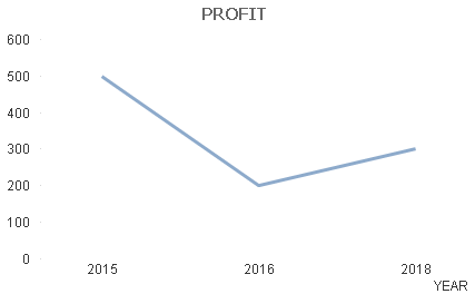
By default, the graphics skip the zero values. E.g. if I have two columns (YEAR with values 2015, 2016, 2017, 2018 and PROFIT with values 500, 200, 0, 300), the x-axis of the graphic (dimension = YEAR and expression = PROFIT) will skip 2017 and jump from 2016 to 2018:
How can I avoid it and make the graphic show the zero in 2017?
Many thanks in advance.
- Mark as New
- Bookmark
- Subscribe
- Mute
- Subscribe to RSS Feed
- Permalink
- Report Inappropriate Content
Check in the presentation tab, that "Supress zero value" option is unchecked.
- Mark as New
- Bookmark
- Subscribe
- Mute
- Subscribe to RSS Feed
- Permalink
- Report Inappropriate Content
Thanks. In this simple example it worked. But my real database is a bit more complex.
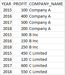
Suppose that I have THREE columns: YEAR, PROFIT and COMPANY_NAME.
When I select a specific company name, the system automatically filters the other columns. So, when I select "B Inc" only rows with years 2015, 2016 and 2018 will remain and will be plotted. How can I make the 2017's zero appear in THIS graphic?
- Mark as New
- Bookmark
- Subscribe
- Mute
- Subscribe to RSS Feed
- Permalink
- Report Inappropriate Content
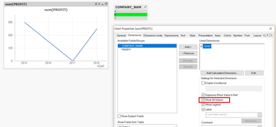
Ok, You have to check in dimension "Show all values".


