Unlock a world of possibilities! Login now and discover the exclusive benefits awaiting you.
- Qlik Community
- :
- All Forums
- :
- QlikView App Dev
- :
- Re: How do you toggle between expressions for sort...
- Subscribe to RSS Feed
- Mark Topic as New
- Mark Topic as Read
- Float this Topic for Current User
- Bookmark
- Subscribe
- Mute
- Printer Friendly Page
- Mark as New
- Bookmark
- Subscribe
- Mute
- Subscribe to RSS Feed
- Permalink
- Report Inappropriate Content
How do you toggle between expressions for sorting in a bar chart
I have a bar chart with three expressions. One for current year, last year and growth. I have a users who wants to be able to sort by any of these three expressions. Basically have the option to select which expression to sort by. Right now, it seems I can only sort by one expression without an ability to change at the end user level.
- « Previous Replies
-
- 1
- 2
- Next Replies »
- Mark as New
- Bookmark
- Subscribe
- Mute
- Subscribe to RSS Feed
- Permalink
- Report Inappropriate Content
Maybe create a "sort by" field with the labels for your three expressions as values. Then use that to pick the correct sort expression in the chart.
- Mark as New
- Bookmark
- Subscribe
- Mute
- Subscribe to RSS Feed
- Permalink
- Report Inappropriate Content
I have a similar problem but I need to toggle ( or enable ) various lines in a line chart based on the selections I make on a field. I explain in detail : I get periodic ( weekly ) data extractions from SAP ( same report with same data fields basically ) with a product sales forecast per month. Concatenating all these extractions I create a calculated field called Week_Nr ( with values 1,2,3...etc, corresponding to the week when the data is extracted ). What I need is to setup a line chart to be able to trend over time the cumulative product sales on the different weeks that I select in the Week_Nr field.
For example I would like to see 2 trend lines ( one corresponding to the data taken on week 7 and a second line showing the data taken on week 8 ) ...this way I could do deviation analysis comparing the forecast on different weeks....similarly I would like to be able to select 3, 4 ..weeks ..or 2 non consecutive weeks for example.
At this moment I managed to display 2 lines using 2 expressions in the chart setup and with Set Analysis ( so the first expression is plotting the data when Week_Nr=7 ( using a set modifier )..and similarly the second expression for Week_Nr=8 ( with a set modifier as well ). So how could I make these set modifiers kind of dynamic or linked to whatever week I manually select in the Week_Nr field ?
Appreciate any help
Thanks in advance
Enrique
- Mark as New
- Bookmark
- Subscribe
- Mute
- Subscribe to RSS Feed
- Permalink
- Report Inappropriate Content
I once had a similar requirement, and solved it by creating a macro (assigned to a button) that was changing chart properties.
- Mark as New
- Bookmark
- Subscribe
- Mute
- Subscribe to RSS Feed
- Permalink
- Report Inappropriate Content
Michael, could you please give me the macro details to see how to do it. Unfortunatelty I never worked with macros in Qlikview.
Anyone has any other trick without using macros ?
Appreciate your help
Thanks
Enrique
- Mark as New
- Bookmark
- Subscribe
- Mute
- Subscribe to RSS Feed
- Permalink
- Report Inappropriate Content
I probably don't understand what you're asking for, but here's a graph that shows detail plus selectable weekly trend lines without using macros or set analysis. You can show the detail for all weeks, but a trend line for the first week, and a separate trend line for the third week. I've used gray for the section of the trend line representing the days used to calculate that trend. There may be better ways to make that information clear - it was just the first thing that occurred to me. This approach is using some data connected by if(), so it would be probably be unacceptably slow for large data sets.
- Mark as New
- Bookmark
- Subscribe
- Mute
- Subscribe to RSS Feed
- Permalink
- Report Inappropriate Content
Thank you John ! It really looks like the way I need it. Based on the selected values of a Field ( In your case TrendLine ) you show/hide the corresponding trend lines on the chart. The only problem is in my case I am not too sure how to configure the script, I believe it´s maybe much more simple : The data I have is as follows :
| DataSet | Jan | Feb | March | Apr | May |
| FW07 | 20 | 15 | 20 | 10 | 50 |
| FW08 | 20 | 15 | 25 | 15 | 55 |
| FW09 | 15 | 15 | 20 | 12 | 33 |
| FW10 | 15 | 15 | 20 | 12 | 33 |
| FW11 | 20 | 15 | 25 | 15 | 55 |
So, in my case the Field where I would select the trend lines to be displayed is DataSet. I know how to convert above table to a tabular list ( using load crosstable ), so I would have 3 fields ( DataSet, Month, Sales ). For the sales amounts I would need to set Accumulation in the Expression settings ( to have a proper trend line, accumulating the values ). The DataSet just represents the data extraction from SAP ( one snapshot report per week for example..this is why these are called FW07, FW08 ....etc ( fiscal weeks ).
I hope it is better explained now . Any help of setting up the script/chart using this table ? Thanks a lot for your help
Enrique
- Mark as New
- Bookmark
- Subscribe
- Mute
- Subscribe to RSS Feed
- Permalink
- Report Inappropriate Content
Let's say I select FW07 and FW08 for that data. A simple line chart with a default trend line and full accumulation does this.
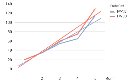
I assume that's not what you want, but what do you want it to look like instead?
- Mark as New
- Bookmark
- Subscribe
- Mute
- Subscribe to RSS Feed
- Permalink
- Report Inappropriate Content
Sorry for the misunderstanding.I used the words trend lines incorrectly.What I simply need are the 2 lines in the chart, one for FW07 and one for FW08...or for any other FW selected.How can i setup the script for that?thanks for the help
- Mark as New
- Bookmark
- Subscribe
- Mute
- Subscribe to RSS Feed
- Permalink
- Report Inappropriate Content
If I understood, then you set it up in the script as you've already said:
"( using load crosstable ), so I would have 3 fields ( DataSet, Month, Sales )"
The chart would have dimensions Month and DataSet, expression sum(Sales), and have full accumulation.
It may take a little effort to get your Month field working right. The attached example shows one way, but it makes some assumptions about how your data is really set up. Here's the script, and there might be a way to do it in one step, but doing a preceeding load with a crosstable has never worked for me for whatever reason.
SalesTemp:
CROSSTABLE (Month, Sales)
LOAD * INLINE [
DataSet 'Jan 2012' 'Feb 2012' 'Mar 2012' 'Apr 2012' 'May 2012'
FW07 20 15 20 10 50
FW08 20 15 25 15 55
FW09 15 15 20 12 33
FW10 15 15 20 12 33
FW11 20 15 25 15 55
] (delimiter is ' ')
;
Sales:
NOCONCATENATE
LOAD
DataSet
,date(date#(Month,'MMM YYYY'),'MMM YYYY') as Month
,Sales
RESIDENT SalesTemp
;
DROP TABLE SalesTemp
;
- « Previous Replies
-
- 1
- 2
- Next Replies »