Unlock a world of possibilities! Login now and discover the exclusive benefits awaiting you.
- Qlik Community
- :
- All Forums
- :
- QlikView App Dev
- :
- Re: How to achieve 2 dimensional bar stacked bar c...
- Subscribe to RSS Feed
- Mark Topic as New
- Mark Topic as Read
- Float this Topic for Current User
- Bookmark
- Subscribe
- Mute
- Printer Friendly Page
- Mark as New
- Bookmark
- Subscribe
- Mute
- Subscribe to RSS Feed
- Permalink
- Report Inappropriate Content
How to achieve 2 dimensional bar stacked bar chart in QlikView?
Hi,
Is there any way to have two dimensions to achieve a stacked bar graph. In Tableau, this functionality is super easy and its just a matter of drag and drop. But I would like to know if is there any way to achieve this. I heard multi dimensions isn't possible in QlikView.
Abhijit
- « Previous Replies
-
- 1
- 2
- Next Replies »
- Mark as New
- Bookmark
- Subscribe
- Mute
- Subscribe to RSS Feed
- Permalink
- Report Inappropriate Content
Hi Vineeth,
Thank you for your reply. This would definitely help me out in defining all the PMTs. But how would we achieve this in order to filter the PMT groups?
Here I have 5 PMT groups and I need to show it on the graph according to the filter selection. If I am selecting 3 PMT groups in filter then it should show 3 PMTs in the grid. How will we achieve the labels in order to have ad-hoc PMT filtering?
Abhijit
- Mark as New
- Bookmark
- Subscribe
- Mute
- Subscribe to RSS Feed
- Permalink
- Report Inappropriate Content
There are two ways to calculate charts
Option1) Modify the Set Expression for PMT level 1 and add and asterisk(*) before the equalto sign
Example = sum({<[PMT Level1] *= {'PMT1 - Body Exterior'}>}[Non Compliant (CAD)])
In the above scenario if no selections are made in PMT Level1 all graphs will show, if a selection is made on PMT level1 only that PMT level chart will calculate.
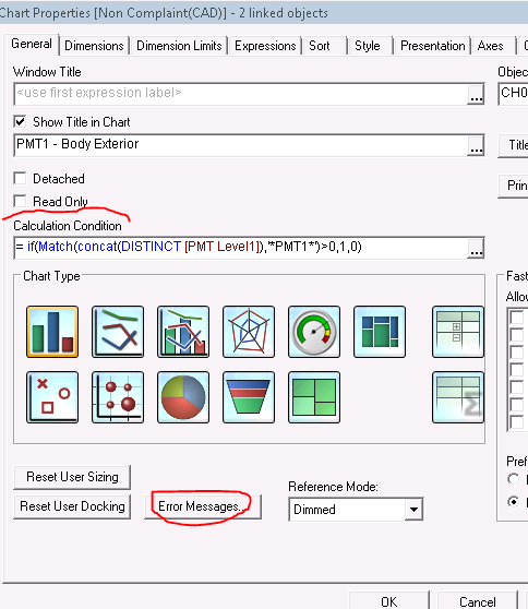
option2)Add a Calculation Condition for Each chart as below(in General Tab)
For PMT 3 chart add below condition
= if(WildMatch(concat(DISTINCT [PMT Level1]),'*PMT3*')>0,1,0)
For PMT 2 chart add below condition
= if(WildMatch(concat(DISTINCT [PMT Level1]),'*PMT2*')>0,1,0)
in the above scenario only selected PMT's will be show in case of no selections made no chart will be shown
You can also change the custom error message shown
If a post helps to resolve your issue, please accept it as a Solution.
- Mark as New
- Bookmark
- Subscribe
- Mute
- Subscribe to RSS Feed
- Permalink
- Report Inappropriate Content
Hi Vineeth,
This is almost close to what I require. Still I have some questions on this. If you see the y-axes are not aligned properly. I have highlighted that below.
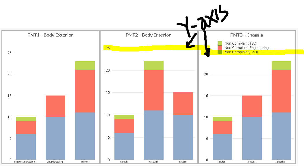
When we are working with grid, we are missing the Y-axis alignment. We need Y-axis for all the PMTs to be aligned with each other. How to achieve this? Is there any way to do it in container? I didn't see any option like this in container.
Abhijit
- Mark as New
- Bookmark
- Subscribe
- Mute
- Subscribe to RSS Feed
- Permalink
- Report Inappropriate Content
Hi,
Have there been any solutions to model what the OP included here? I am similarly attempting to create a stacked bar chart that will include 2 dimensions and 2 measures. This is basically what I want to show: Actual vs. Budget for each month during a Fiscal year. Actual and Budget are 2 different measures. The bar will represent the totals, but I would like that segmented by Category so it is a stacked bar. I can't seem to add this second measure. Thanks
- « Previous Replies
-
- 1
- 2
- Next Replies »