Unlock a world of possibilities! Login now and discover the exclusive benefits awaiting you.
- Qlik Community
- :
- All Forums
- :
- QlikView App Dev
- :
- How to create this chart in Qlikview?
- Subscribe to RSS Feed
- Mark Topic as New
- Mark Topic as Read
- Float this Topic for Current User
- Bookmark
- Subscribe
- Mute
- Printer Friendly Page
- Mark as New
- Bookmark
- Subscribe
- Mute
- Subscribe to RSS Feed
- Permalink
- Report Inappropriate Content
How to create this chart in Qlikview?
HI All,
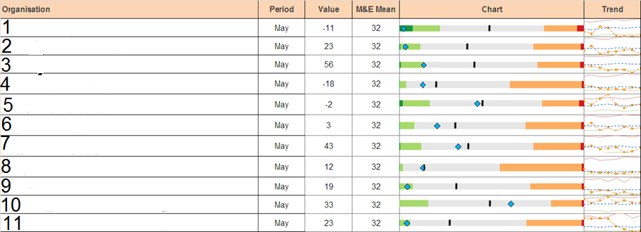
Please find below the below figure,I'M facing problem creating the chart column in this chart.Do anyone have an idea how can i re-create this chart in qlikview.Thank you.
- « Previous Replies
-
- 1
- 2
- Next Replies »
- Mark as New
- Bookmark
- Subscribe
- Mute
- Subscribe to RSS Feed
- Permalink
- Report Inappropriate Content
Kevincool,
It all depends on your data, expression you written for Chart label. In Expression Tab select your chart expression and select minichart in Representation -> Mini Chart Settings ->Select your dimension here and choose your Mode -> Ok
- Mark as New
- Bookmark
- Subscribe
- Mute
- Subscribe to RSS Feed
- Permalink
- Report Inappropriate Content
I know what your talking about...The modes in mini chart does not consist of the requirements in my chart.Instead of mini chart we have to use linear gauge but i am unable to do this with linear gauge.
- Mark as New
- Bookmark
- Subscribe
- Mute
- Subscribe to RSS Feed
- Permalink
- Report Inappropriate Content
Hi kevin,
did you succeed?
What about an example QV-App? Or some examples in excel from what you want to achieve. Then give the community a chance.
Lets try,
Roland
- Mark as New
- Bookmark
- Subscribe
- Mute
- Subscribe to RSS Feed
- Permalink
- Report Inappropriate Content
I don't think a chart that is EXACTLY like the one presented, is possible to reproduce in QlikView.
The closest to it would be a Gauge inside a straight table, however the Gauge can't have variable segment boundaries within the same chart - all the segment boundaries are calculated once for the whole chart and can't vary in each line.
In order to do it in QlikView, you'd have to "normalize" all the segments across the lines, and deven then you might have to overlap a number of transparent charts in order to reproduce all the "bells and whistles".
Perhaps a good candidate for an Extension object?
Oleg
- Mark as New
- Bookmark
- Subscribe
- Mute
- Subscribe to RSS Feed
- Permalink
- Report Inappropriate Content
Hi Oleg,
I agree with you, you can't allways rebuild exactly every feature of other tools (esp. excel).
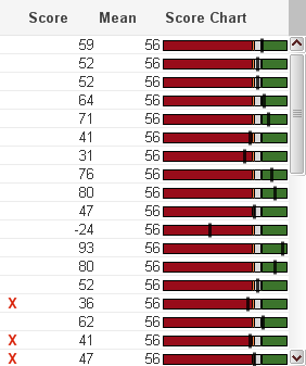
But recently I had the challenge to "copy" a straight table chart which includes a bar in every line for some measures. My nearest QV-Version looks like the attached pic. (Put the Delta bars into the straight table)
I tried in vain using linear gauges because of the reasons you mentioned above.
Any way: I think it is a real and reproducible requirement.
RR
- Mark as New
- Bookmark
- Subscribe
- Mute
- Subscribe to RSS Feed
- Permalink
- Report Inappropriate Content
hi,
I know my reply is late because I gave up creating this chart as it cant be done in qlikview.QV calculates segments in linear gauge the same for all dimension values although the needle varies!.This chart was done in excel by my client.I found an alternate way although not the correct alternative,it is to display only ONE VALUE of the dimension so that the segments change with the selection.
i have tried with the trellis chart option,came somewhere near to the goal but no the chart cant be done just
as it is in qlikview.Thanks all for ur comments.

- Mark as New
- Bookmark
- Subscribe
- Mute
- Subscribe to RSS Feed
- Permalink
- Report Inappropriate Content
Hi Kevin,
After two years, I faced the same request... and I was combining a mini-graph (spark-lines) with a charts but this is complex aligned the dimension (Organization).
Do you have a workaround?
-JFlorian
- Mark as New
- Bookmark
- Subscribe
- Mute
- Subscribe to RSS Feed
- Permalink
- Report Inappropriate Content
Hi Javier, Any luck! Regards, Manish Virmani
- Mark as New
- Bookmark
- Subscribe
- Mute
- Subscribe to RSS Feed
- Permalink
- Report Inappropriate Content
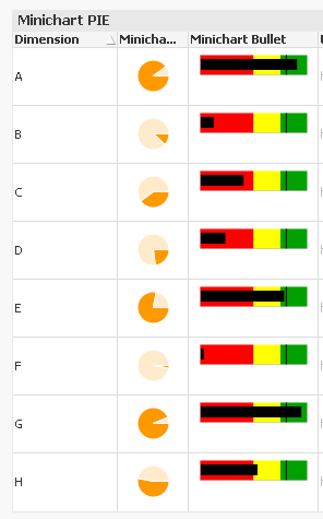
Hi, if you can work on web view, you can use the google static charts API to create inline graphical representations of your data in a grid, like so:
 !
!
For example see this URL:
https://chart.googleapis.com/chart?cht=p&chd=t:20,80&chs=100x100
It's quite easy, the goal here will be to build a URL-like string, that contains the numbers for each dimension in the table you want to plot. You have to set the expression to be shown as . For example:
='https://chart.googleapis.com/chart?cht=p&chd=t:' & value & ',' & (100-value) & '&chs=100x100
Whereas something like this will let you create a bullet chart that seems closer to what you need.
Some tweeking will be needed (for example, some scenarios need a concat(aggr...)), but that should solve your problem. Also note that this API is unsupported by Google any more, but still running and no plans on taking that out. Depending on how critical your environment, this might not be acceptable.
See or copy code from attached example,
Cheers!
- « Previous Replies
-
- 1
- 2
- Next Replies »